Visit.brussels
Don't visit Brussels, LIVE it!
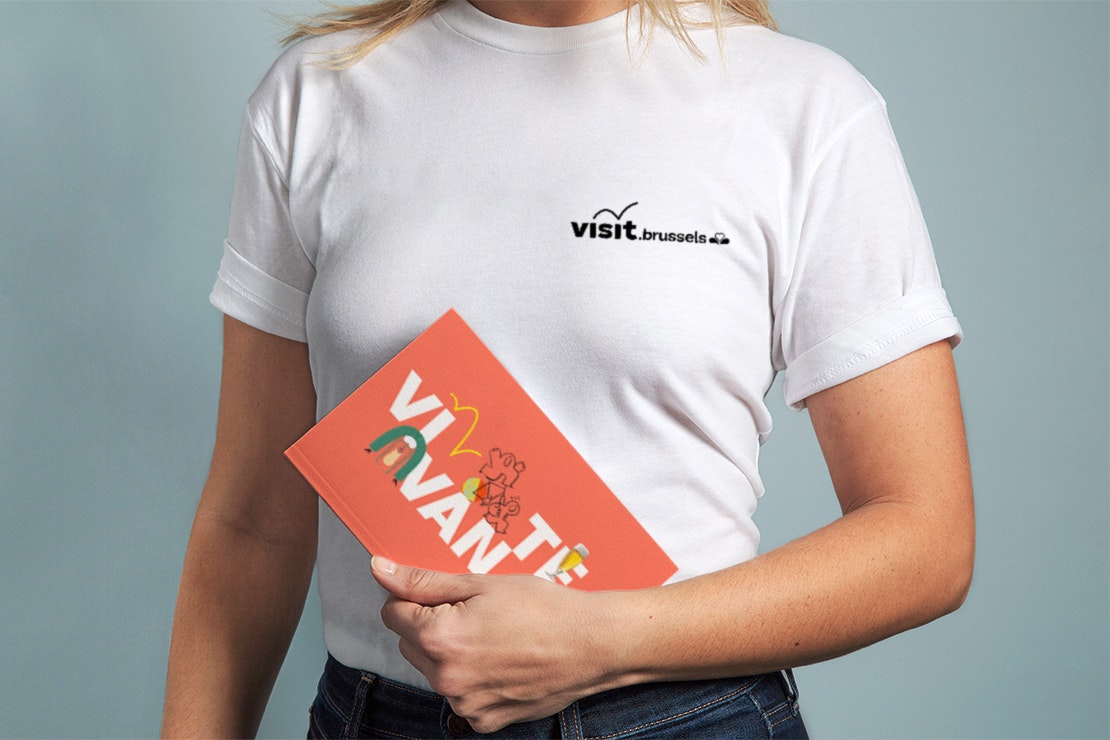
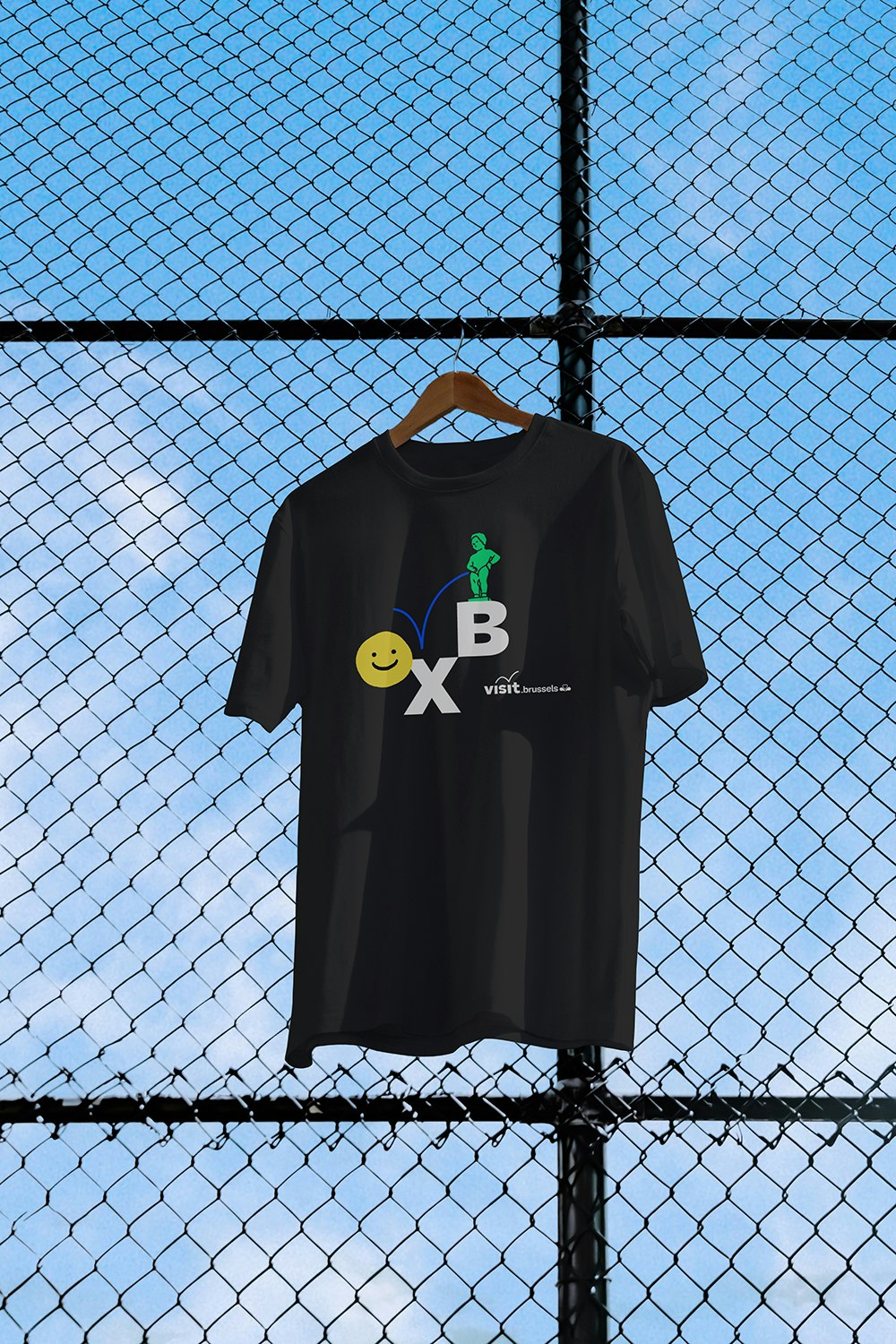
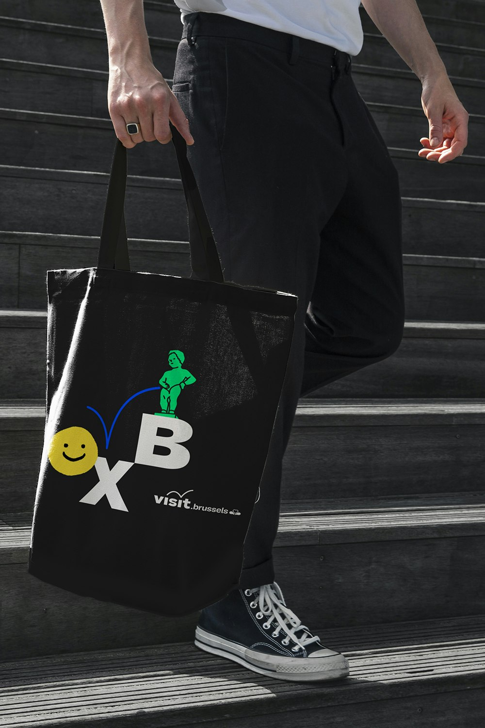
Visit.brussels, the operator in charge of promoting the Brussels Region to tourists and organisers of conventions and events, has decided to adopt a radical new visual identity to better reflect Brussels, its inhabitants and its culture.
After years of helping people visit the city of Brussels, visit.brussels now wants them to LIVE it!
Industries
- Public Services.
Skills
- Strategy,
- Brand Architecture,
- Brand Design.
Challenge
First of all, we needed to give substance and purpose to the visit.brussels brand. This was an essential step to making the transition from a standard tourism operator to THE central player on Brussels' cultural and tourist scene. Secondly, we needed to restore order and consistency to a vast, heterogeneous and overly complicated brand portfolio. And all in an extremely restrictive regional environment.
Solution
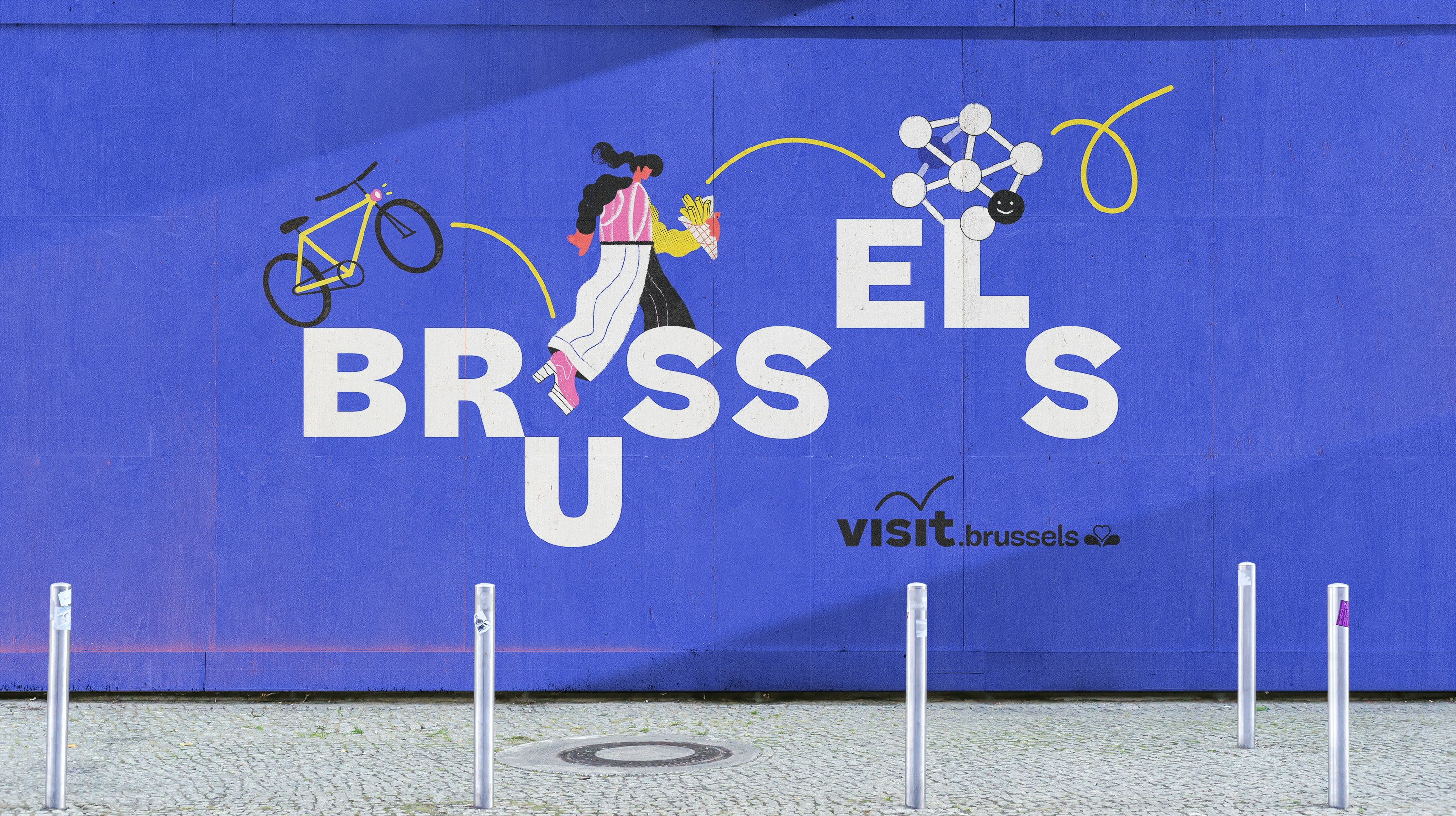
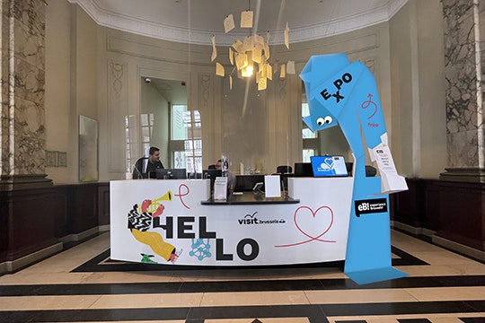
We decided to capitalise on the fundamental identity of the operator visit.brussels and the DNA of the Brussels-Capital Region to create a strong, dynamic and lively identity. An identity that inspires visitors and residents to experience Brussels to the full. We also needed to simplify and standardise the brand architecture of visit.brussels to enable it to fully take on its role as a driving force for the area.
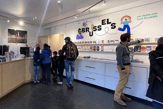
Today, the brand, its experiences, its services, and its events are all focused on a single mission: We make you love Brussels!
Building on good foundations
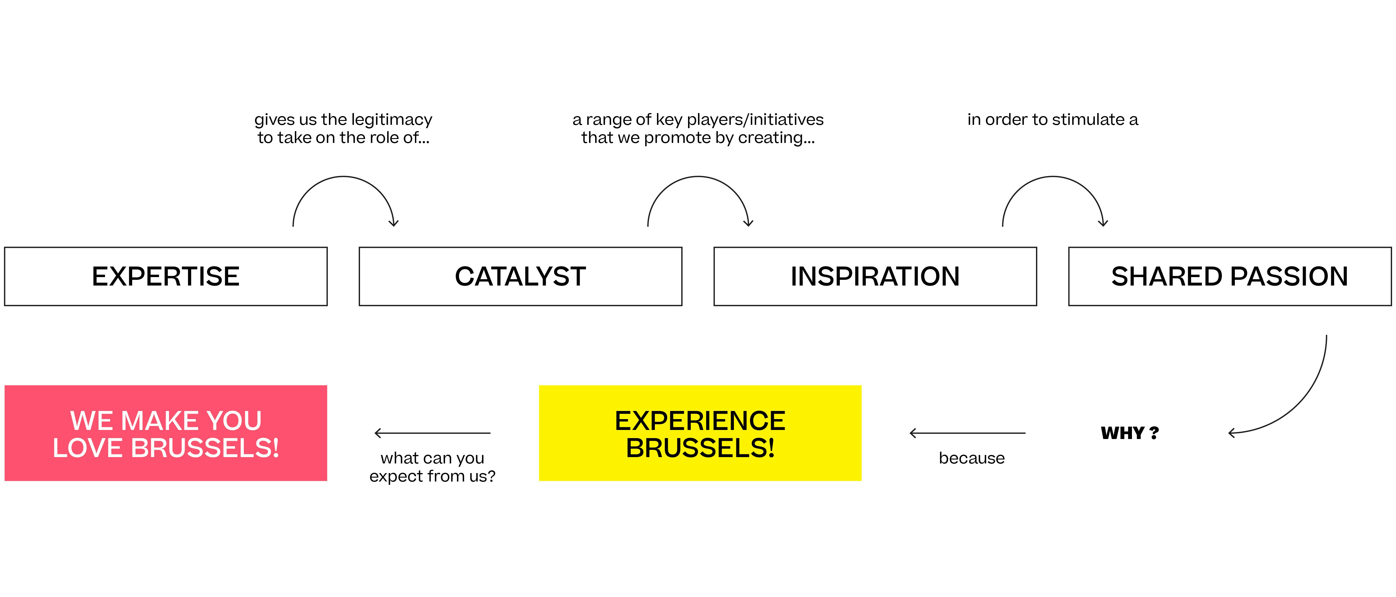
Before starting work on branding, we needed to identify the fundamental features that make visit.brussels a unique and distinctive brand. This process of reflection allowed us to come up with four complementary values: expertise, catalyst, inspiration and shared passion. Together, they support a purpose and philosophy: Don’t visit Brussels, LIVE it!
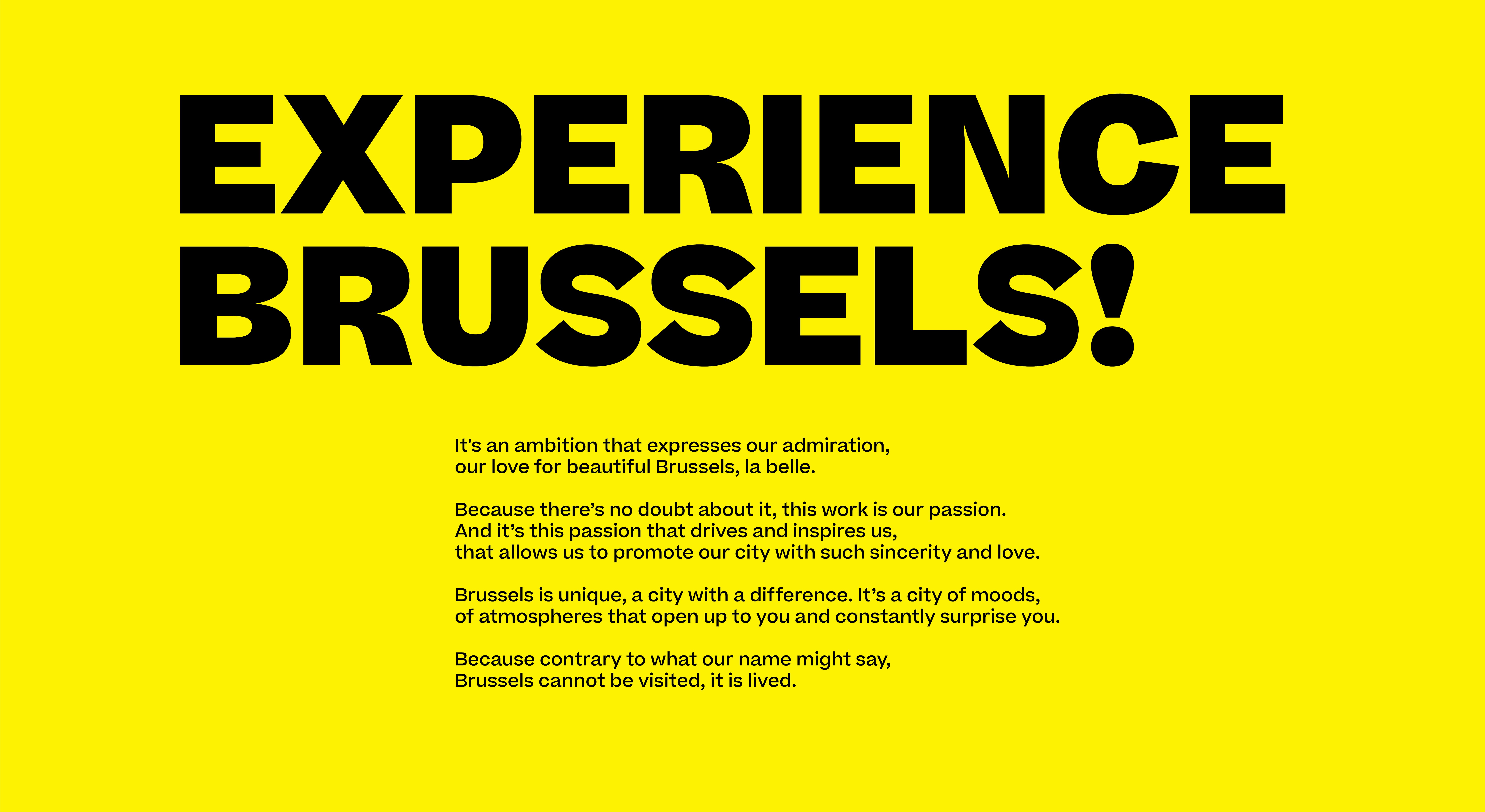
A reflection of the city we promote
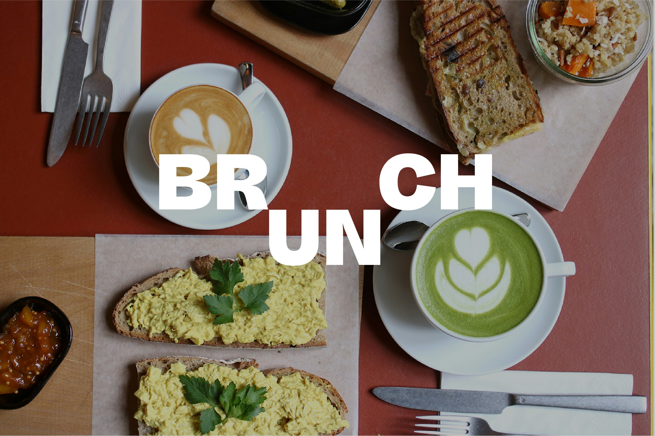
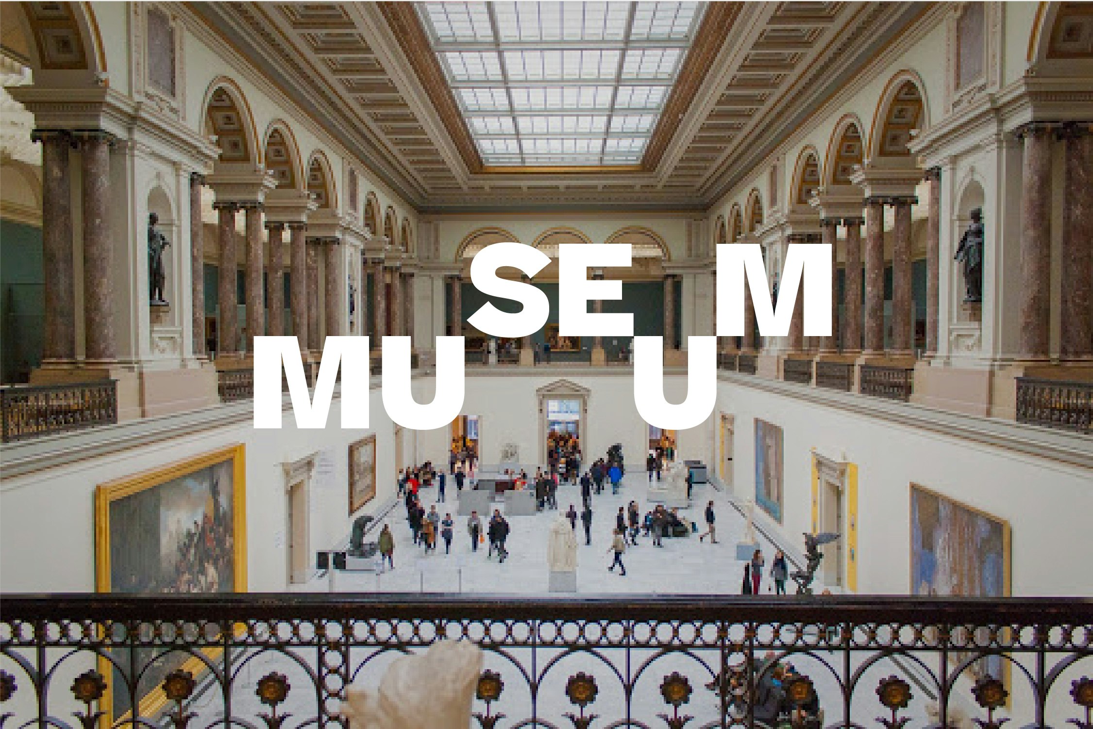
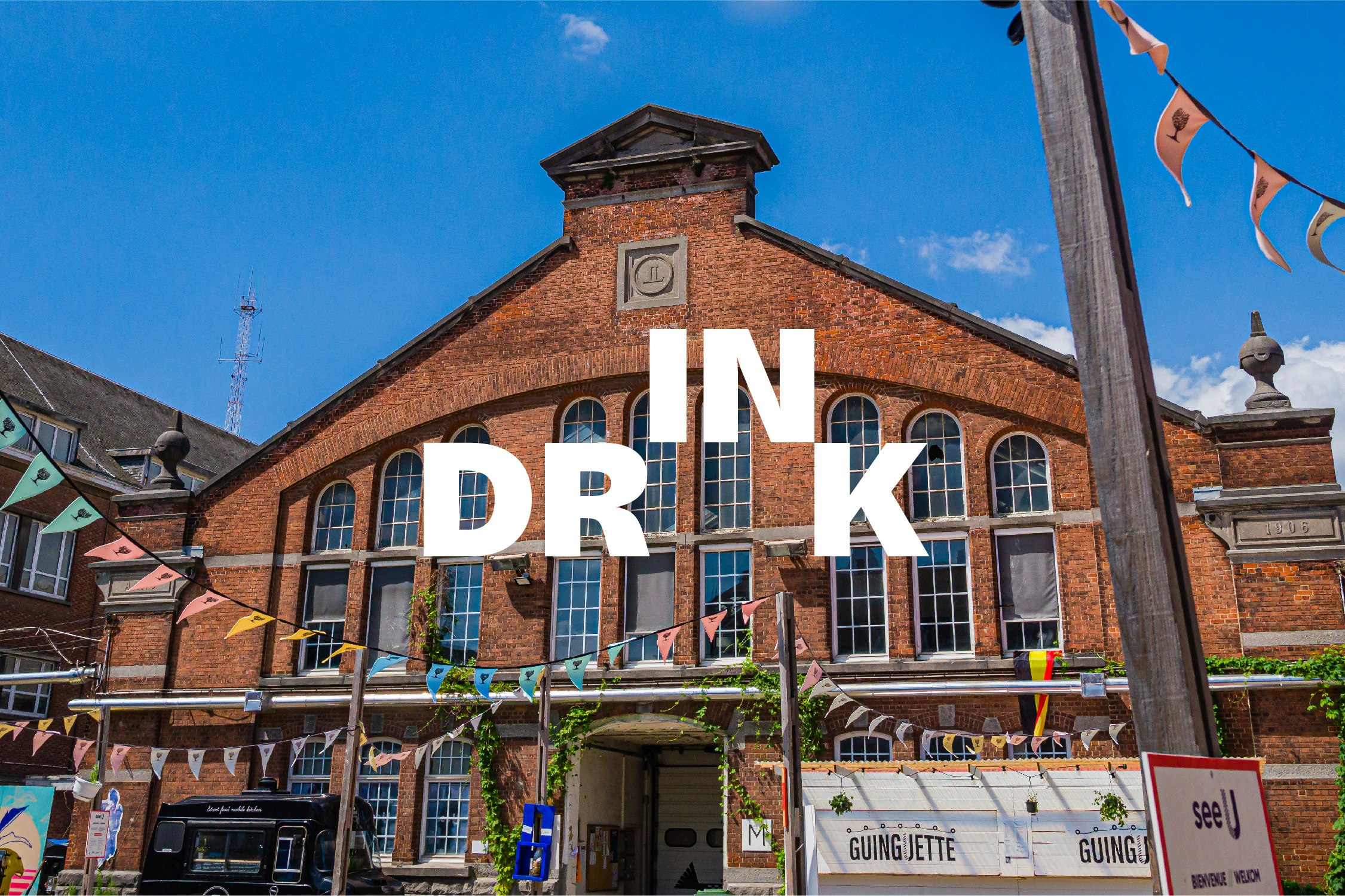
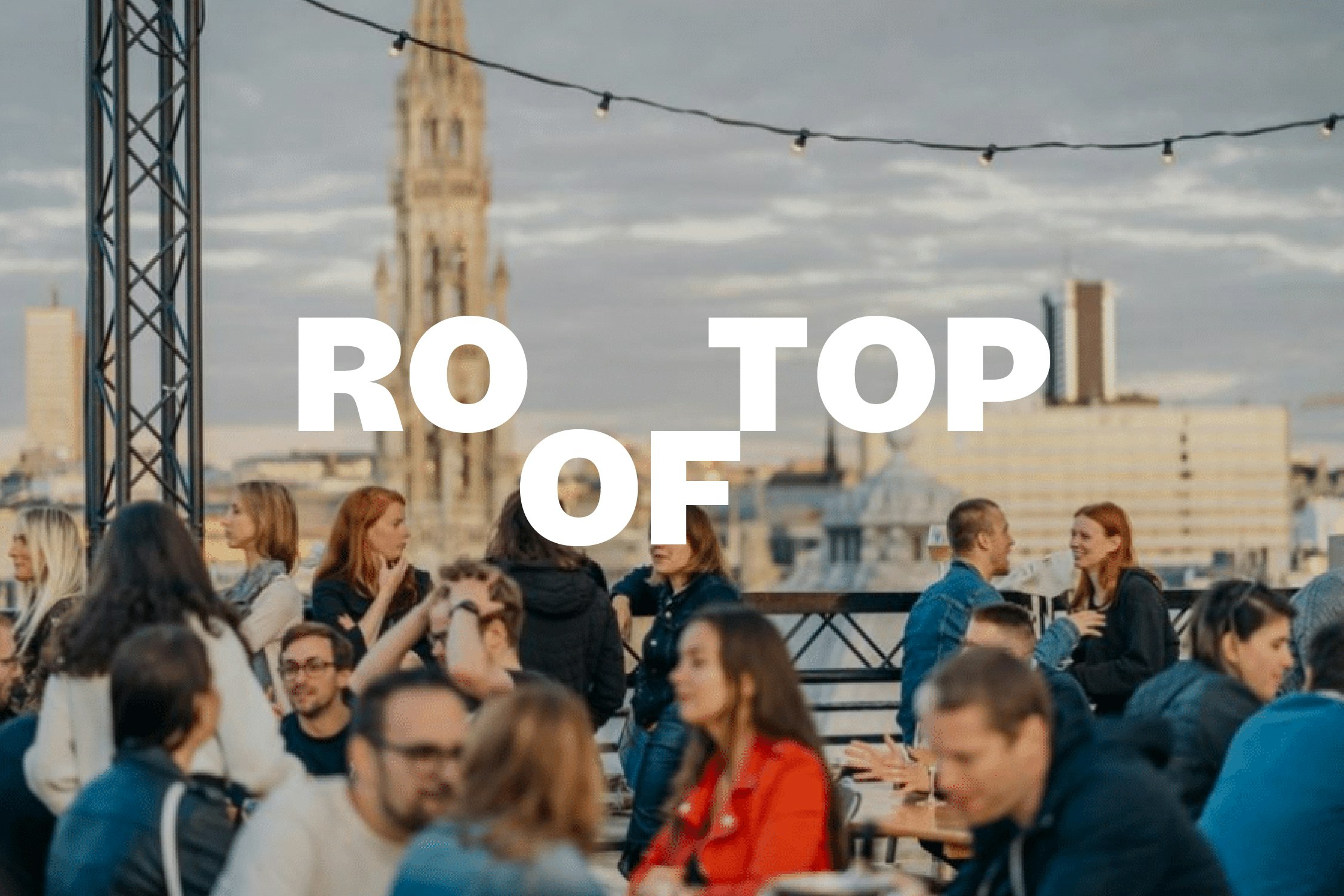
To fully share its passion for Brussels, visit.brussels needed to reflect the identity and values of the European capital. Although it is clearly impossible to sum up the city in just a few concepts, we were able to capture some of its essence in four main themes.
How to best promote Brussels as a destination?
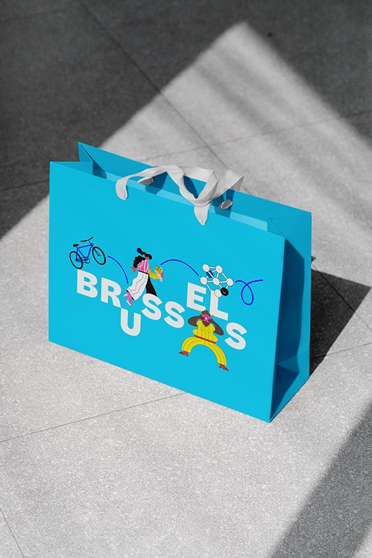
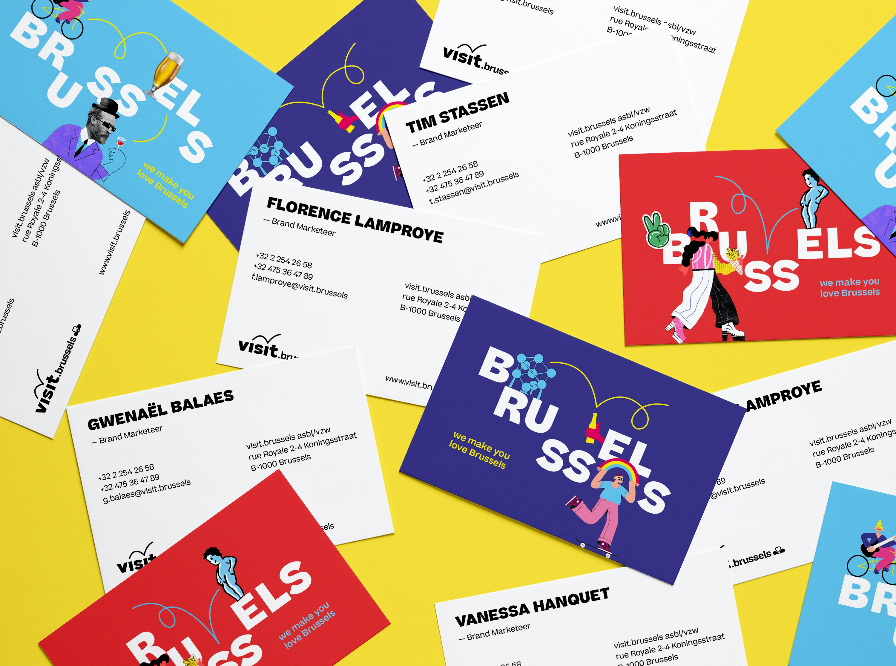
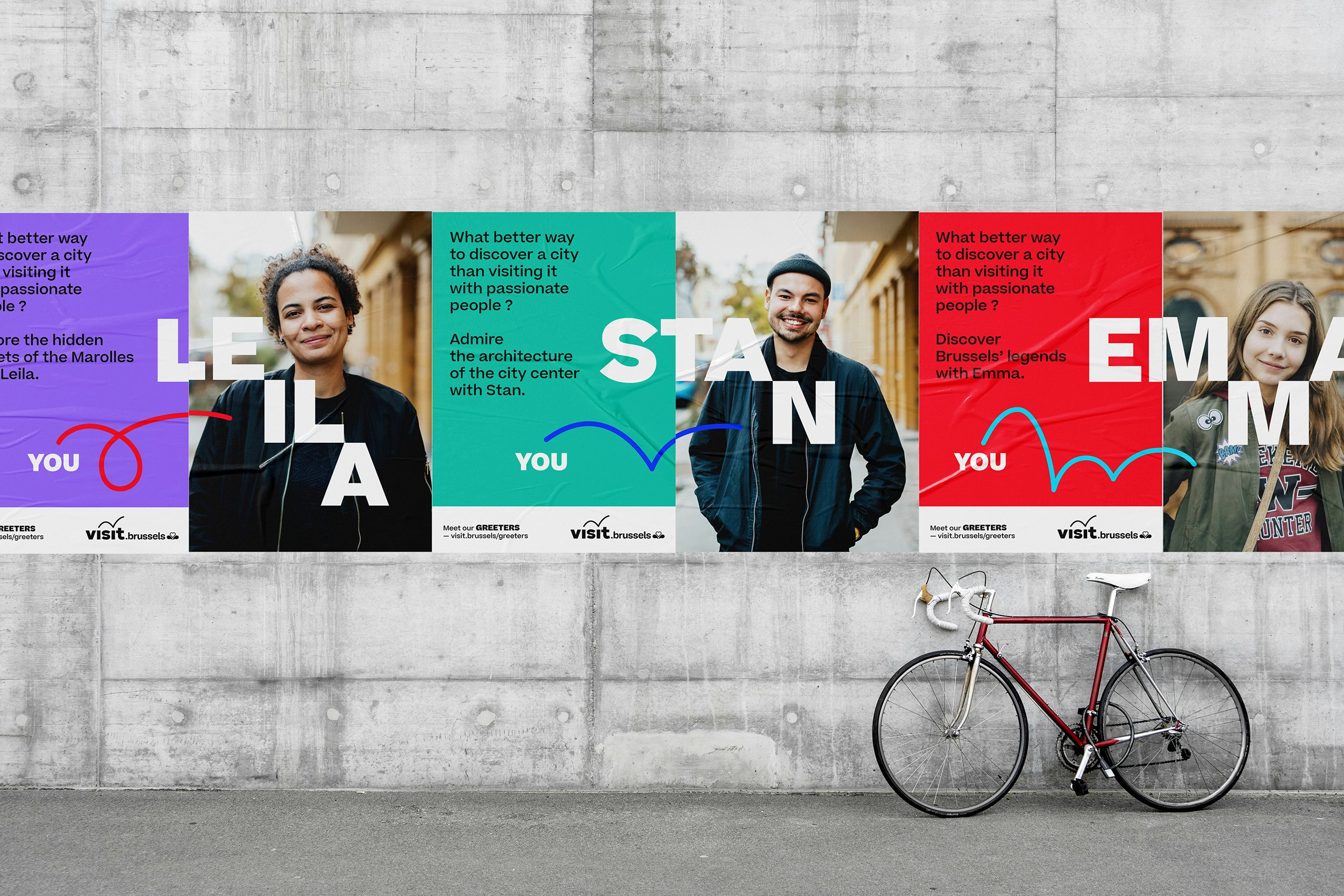
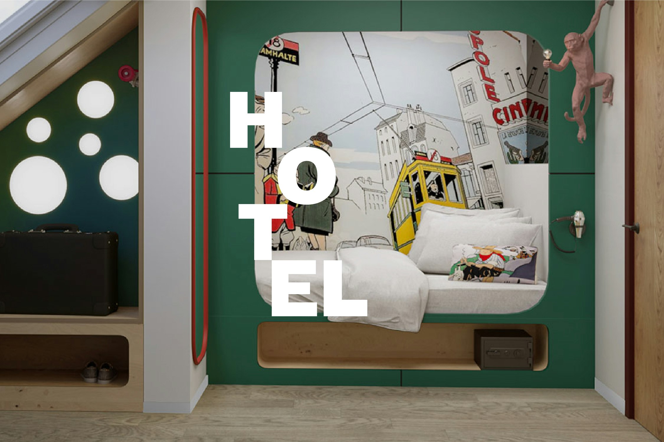
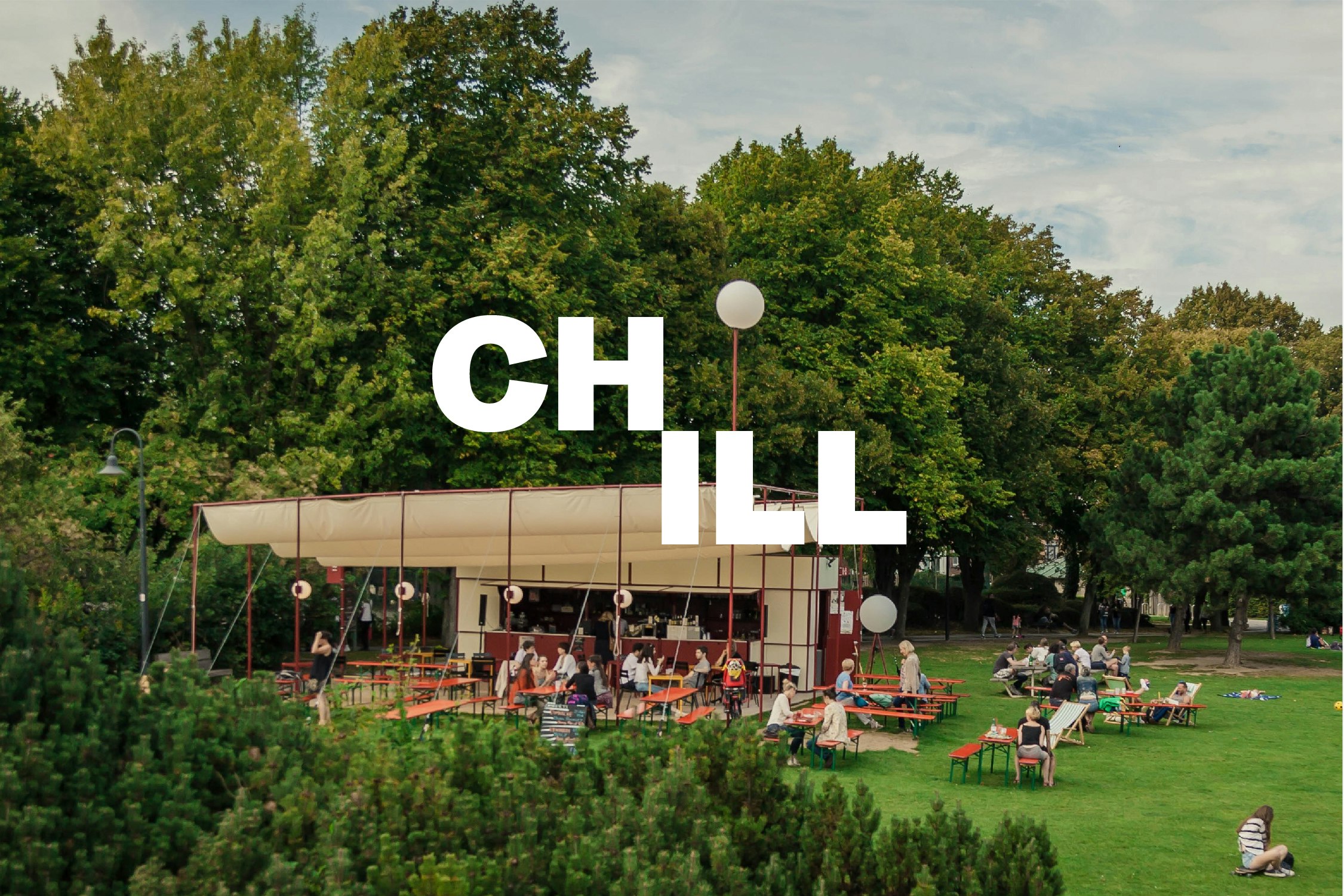
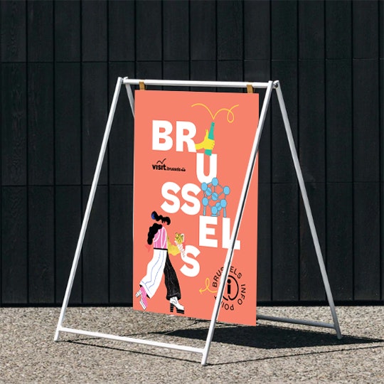
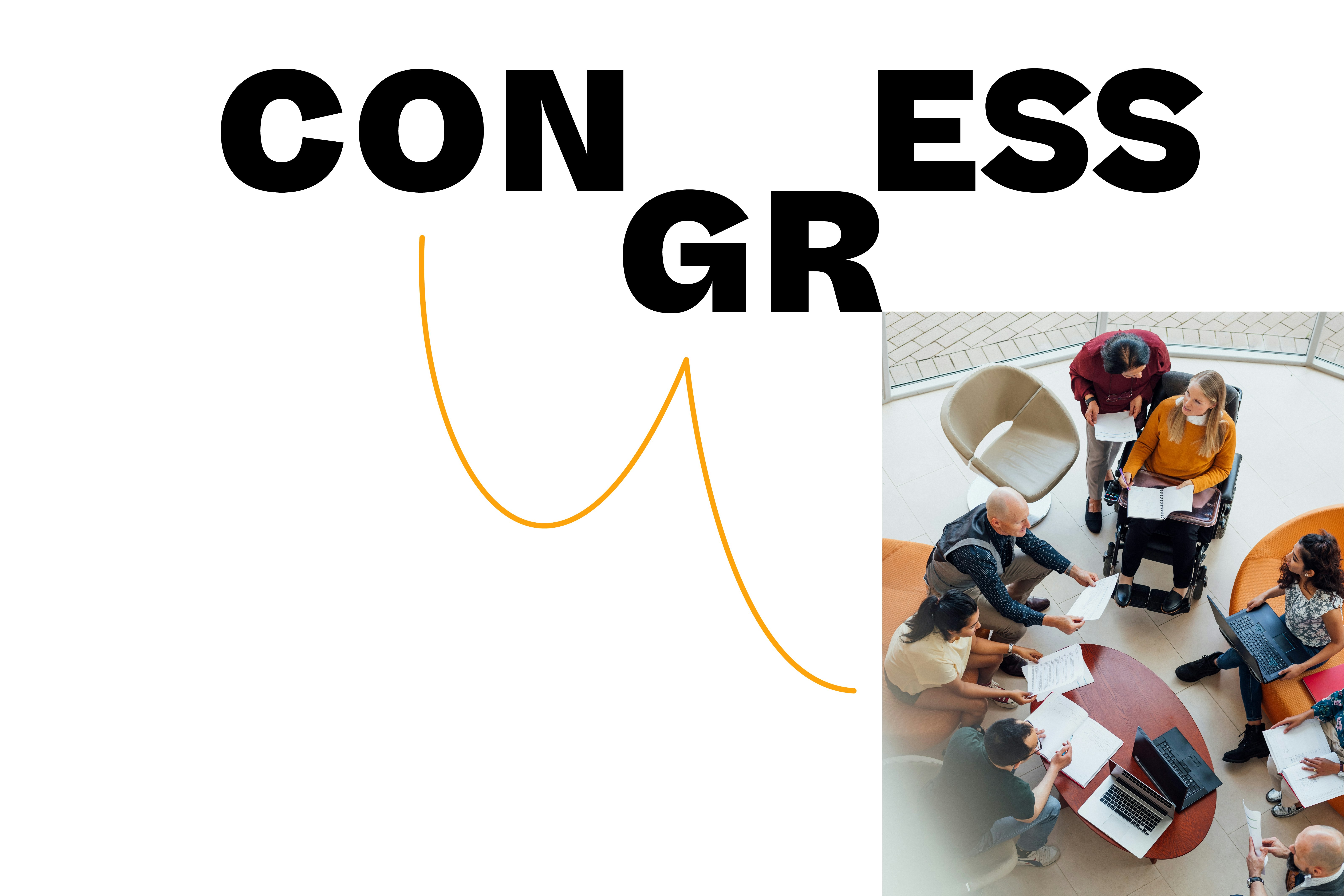
By adopting an identity that highlights a range of themes and ideas, focused on a single brand. A single brand that fully embodies brussels and its DNA through lively, dynamic and changing graphical codes.
A clearer and simpler brand architecture
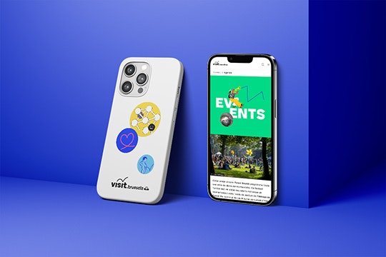
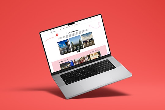
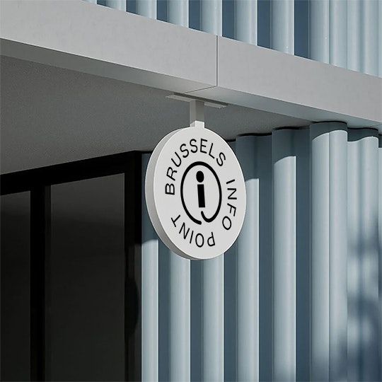
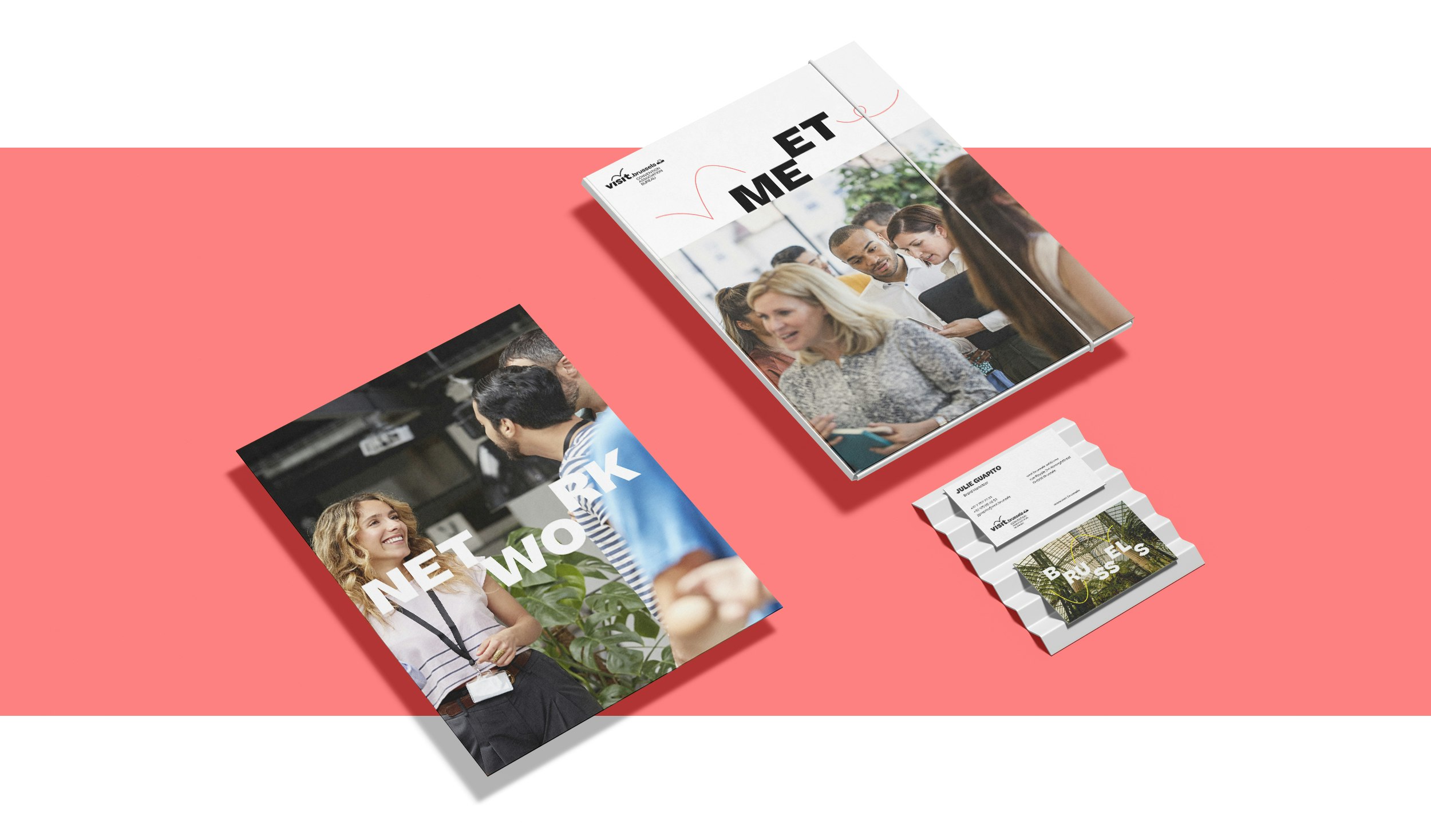
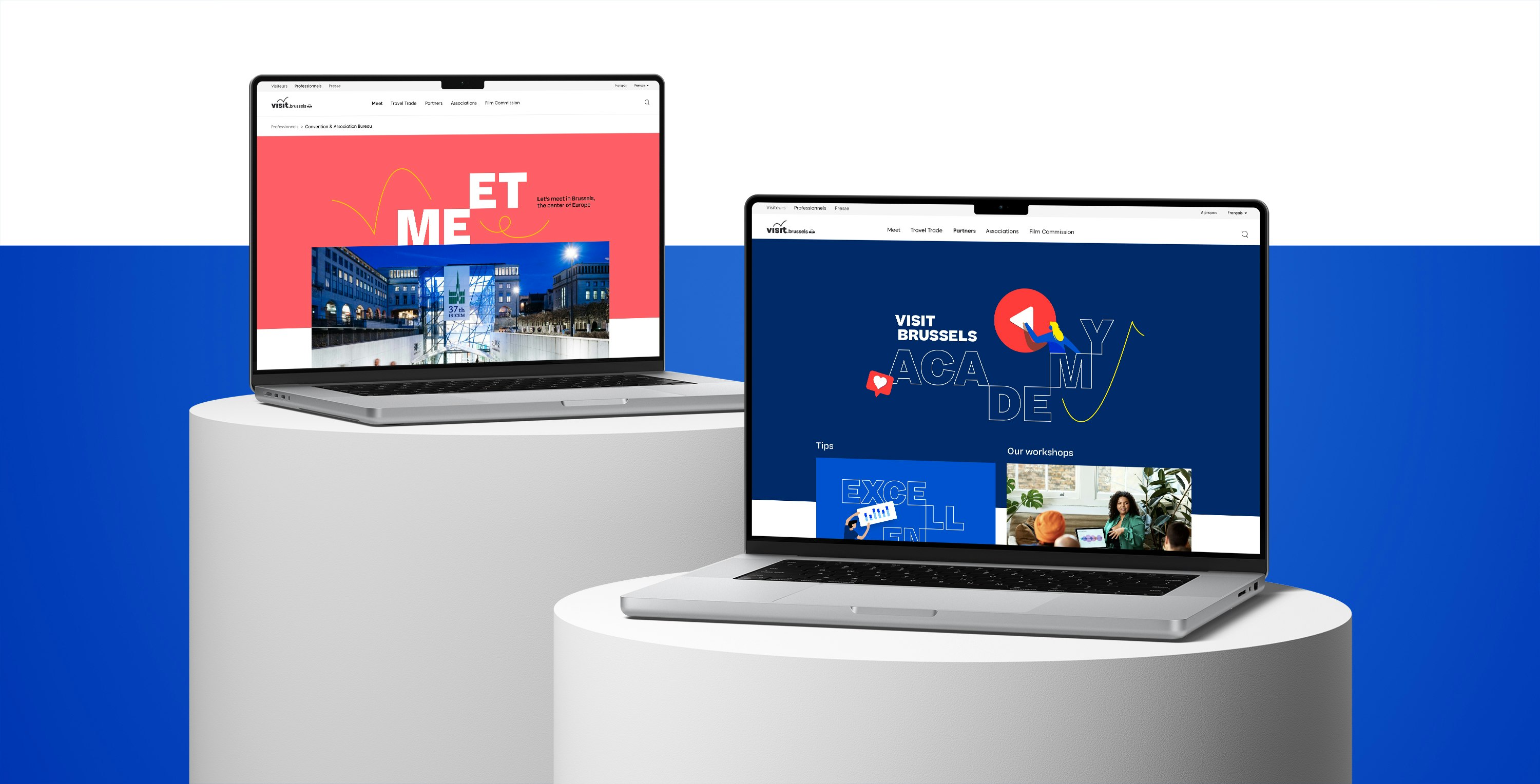
A new brand architecture, built around a single strong brand: visit.brussels. This allowed us to move from an inconsistent and complicated system to a clearer, more consistent and coherent approach, with an extremely dynamic and lively feel.



Digital by Emakina
Pictures by Visit.brussels
