QU4TRE
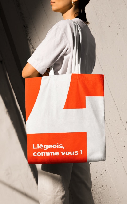
From Liège... Like you!
In Belgium's rapidly evolving media landscape, RTC Télé Liège is transforming into Qu4tre. This rebrand marks a shift from a traditional local TV station to a multi-channel platform, embracing the digital challenges of our time while staying true to its roots. Far from losing its character, Qu4tre will proudly showcase its Liège heritage with a fresh, modern, and dynamic approach, reaching out to new audiences and striving for new heights.
Industries
- Media.
Skills
- Strategy,
- Naming,
- Brand Design,
- Brand Architecture,
- Brand Management.


Challenge
Make Qu4tre a leading local media BRAND, by doing the following: Translating a company vision that encompasses both TV and new digital media, Energising the brand and creating a vibrant, distinctive style, Building a community around its new media, bringing people together and fostering a shared sense of pride.
Solution
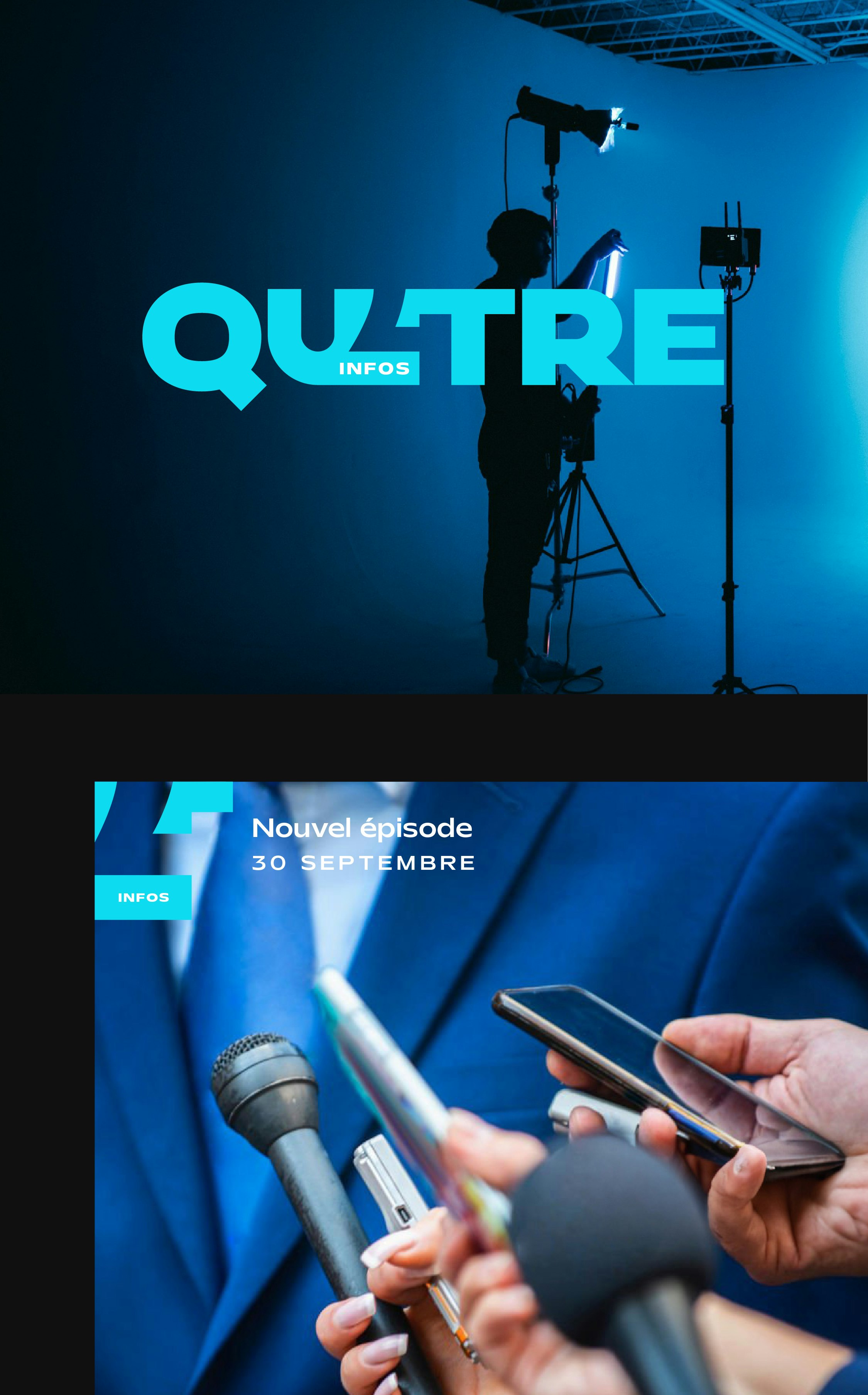
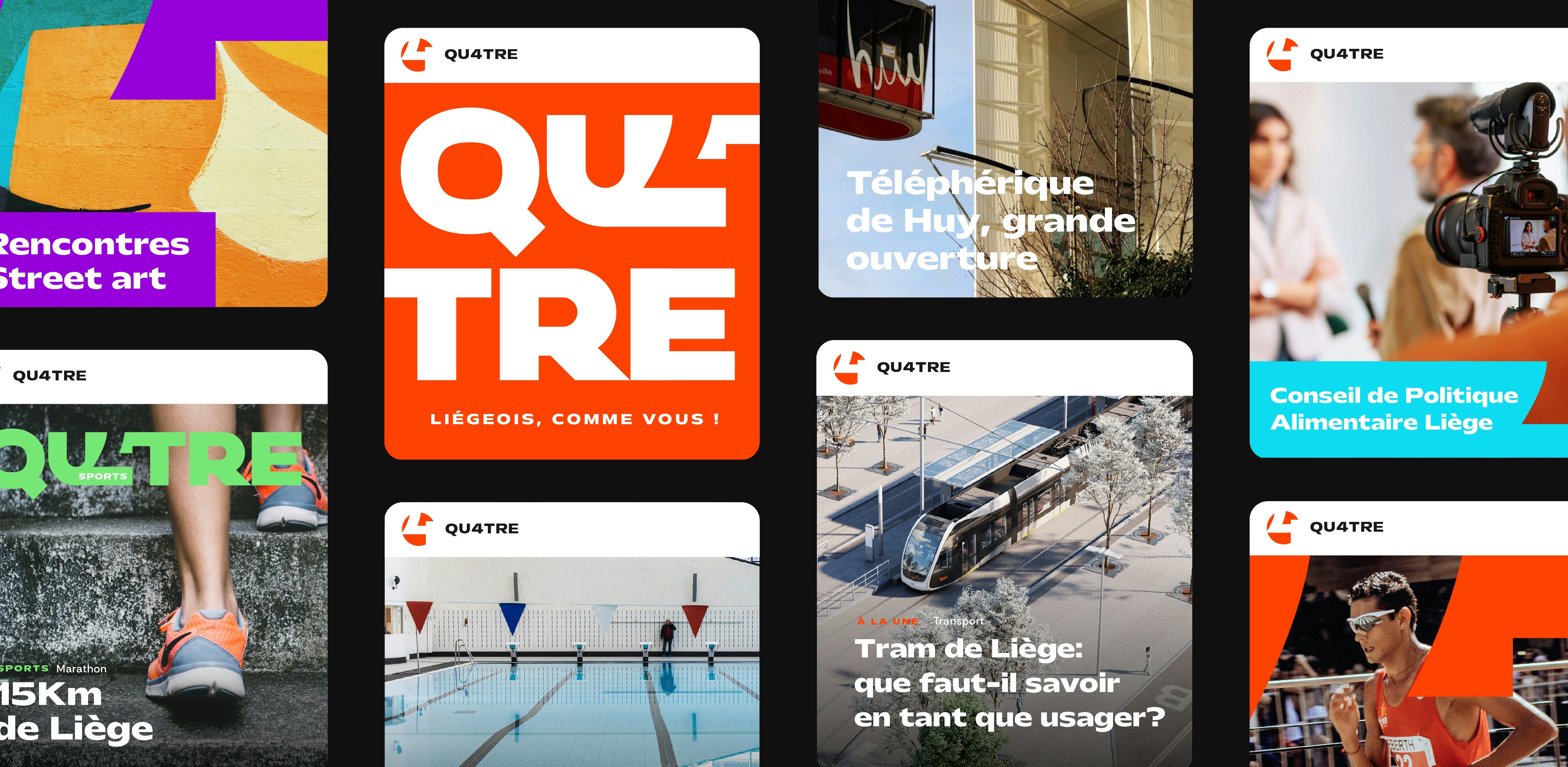
The brand platform has sparked the creation of a fresh new identity. Inspired by local references whether tangible, like postcodes, or everyday lingo, Qu4tre stands out as a modern, digital and locally connected brand. It has adopted a distinctive style that balances volume and transparency, creating a brand architecture that successfully showcases its range of programmes and content.


A brand with more than meets the eye!
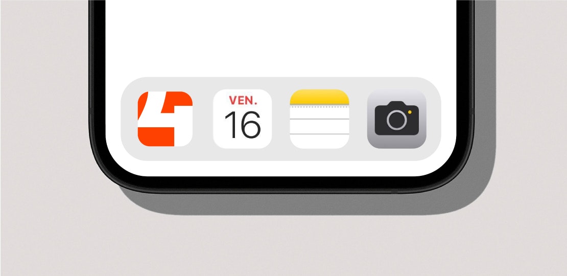
Instead of using numbers, as is typical in the media, this brand presents itself in letters, featuring a modern, rounded typography for a more tactile effect. The ‘4’ subtly appears in a transparent design, highlighting the seamless connection between the audience and the media. This ‘graphic accident’ embodies the brand’s character and personality. Qu4tre also perfectly conveys the brand’s local roots. The name is inspired by the postcodes in the region (ranging from 4000 to 4920) and responds to the way in which younger generations now identify with their local area.


Structured sophistication
The use of orange, inspired by the official colours of the Province of Liège (red and yellow), brings a vibrant, optimistic, and joyful feel. These complementary colours, combined with the transparent design approach, structure the various programmes in a streamlined brand architecture, resulting in a lively, dynamic style that effectively showcases both images and content.