Eloy
Only Eloy.
In recent years, Eloy has successfully expanded into different but complementary sectors. Eloy is re-inventing itself, in a field where we might not expect it! By taking a fresh look at its branding, the company, which is active in the fields of water treatment and construction, is redefining its foundations in order to boost its growth. A milestone in its history.
Industries
- Industry.
Skills
- Strategy,
- Brand Design.
Challenge
Eloy has always had its particularities, and therein lies its strength. It was essential to understand these, to structure them, to be able to share them with the outside world. Everything that happens inside, its personality, is a way to make it stand out. Aside from its expertise, the main thing we wanted to focus on was its philosophy, its approach. Because although Eloy is changing, evolving, growing, their story now is the same as 50 years ago - one of men, women, and beliefs. Before it's a construction company, Eloy is, above all, a state of mind.
Solution
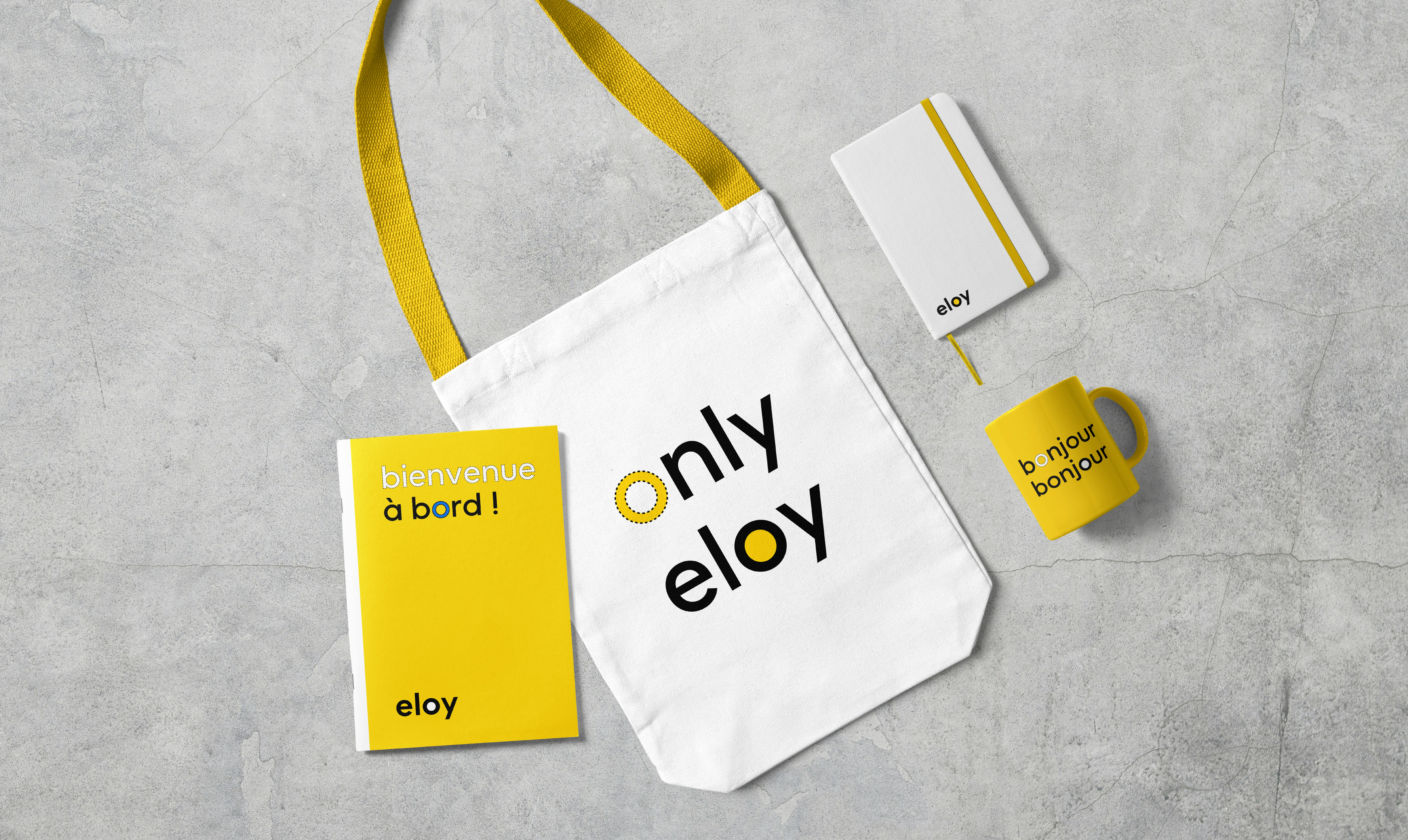
The Eloy logo as we know it is simple, contemporary and easy to recognise. We quickly decided to keep it as it was - as the saying goes, "if it ain't broke, don't fix it". The new, more streamlined, brand architecture puts Eloy back centre stage. It puts the spotlight back on the Eloy name, its main strength. All entities are now united under one umbrella. The new architecture gives the brand a clear visual identity, stronger and more unique; it makes it more recognisable, and never fails to get the message across.


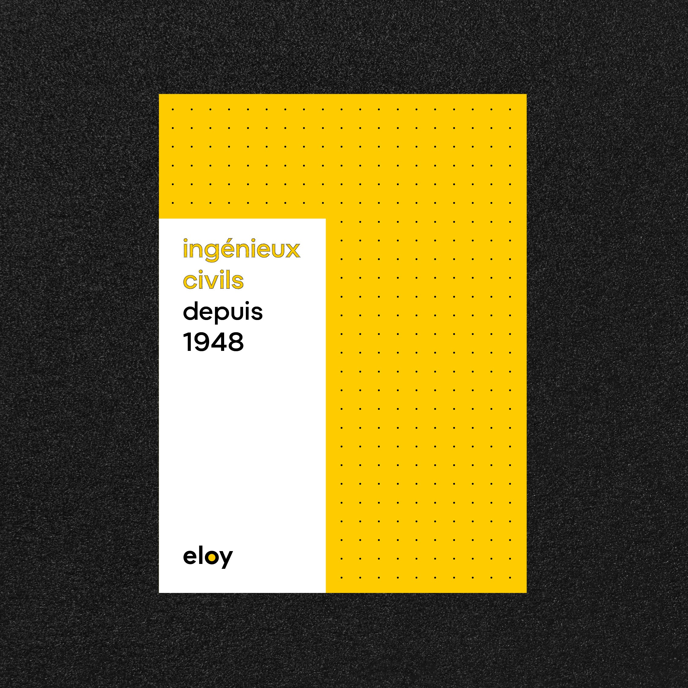
Ingénieux Civils - the perfect tagline
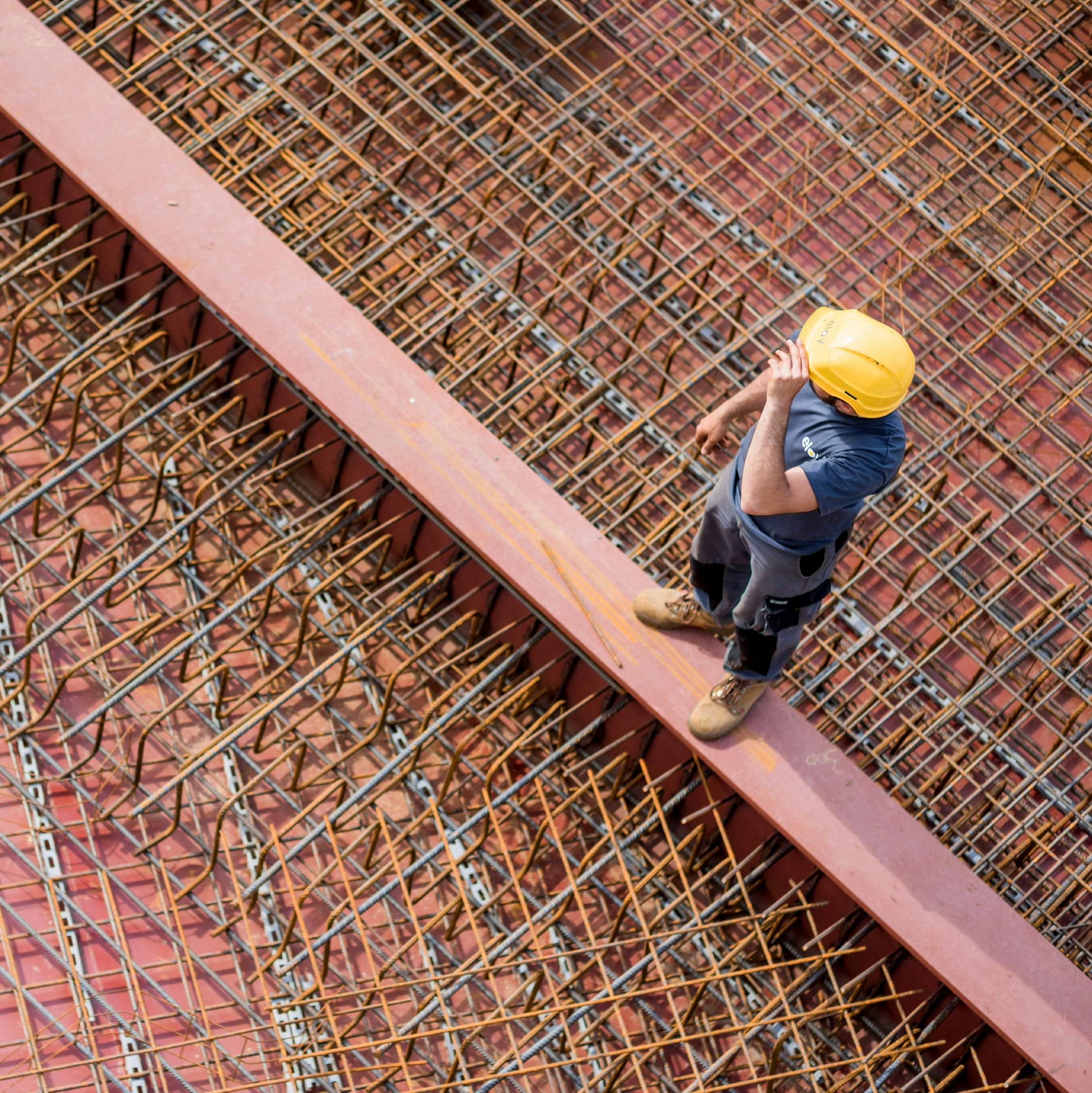
Eloy has always known how to seize opportunities, and embrace them with inventiveness and flair. Its teams now specialise in many fields, rigorous, demanding, reliable and, also… inquisitive. “Being Eloy” is all about being an "ingenious engineer", which translates into our concept of "Ingénieux Civils". Because yes, we can be both inventive and respectful, innovative and cautious, too. An ingénieux civil looks at the big picture, and sees the details. And an ingénieux civil doesn't take themselves too seriously... that's Eloy!
Beyond the logo
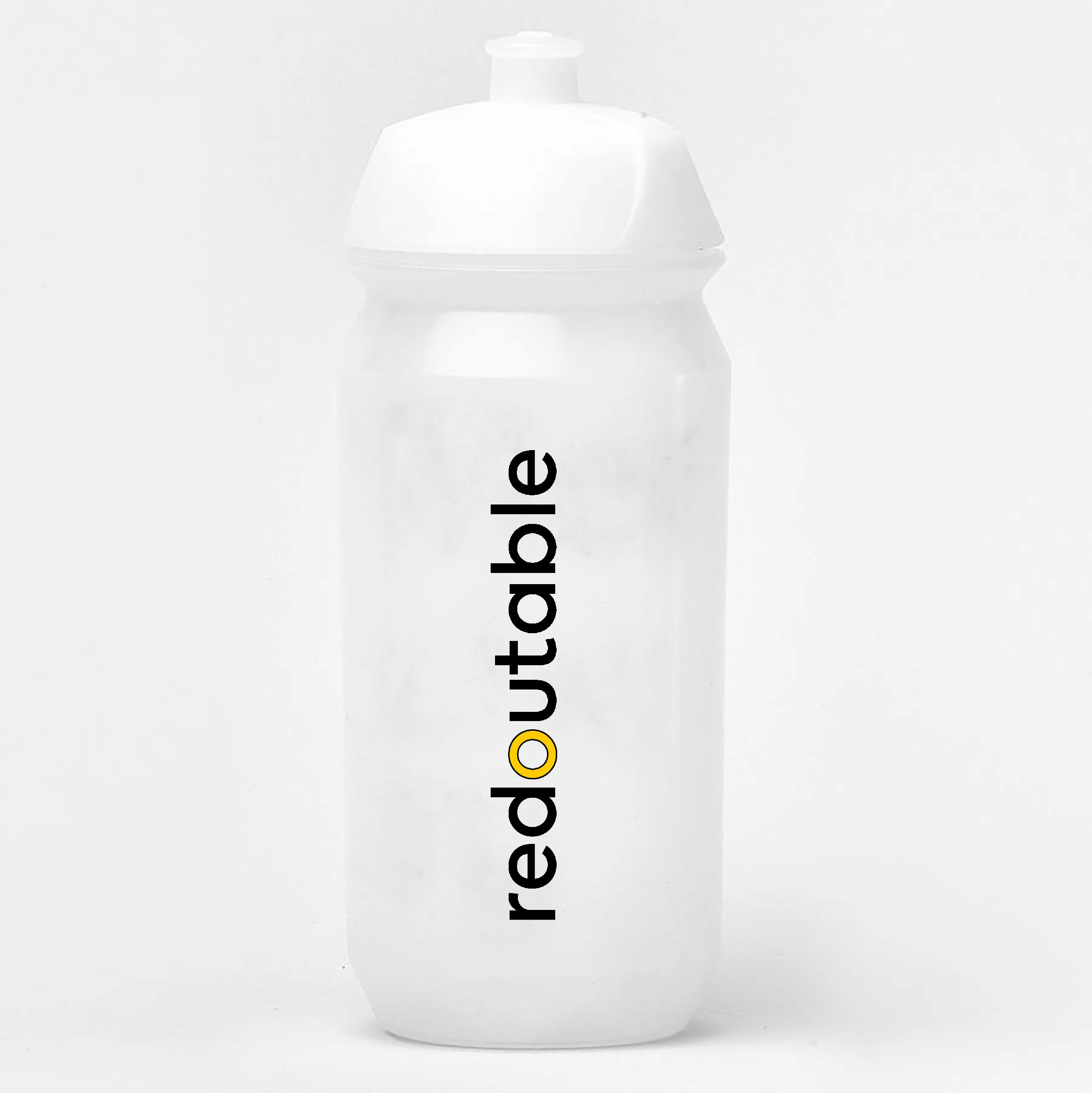
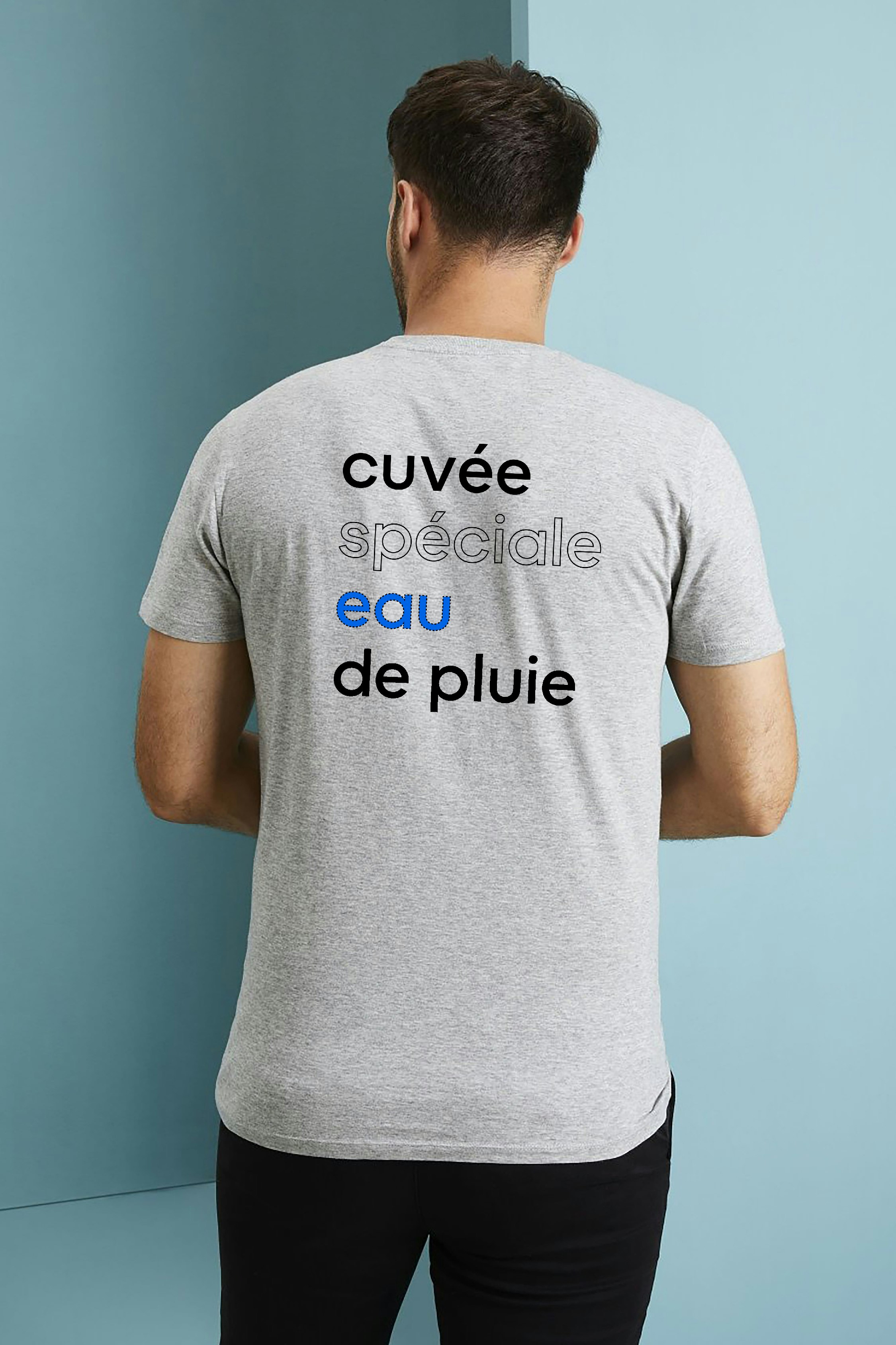
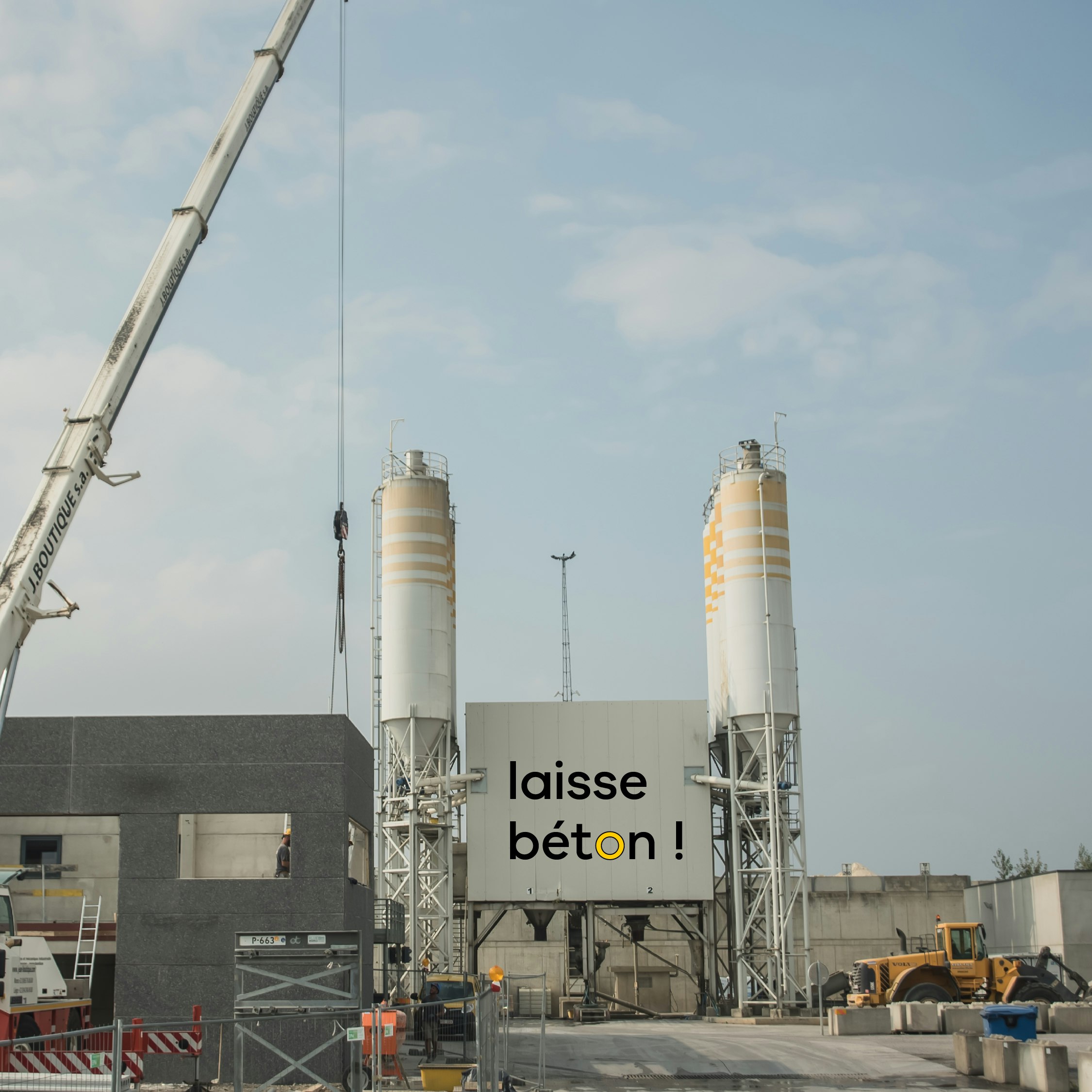
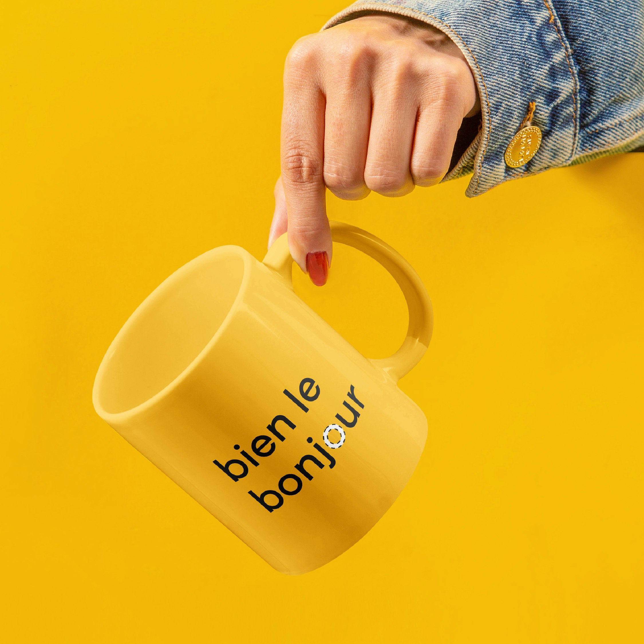
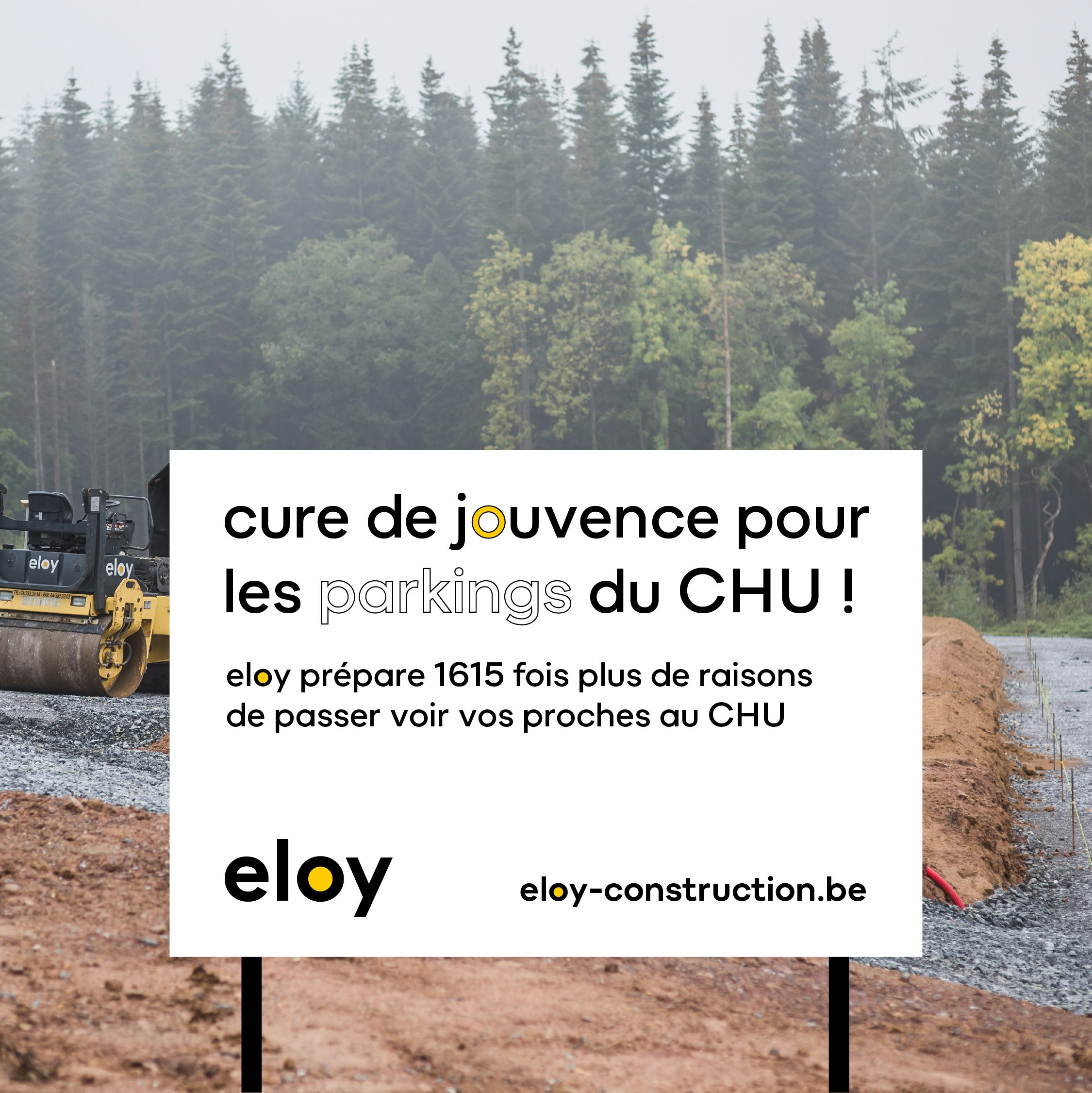
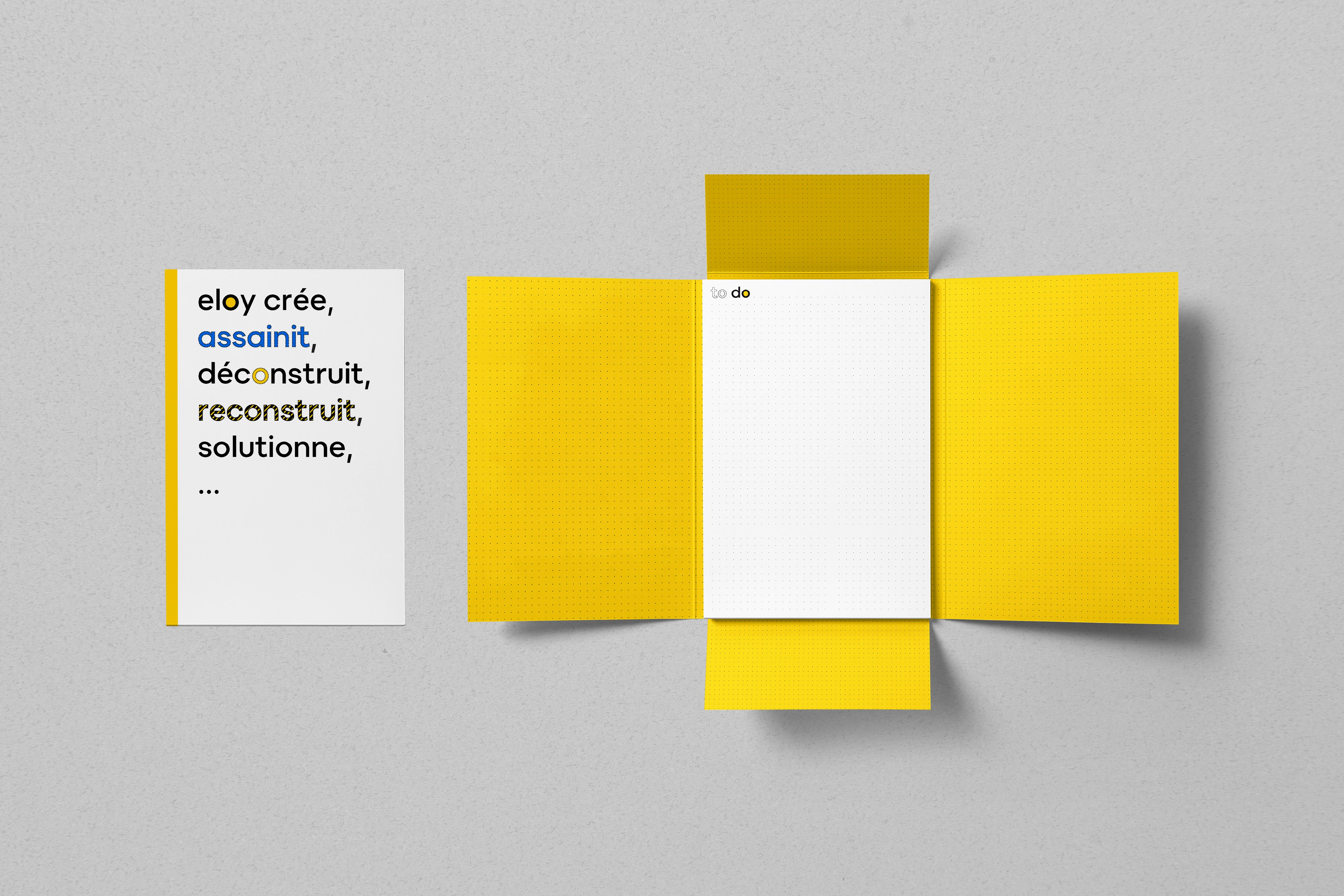
Through our work on strategic design, we concluded that the logo was fully in line with the message to be conveyed. It was important to capitalise on this, by refining its various applications through a simpler brand architecture, and by establishing just the right tone - light but sincere, professional with a touch of humour.
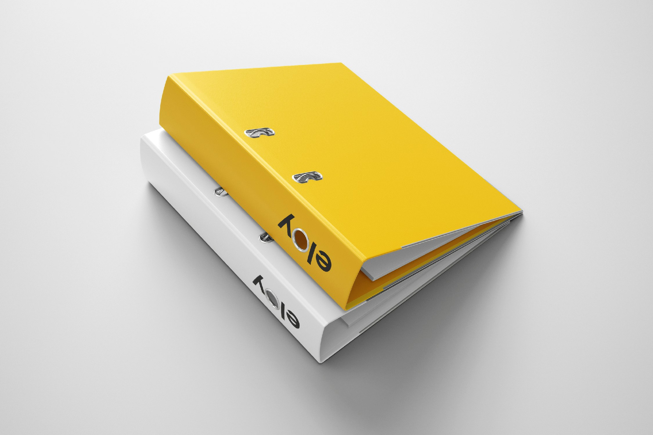
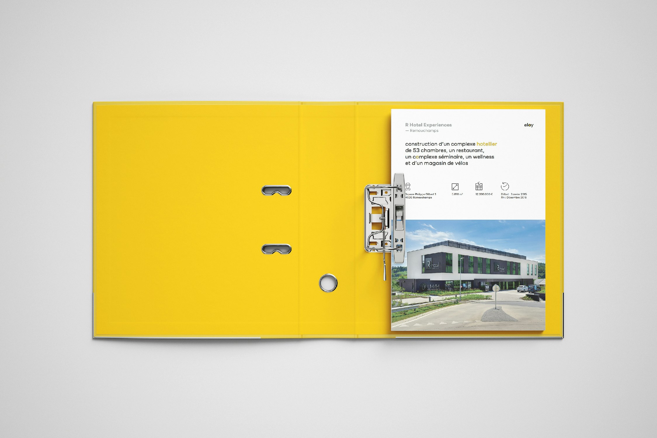
An all-encompassing approach
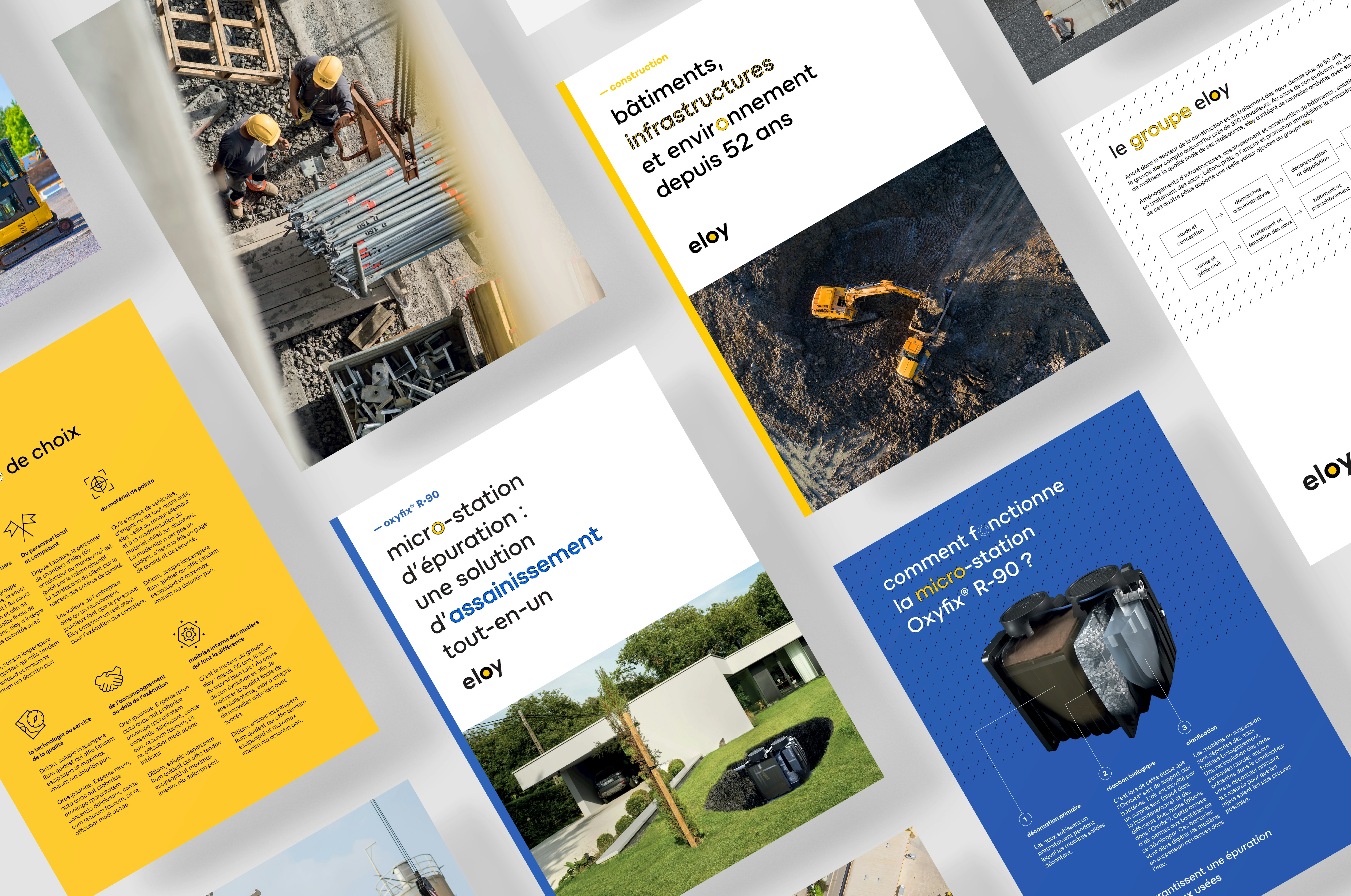
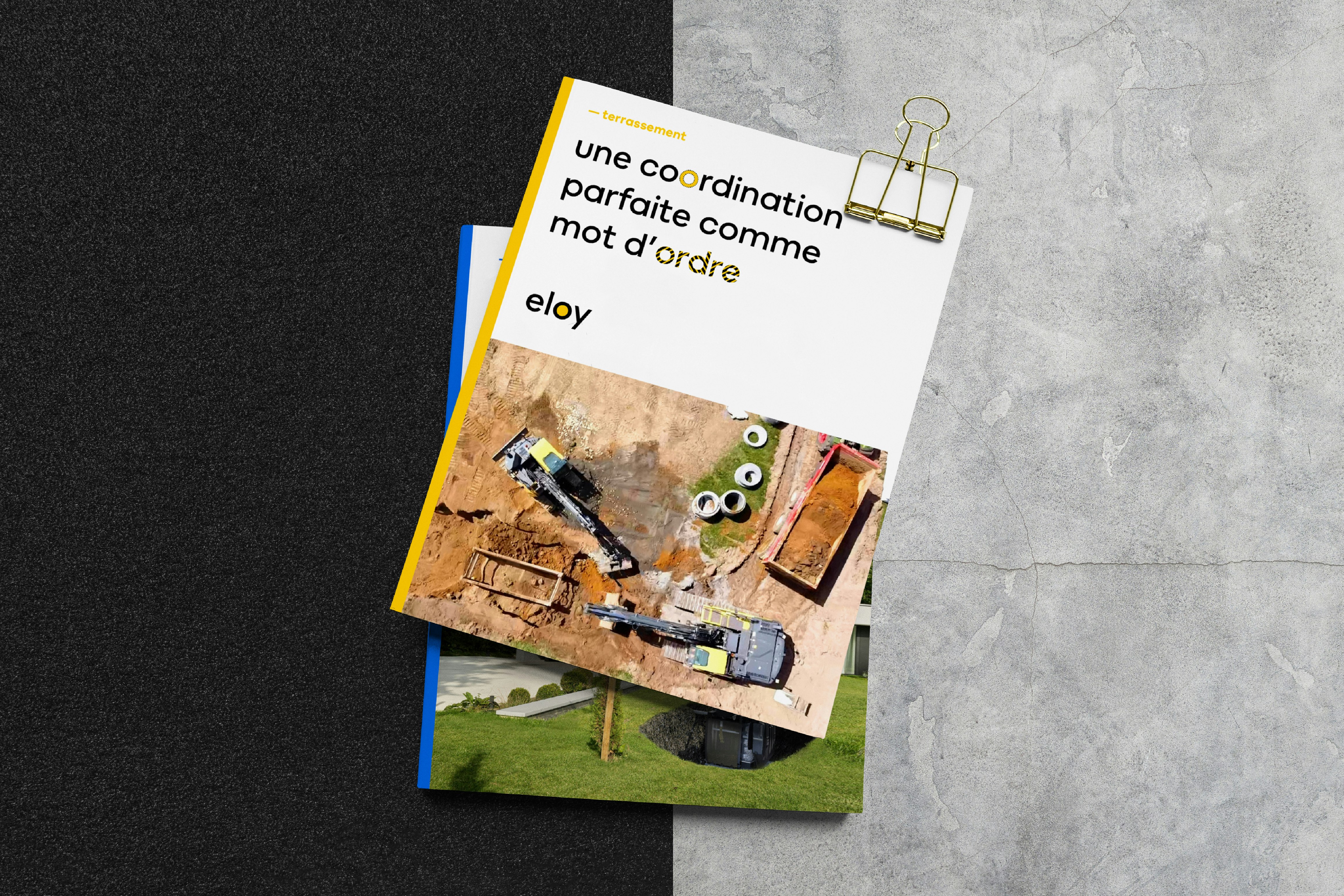
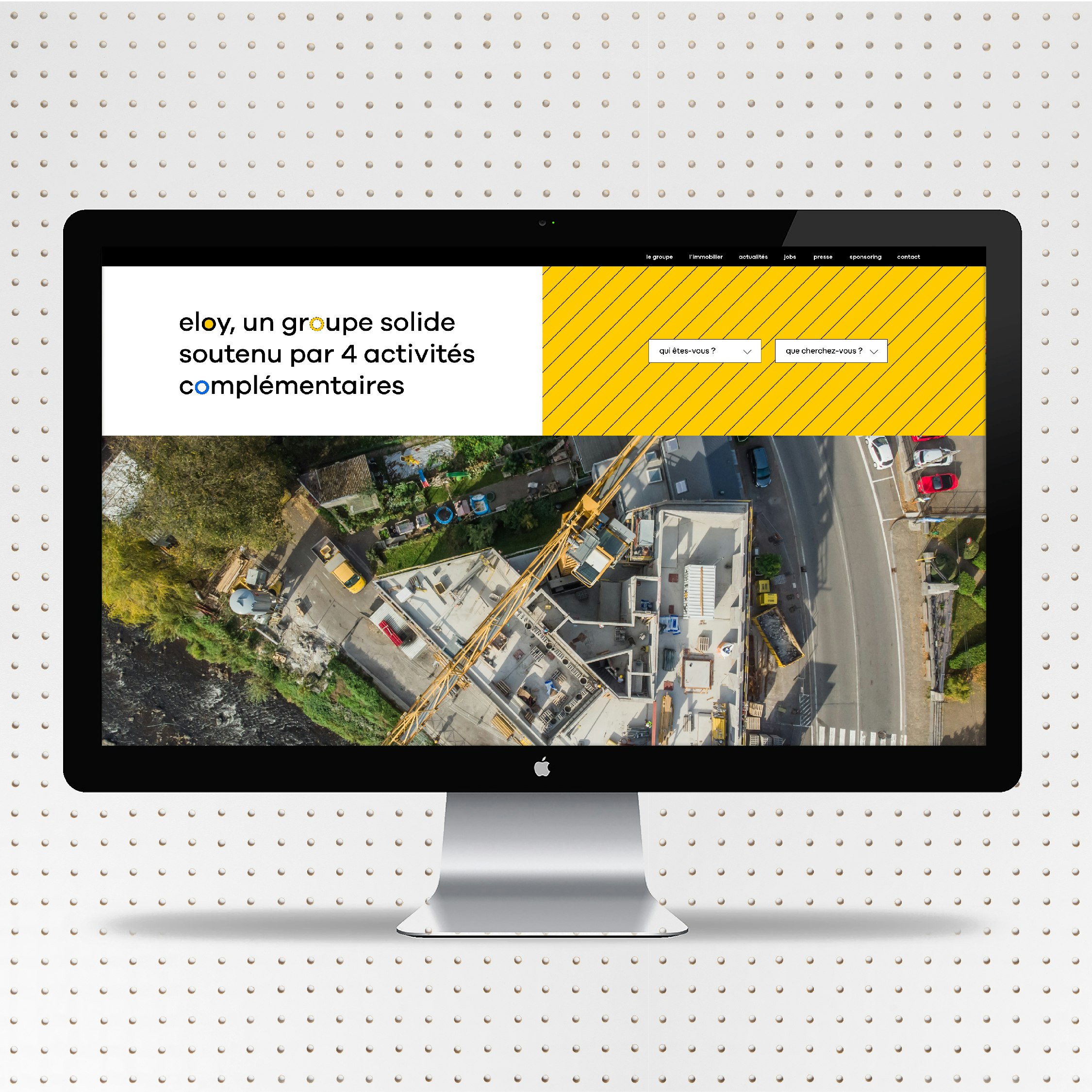
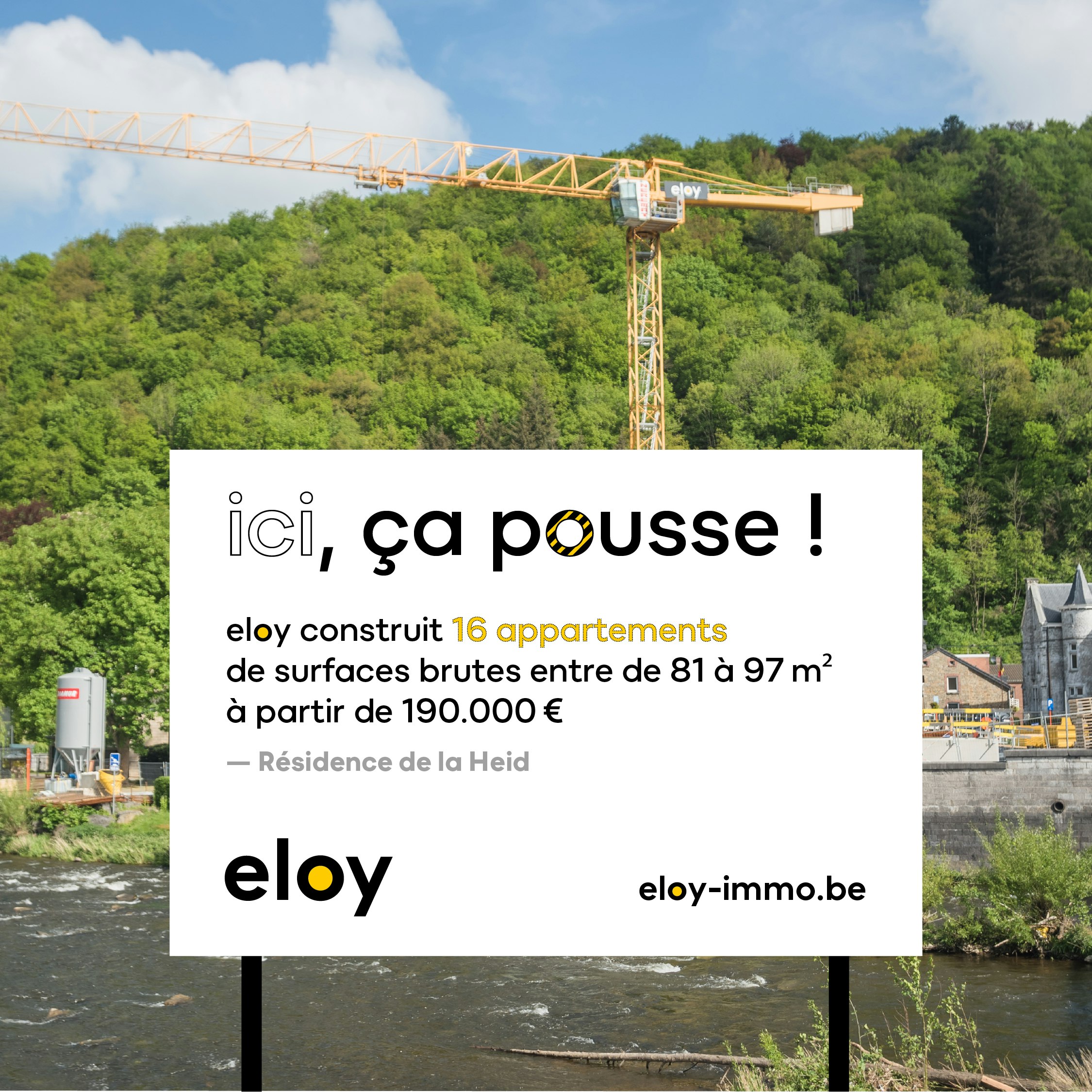
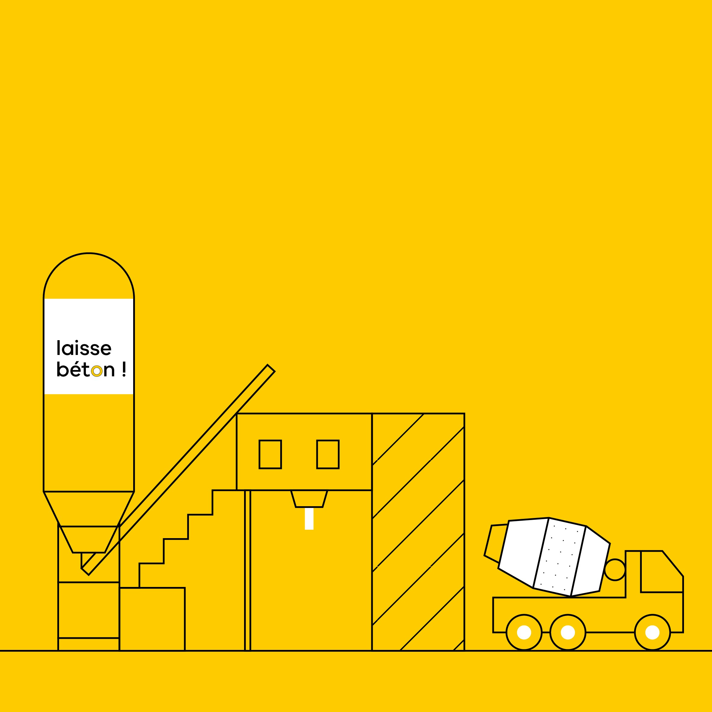
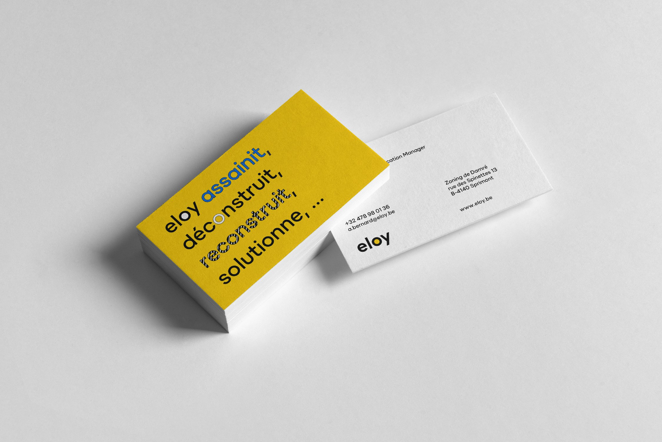
A strong brand is much more than an attractive logo. Around the logo, the entire communications strategy needs to contribute to building a brand that sparks interest and a desire to get involved. The message (both in content and in tone), the visuals, the typography, the illustrations, and the way colours are balanced and used, are the rational or emotional elements that bring that touch of something extra to convince potential customers to take the plunge.
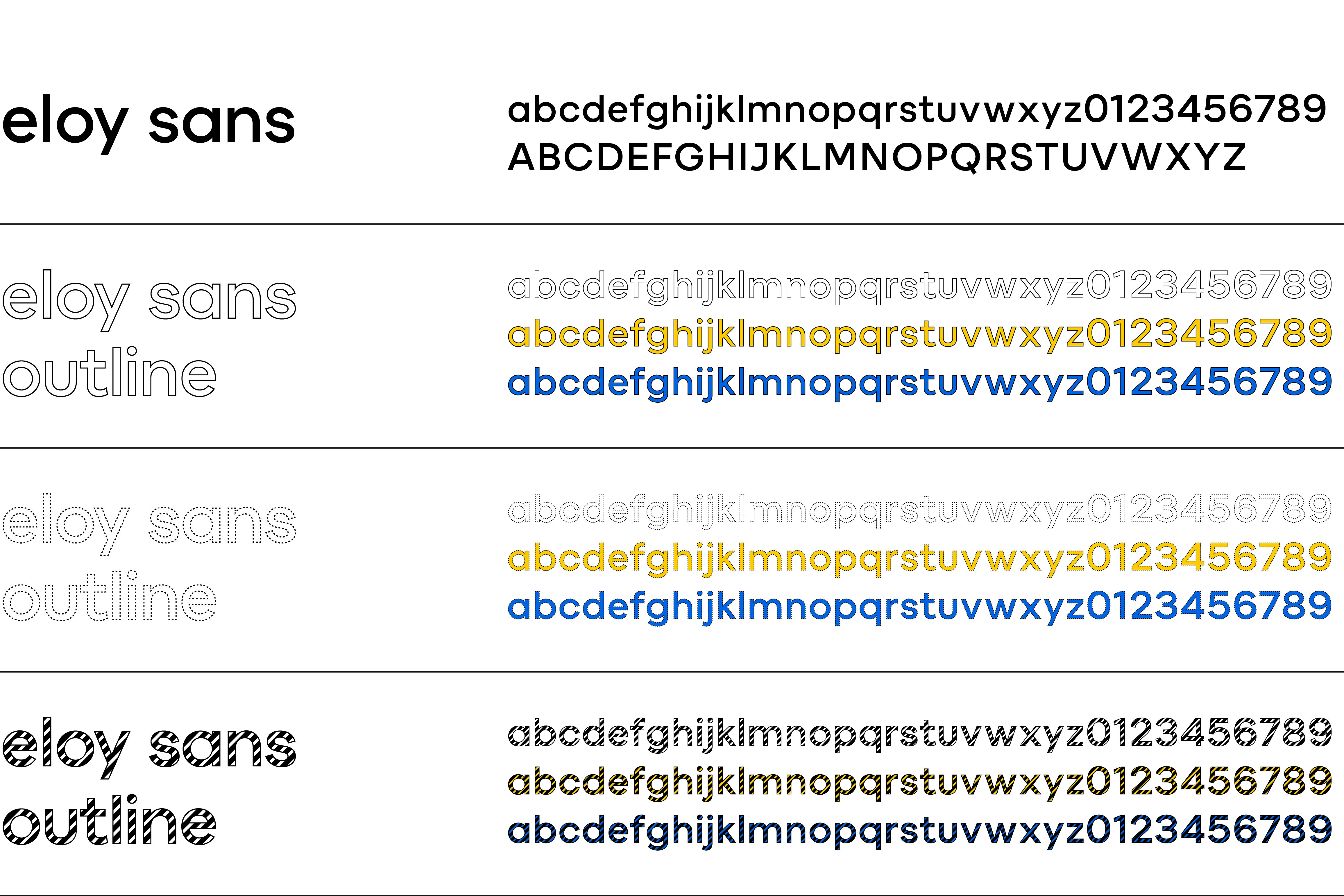
A unique and dynamic font
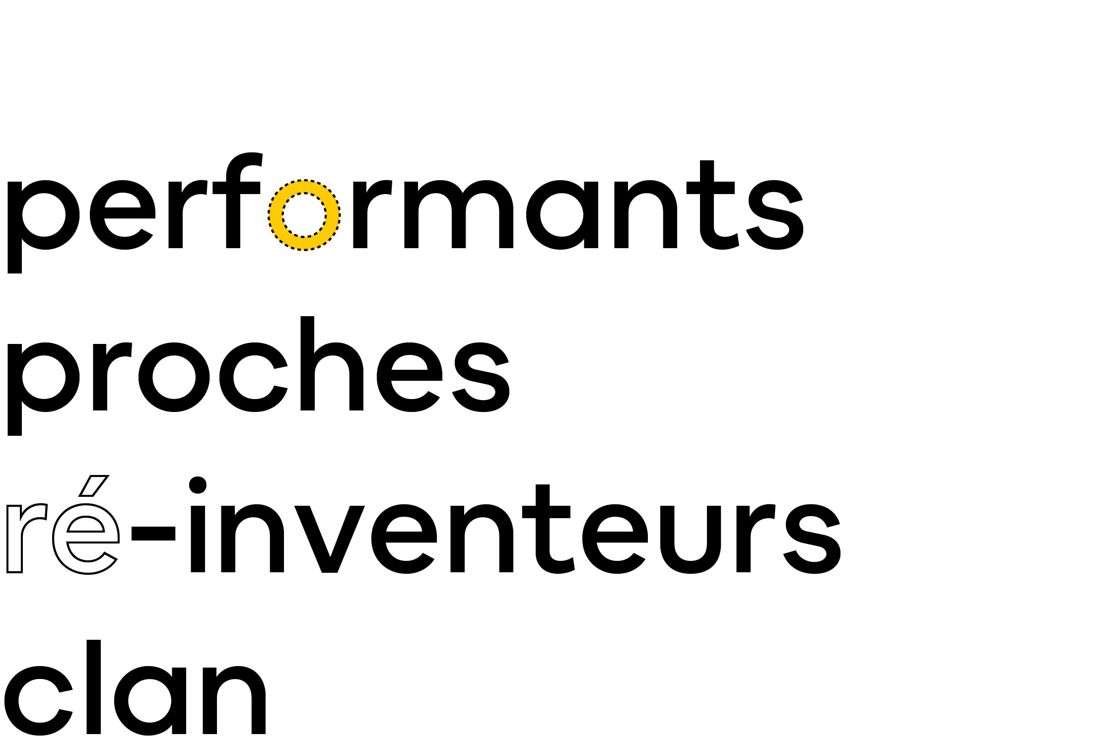
To establish the company's personality, the “Eloy sans” typography has been specially created. Inspired by the logo, of course the typeface is unique and "only Eloy"! Modern, rounded, lively and accessible, it reflects the company's positioning.
