Créteil Soleil
One step ahead!
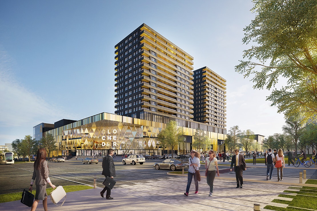
An iconic shopping centre with over 20 million visitors each year, Créteil Soleil never fails to maintain its appeal! The revamped customer journey with thoughtful features at every customer contact point, and the new food court with its strong identity, both serve as a catalyst for the many visitors. It’s a sure-fire success for this Klépierre-owned centre, bringing life to the south-east of Paris since 1974.
Industries
- Shopping Centres,
- General Retail.
Skills
- Strategy,
- Brand Design,
- Retail Design.
The Challenge
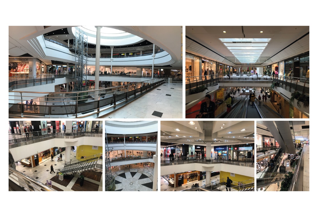
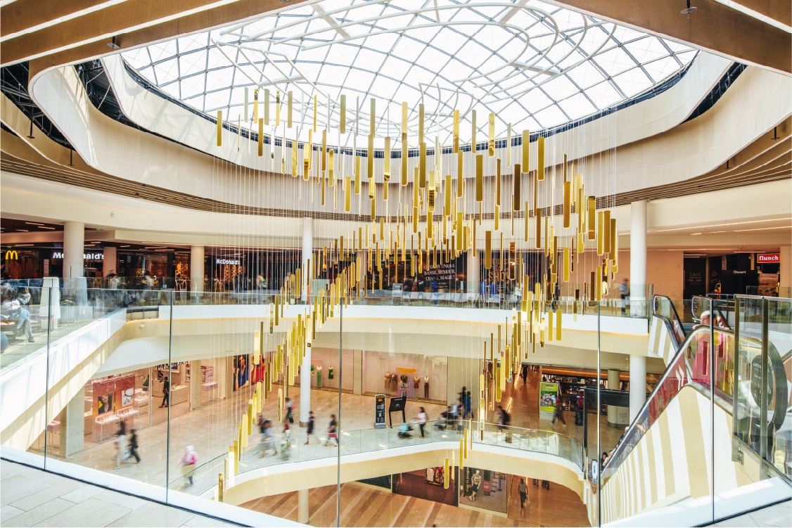
Our mission was to link an existing mall, with its 220 stores, to an extension spanning over 12,000 sqm, while creating a real sense of continuity.
We needed to ensure the success of the new first-floor food court by attracting customer flow, and providing a standardised framework for this catering space, to ensure coherence and continuity as the tenants change.
All while adhering to the Klépierre "Club Store" concept as well as expressing the shopping centre's urban, energetic and vibrant feel.
Solutions
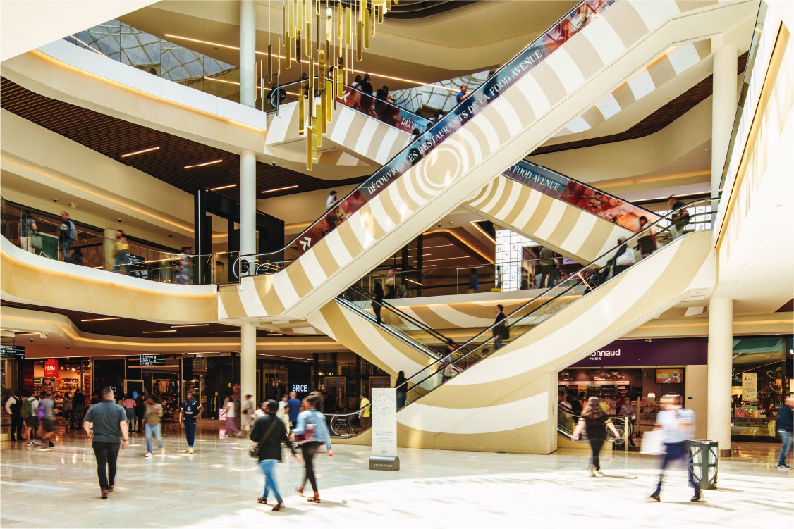
The extension and existing mall are connected and united through a dynamic link. On either side, open spaces with bold features act as visual call-outs.
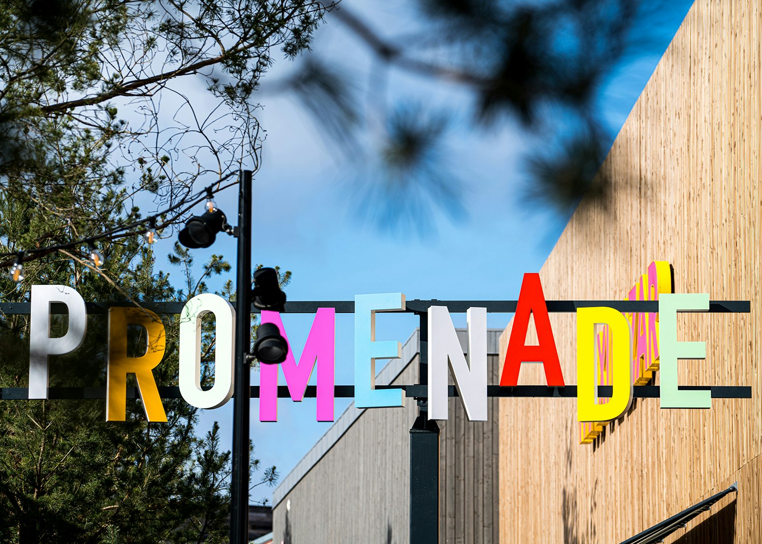
The "My Urban Energy" positioning is reflected in strong branding choices that mark out strategic points in the customer journey.
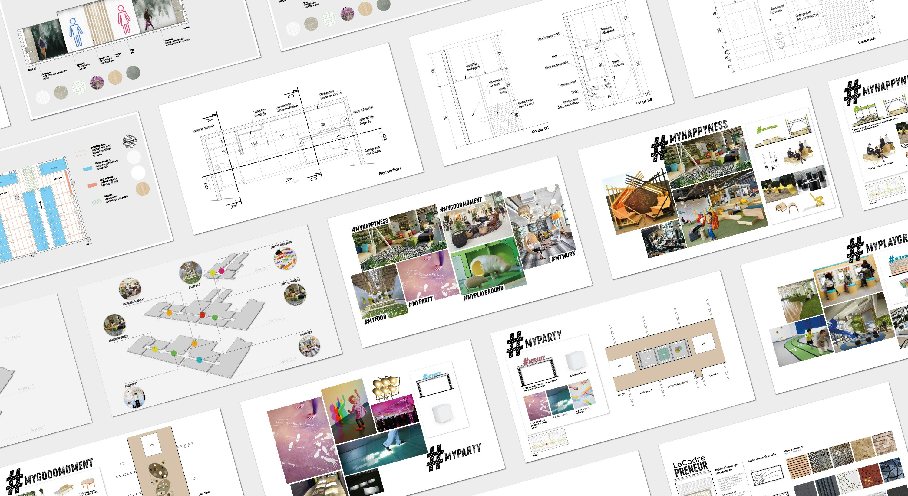
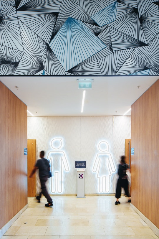
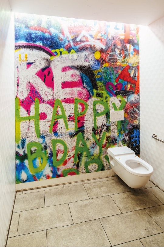
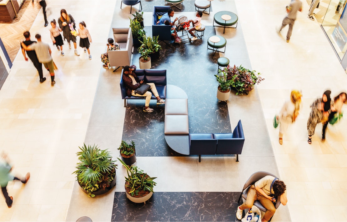
Particular attention has been paid to comfort, with relaxation areas, sanitary facilities, etc., that contribute to a positive experience while expressing the centre's energetic feel. These elements create harmony and consistency between the existing part of the mall and its extension.
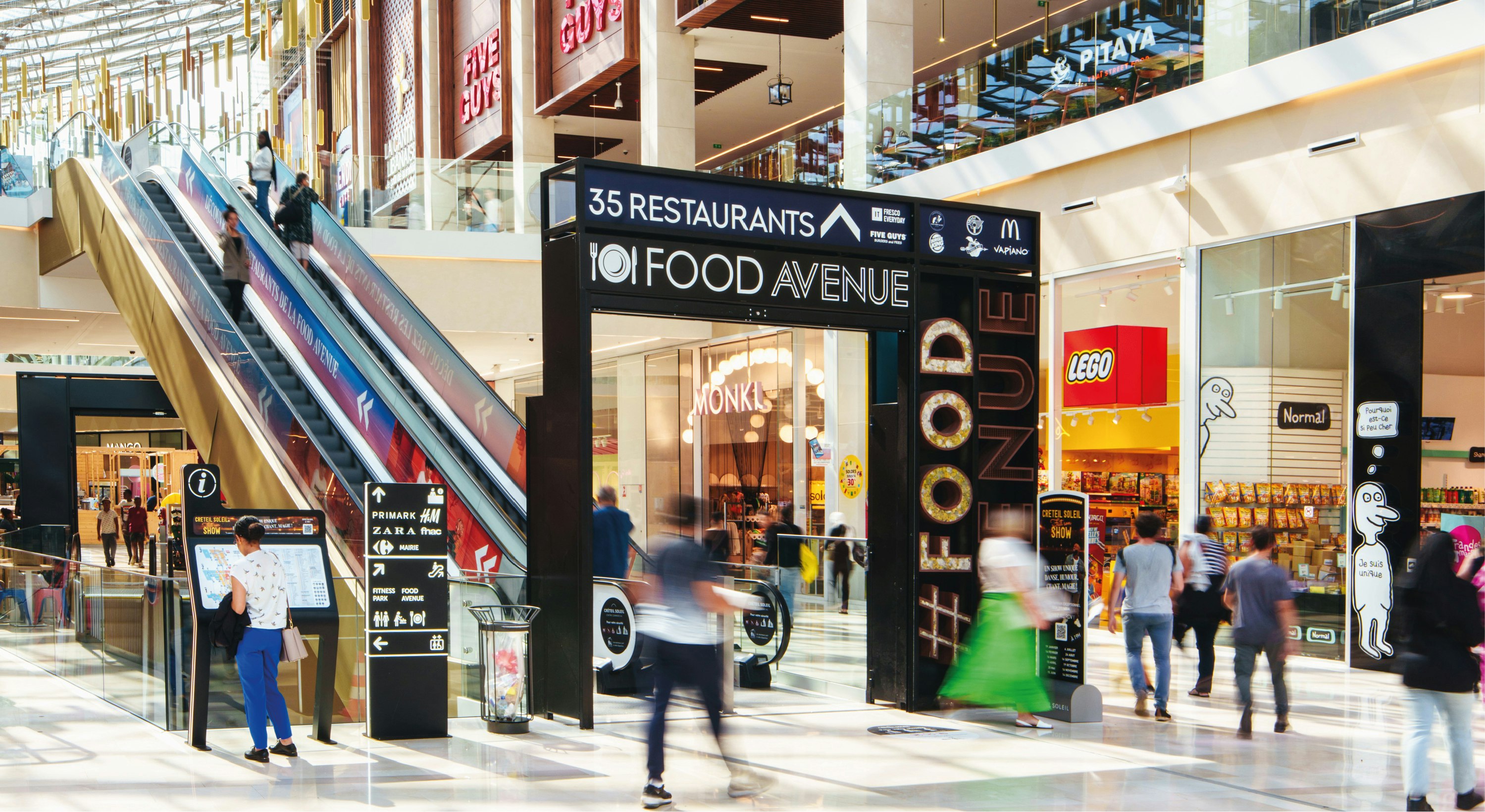
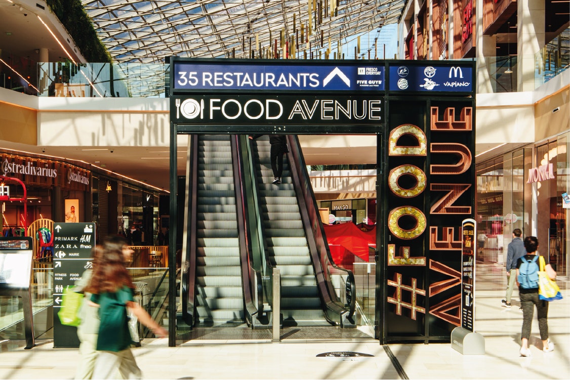
The aptly named #Food Avenue has been subject to a special branding approach: an archway on the ground floor draws visitors upstairs, where each tenant is identified on a frame/board, to effectively mark out the space.
Attracting customer flow
The #Food Avenue food court begins on the ground floor via an archway, a portal to the first floor. The easily recognisable and identifiable design guides customers towards a clear promise.
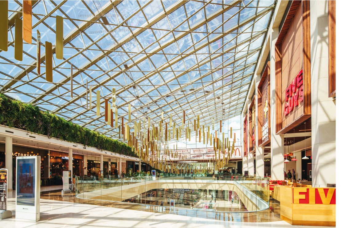
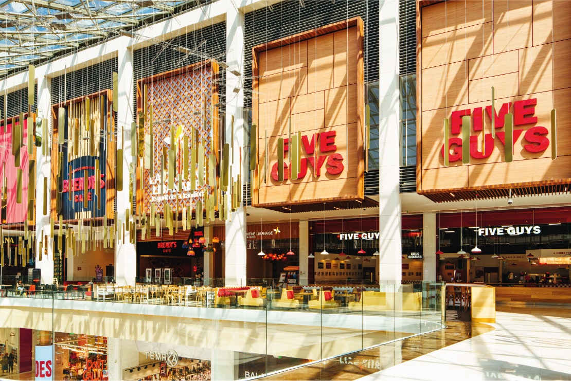
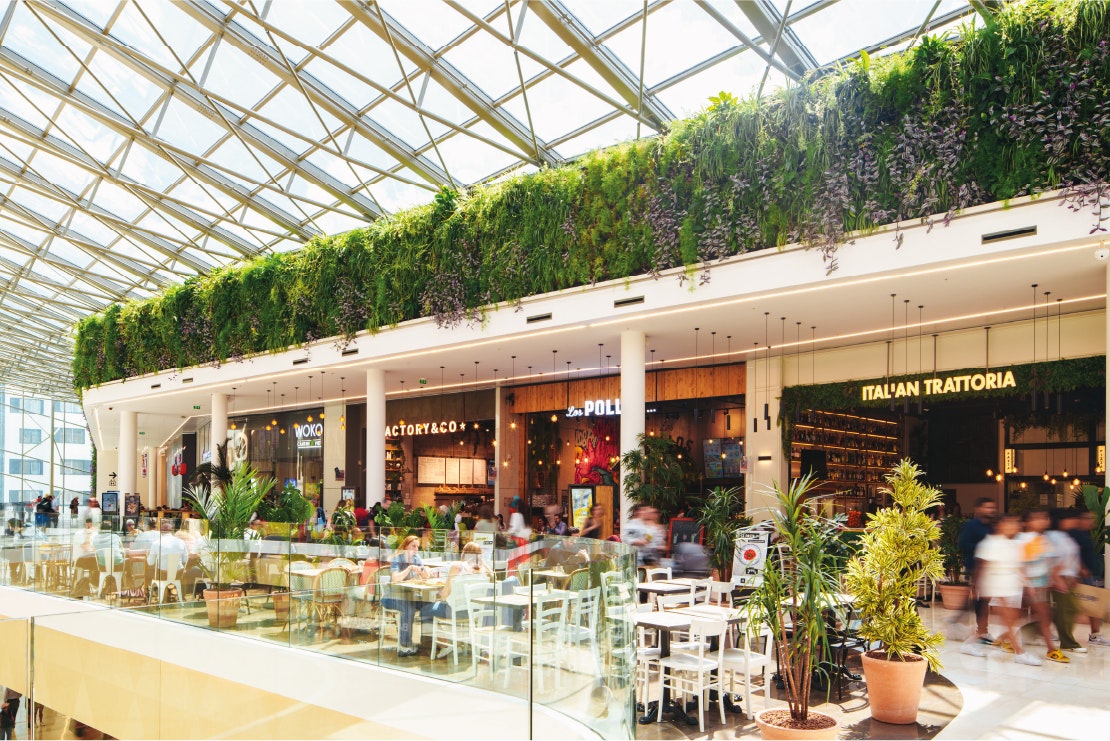
Upstairs, boards assigned to each brand and inspired by the world of food service are distributed around the food court, enhancing visibility and structuring the space.
A breath of fresh air
A green wall is positioned opposite the boards, offering a moment's pause in this inorganic environment, and bringing another texture to the space.


My Urban Energy
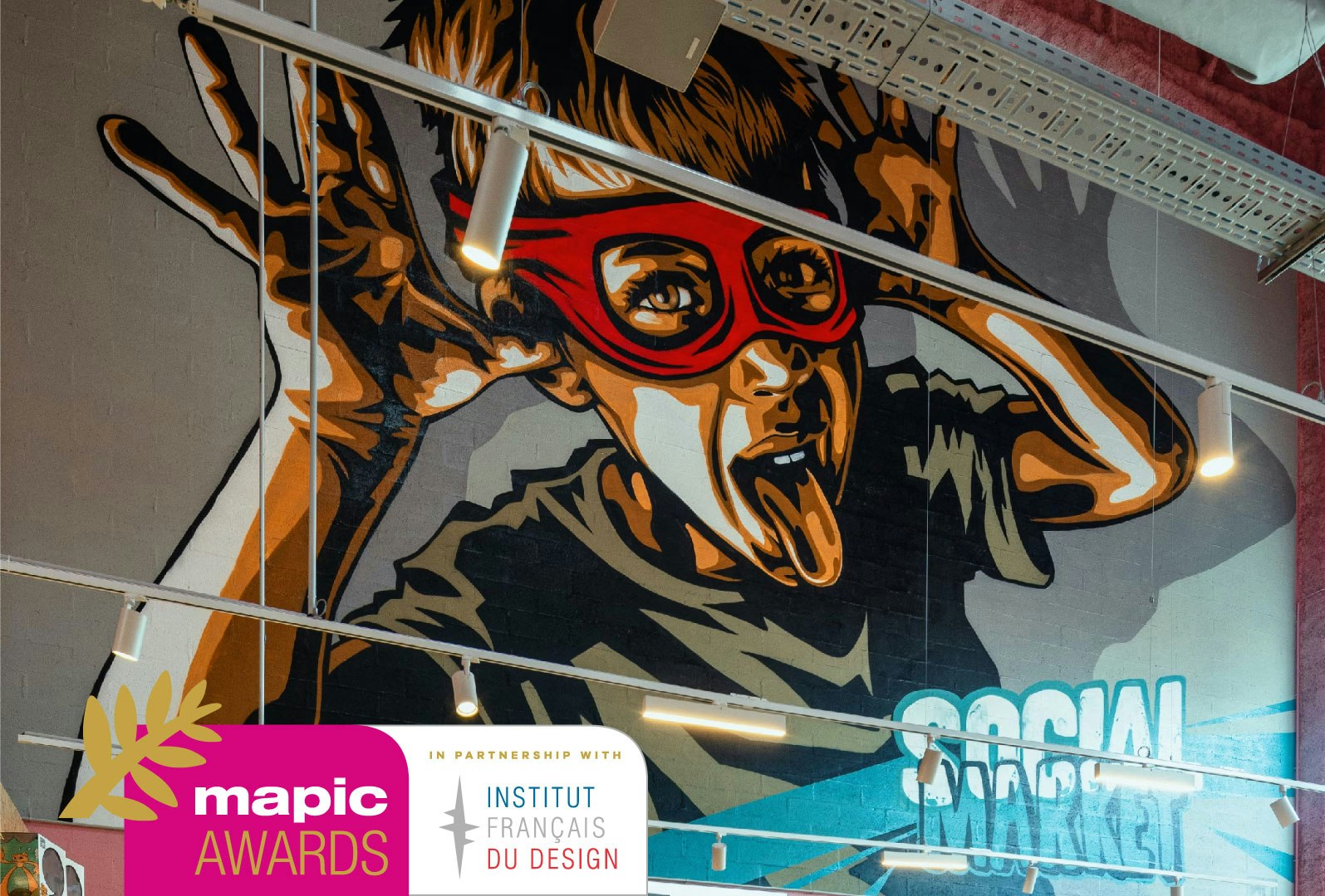
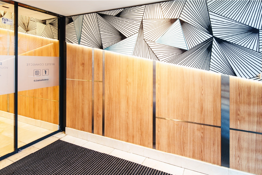
Combining a chic and urban feel, the theme has been applied in the graphic style at the various contact points in the customer journey, such as entrance areas, stairwells, escalators, signage, and more.

Creating consistency through a standardised approach
Tenant specifications and guidelines, including the board, terrace and fixtures, have been drawn up to maintain the coherence of the space as it evolves.
