Walmart
The world's largest retailer looks at the smallest details.
In 2016, Walmart Canada decided to reconsider its approach to store design. Minale Design Strategy was selected to accompany this long and complex project. The result of 2 years of an iterative design process resulted in a simpler, more contemporary environment for greenfield stores and a design system that can be rolled-out to exitsing stores.
Industries
- General Retail.
Skills
- Strategy,
- Retail Design.
Challenge
Redesigning a new supercentre for the world's largest and most succesful retailer, the challenge demands experience, talent and a very close client / agencey relationship. The project involves working with general management, marketing, communication, store design and work processes that the client has honed over decades of experience, any solution must be able to meet a number of seemingly impossible parametres. And yet, there are solutions.
Solution
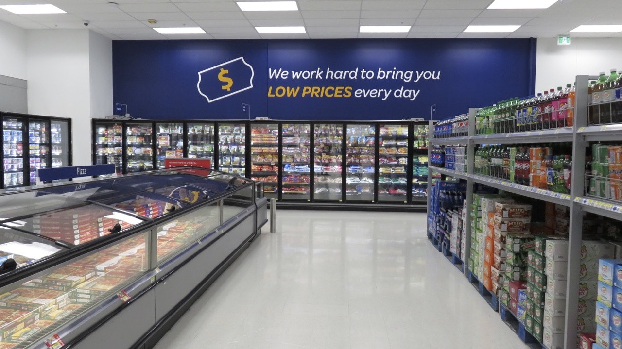
The key ideas, stay simple, communicate and deliver on your promise to the customer, take care of your associates. With these guiding factors, we were able to eliminate a large amount of overpowering in-store communication, focus on the important aspects and render the entire store easier to navigate, develop themes for better targeted communication, create a more coherent overall experience for the customer.
Exteriors
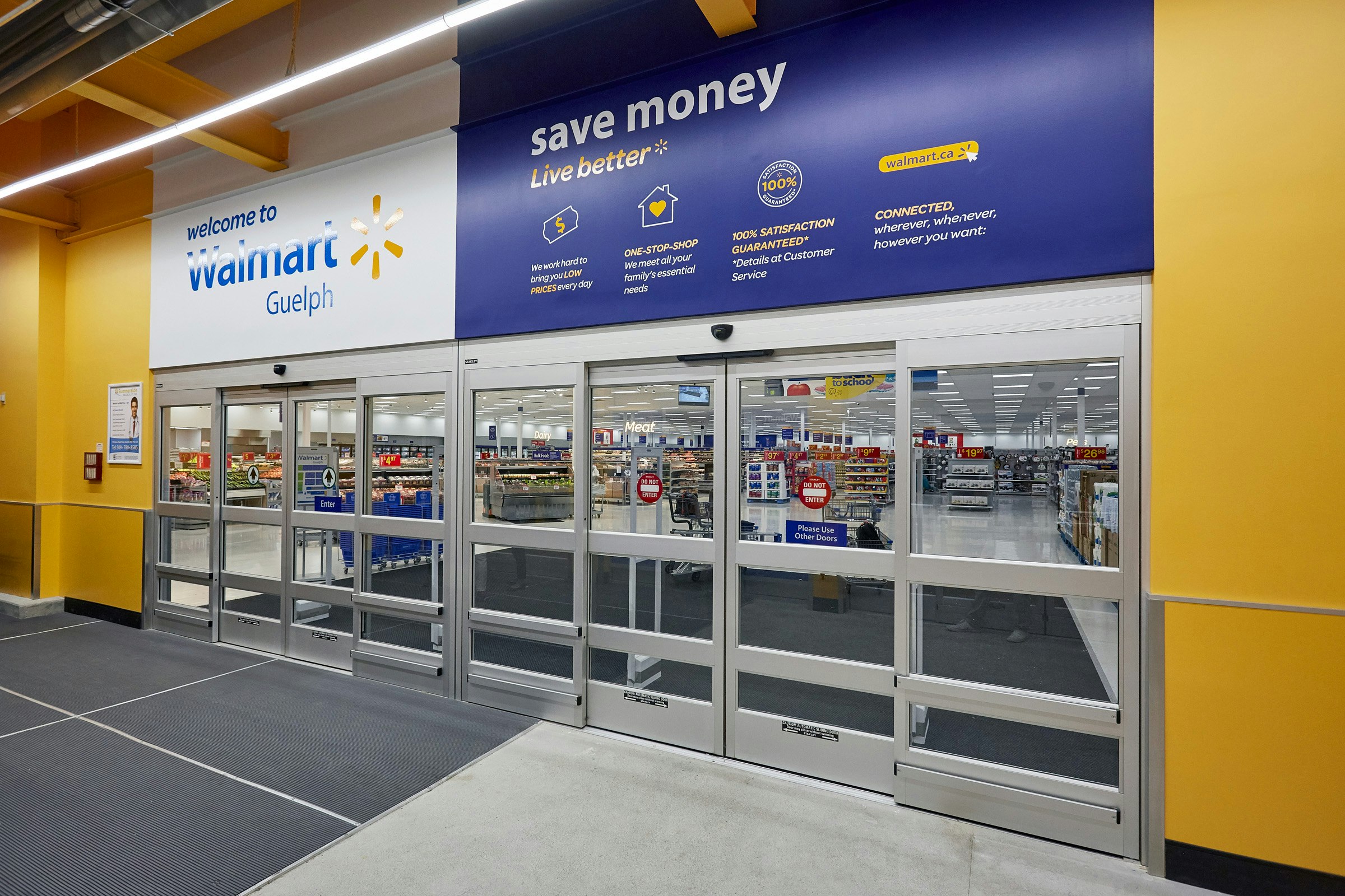
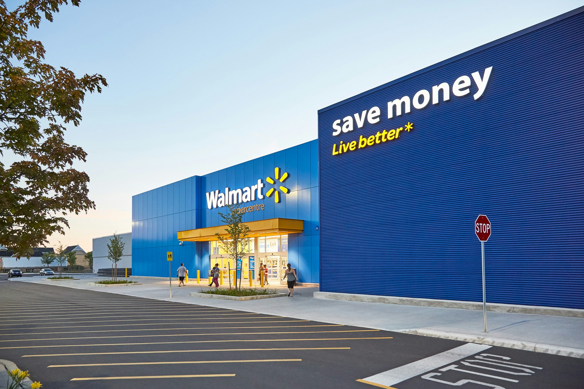
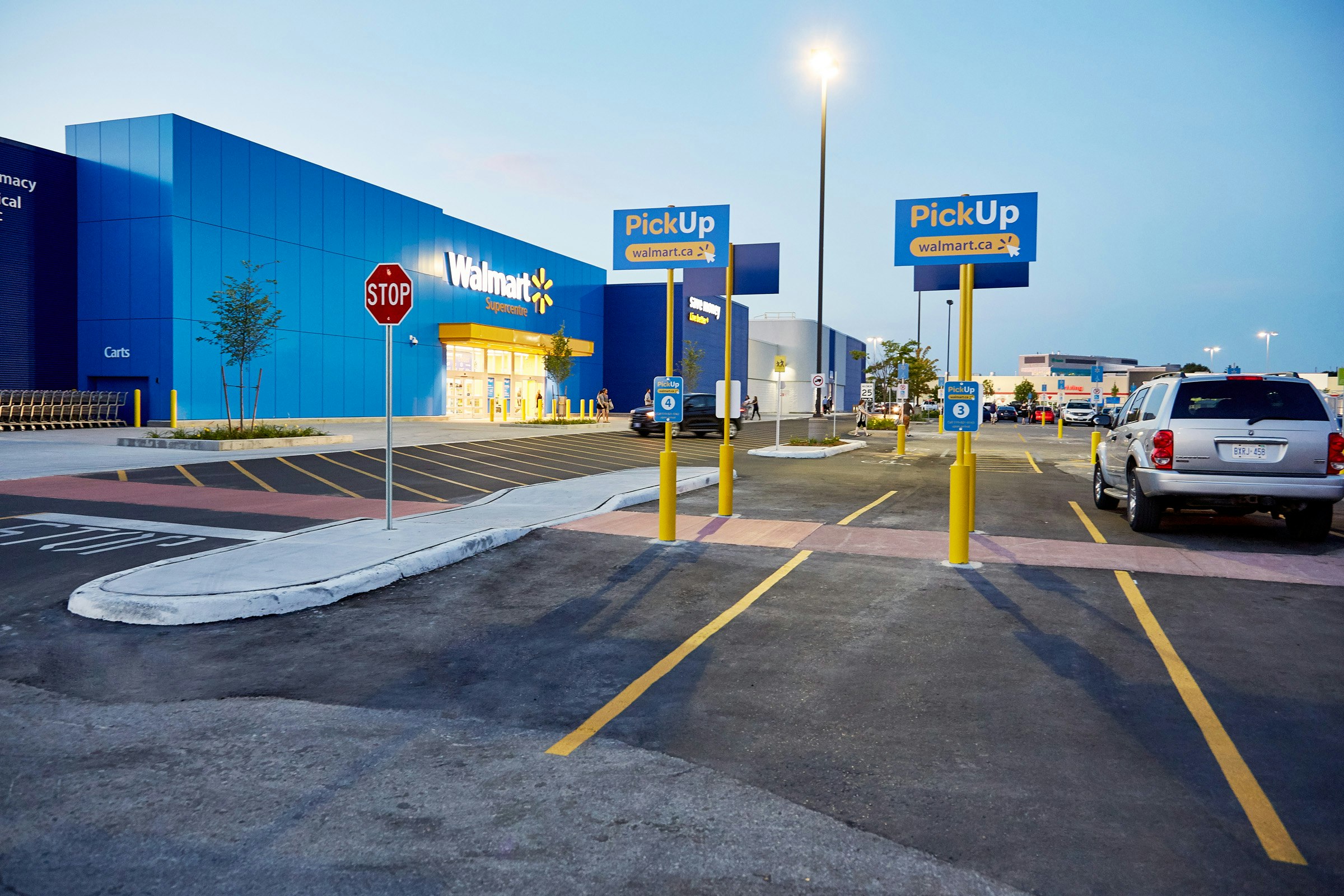
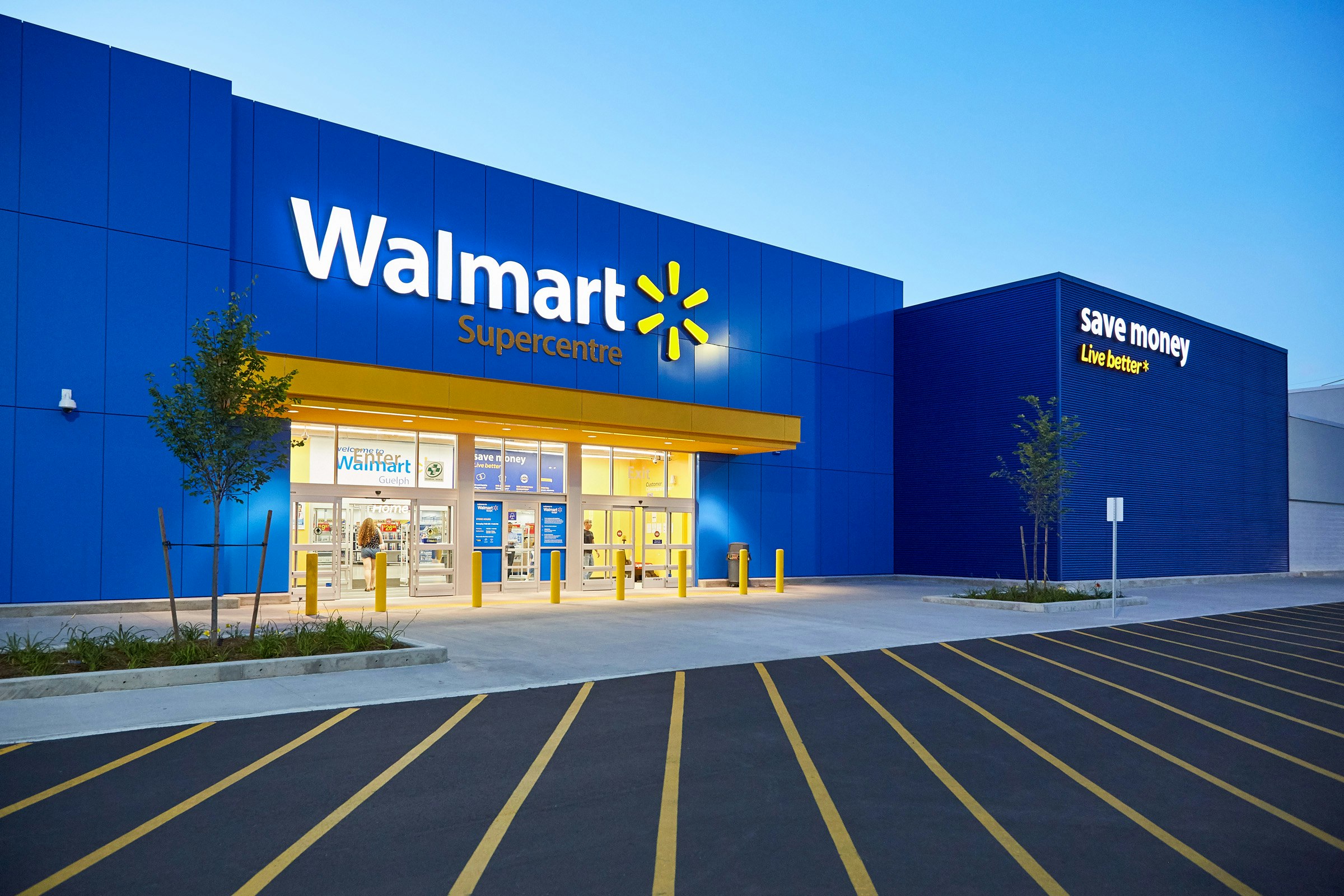
As the first interface with both customers and non-customers, the exteriors were given the attention they deserve. The facade clearly calls out the promise.. to save money but also, to live better. The entrance is clearly identified with a welcoming warm arch in yellow and special attention is given to specific parking zones.
Navigation
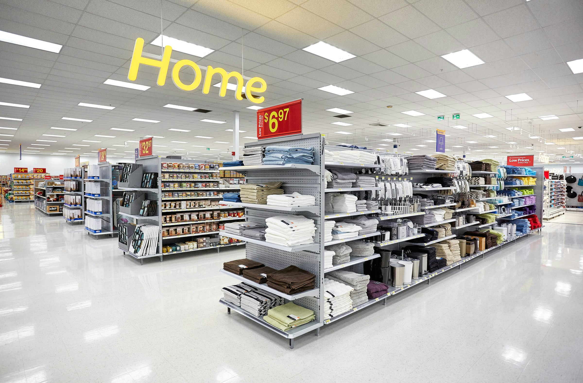
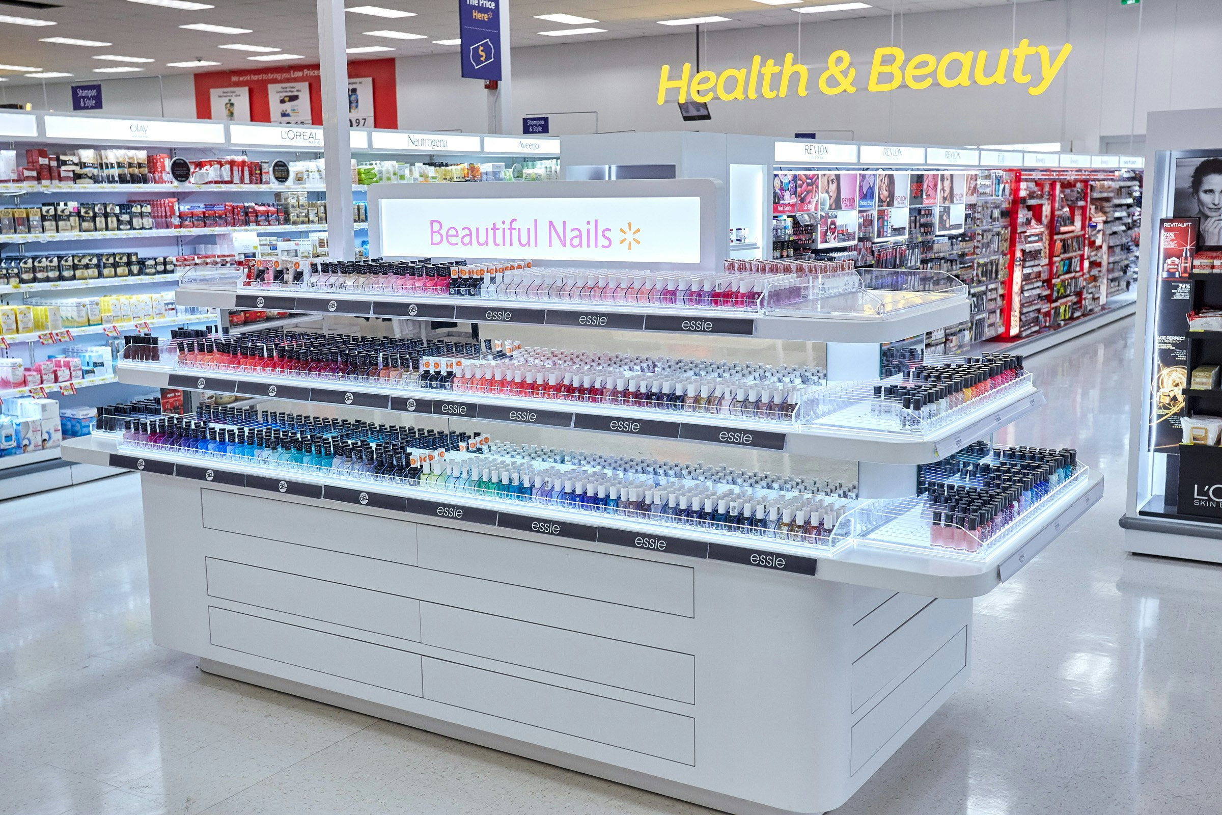
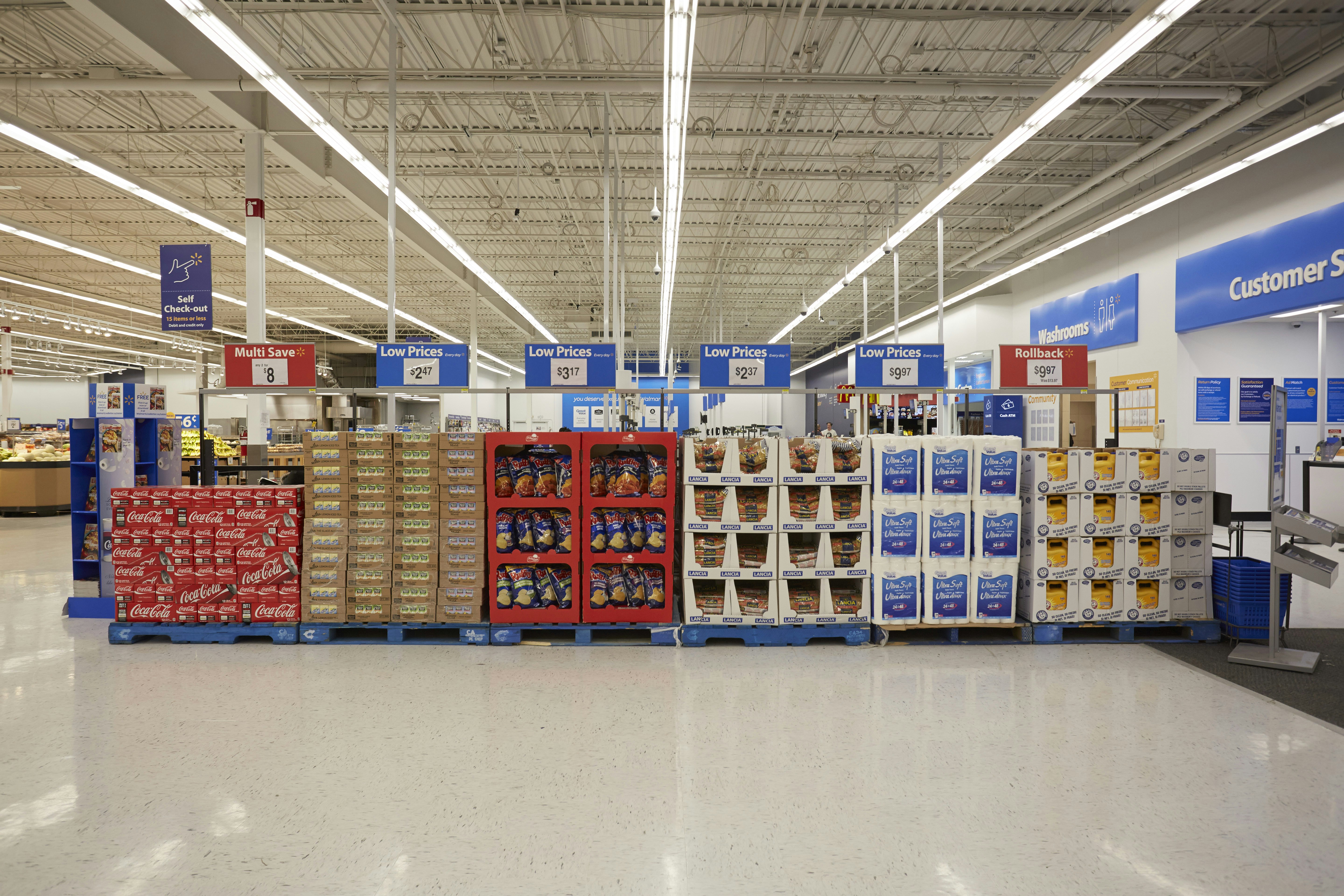
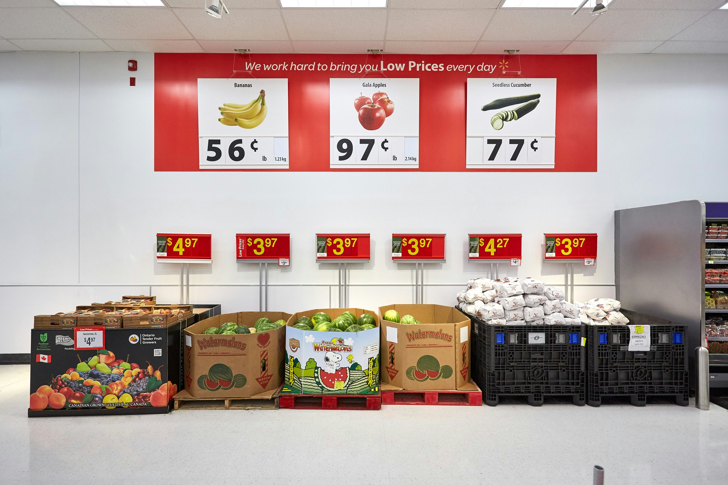
By lowering the height of many fixtures and creating a hierarchy for signage, we were able to create a total signage system that allows customers to see where every department is placed and what is found in each department. Customer surveys confirmed that navigation, therefore level of comfort was greatly enhanced


Services
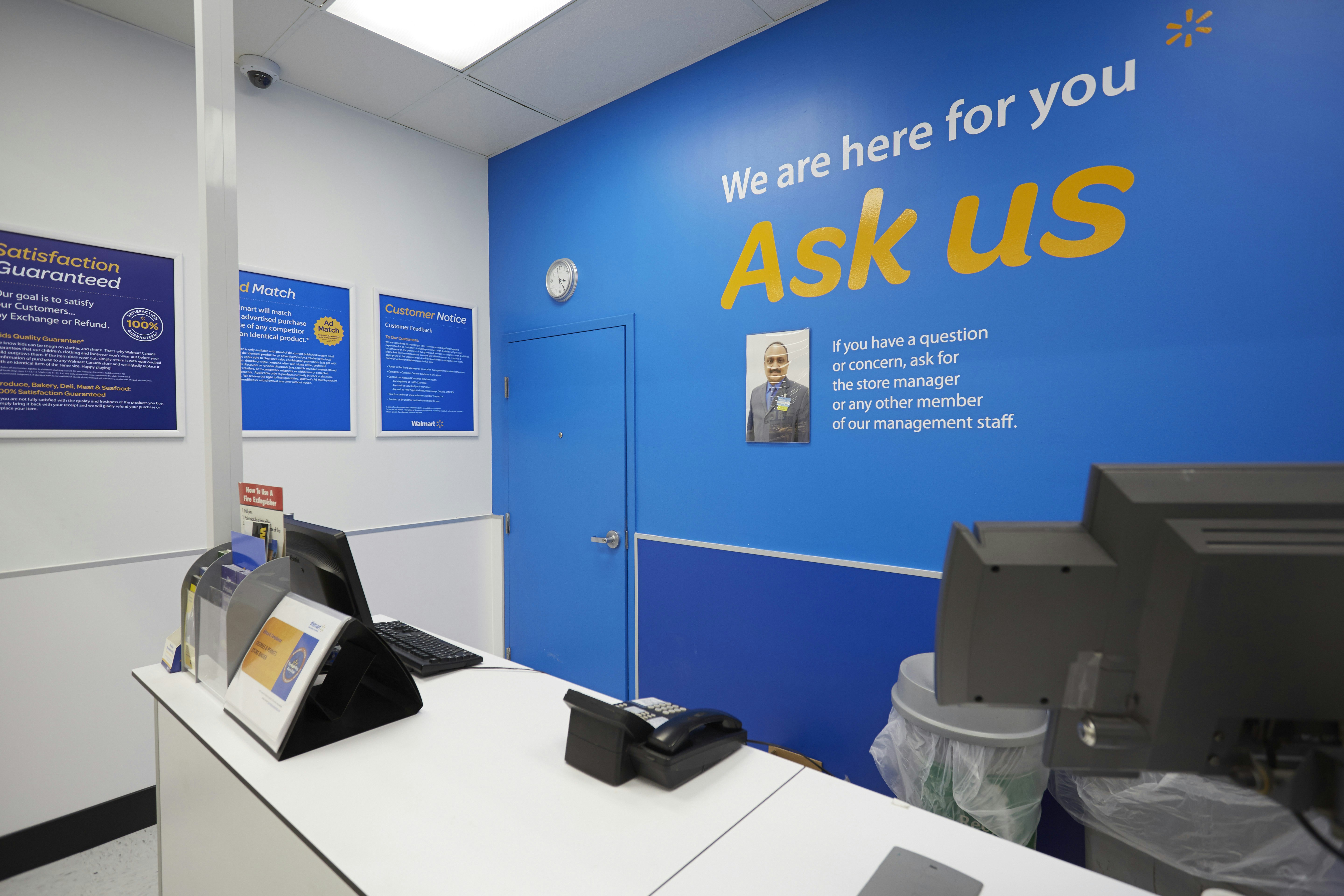
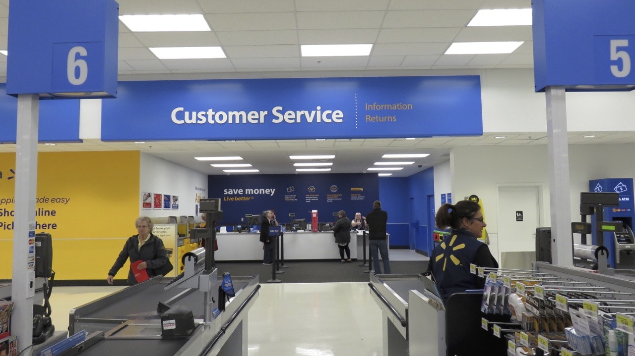
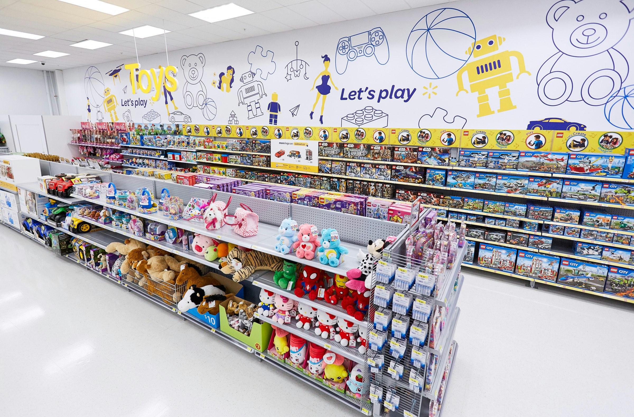
Services, as an important aspect ot the Walmart offer, have been clearly identified and organised in a more contemporary manner.
