Bricorama
The DIY Revolution.
Repositioning the Bricorama brand and its large-format stores, focused on a powerful message: "do, succeed and be proud".
Giving the retailer "brand status" by turning it into a credible brand and moving closer to its target: occasional DIYers and home improvement enthusiasts.
Industries
- Specialised Retail.
Skills
- Strategy,
- Retail Design,
- Brand Design,
- Digital.
Challenge
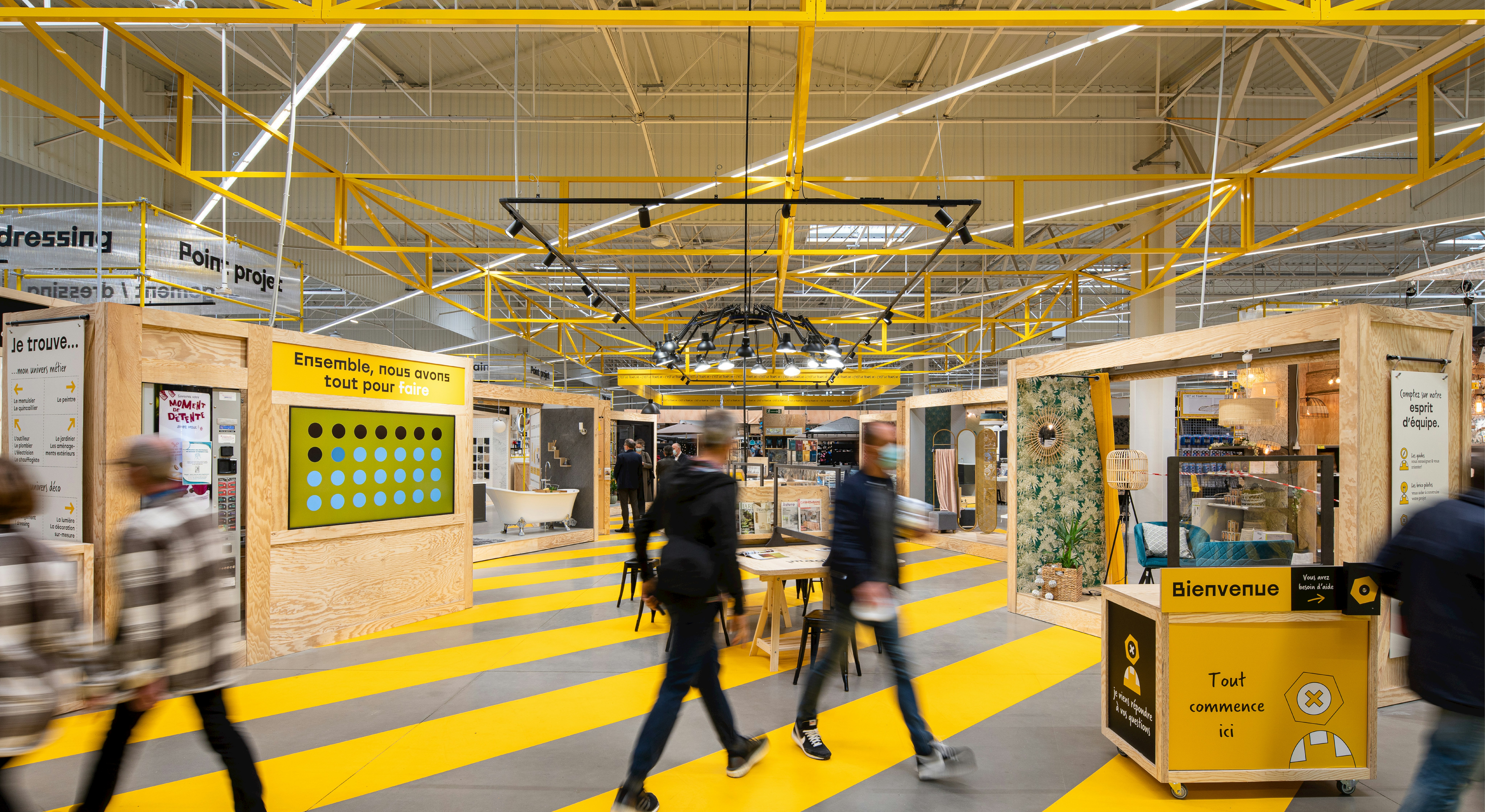
The aim was to bring this new positioning to life in the overall customer experience, by creating a dynamic store in which the physical and digital customer journey provides inspiration, experimentation and support. As well as boosting customer awareness of the brand's CSR approach.
The main challenge was to put people back at the heart of the stores, by making the customer the primary focus of the brand. With the ultimate goal of building DIY confidence in even the most hesitant hopefuls, moving from “I'll never be able to do this myself” to “I may as well give it a try, I'm allowed to make mistakes".
Solution
Reinventing the store concept by putting people at the heart of the approach, whether it be the members, who form the backbone of the stores, the sales assistants who become providers of solutions, or a new take on the role of a home and its consequences on the planet.
We needed to come up with a more inspiring and interactive customer journey, emphasising the notion of a project. This meant updating Bricorama's identity, giving it a fresh and more modern feel, and building more meaningful communication between the brand and its customers.
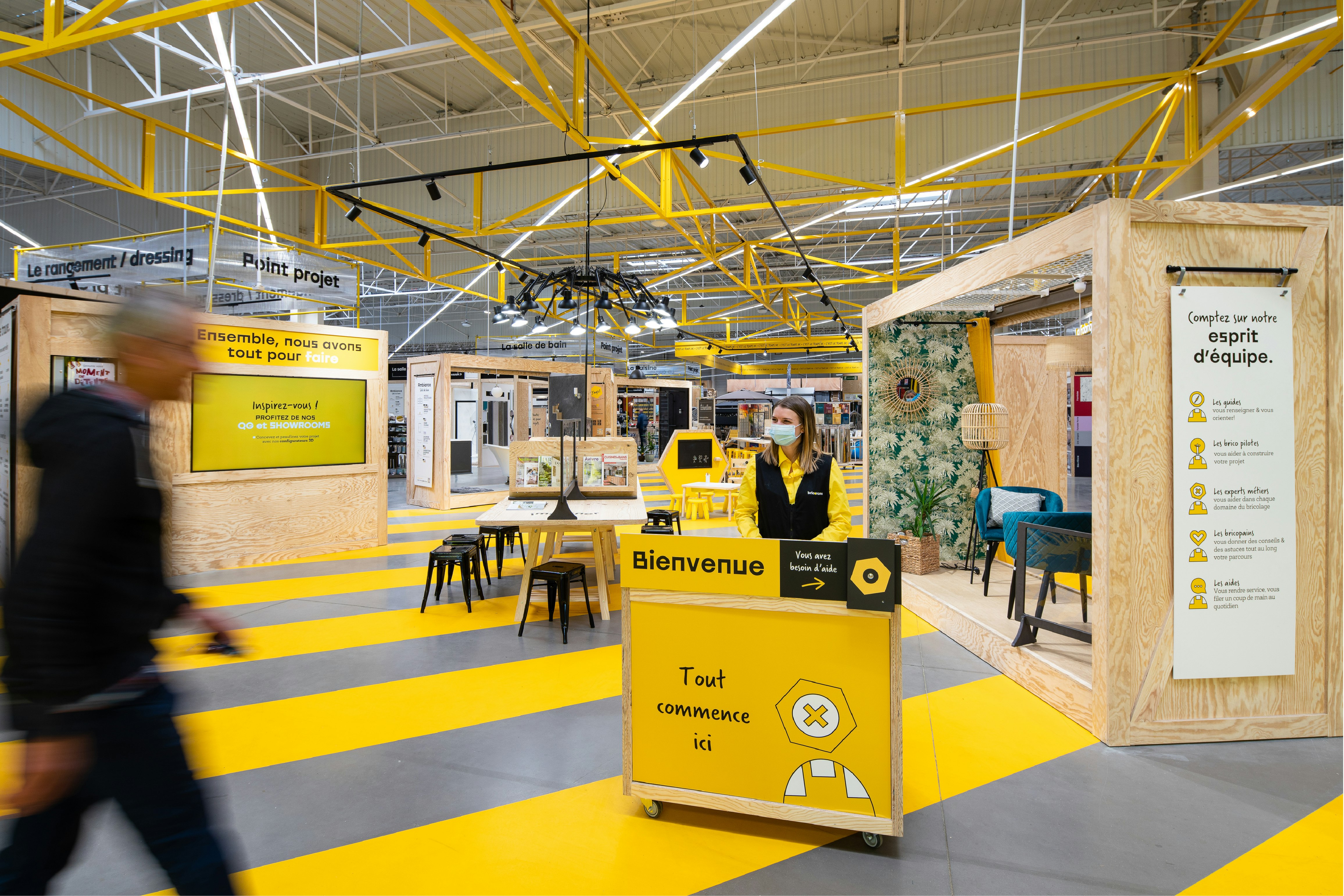

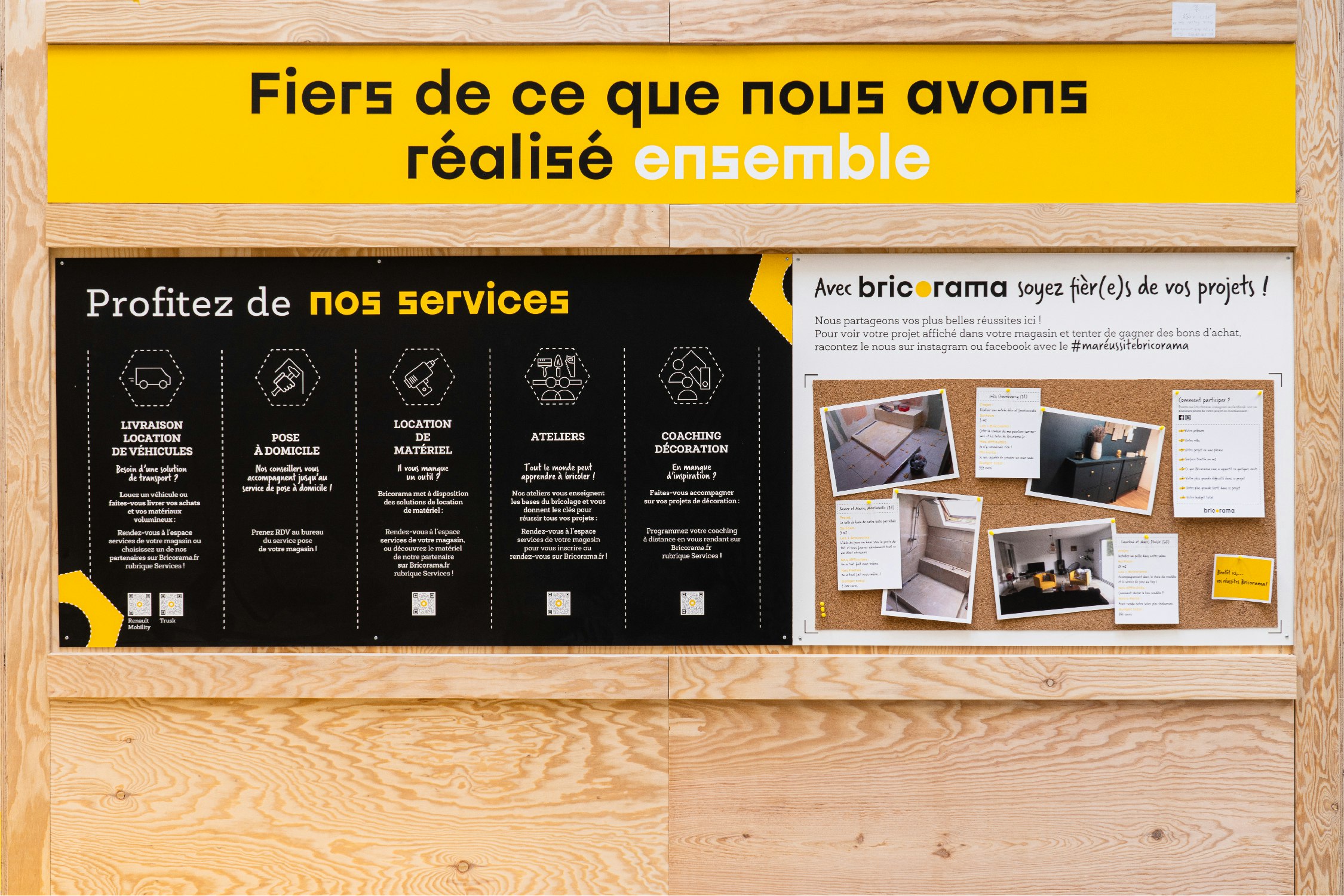
The pillars of the new store concept.
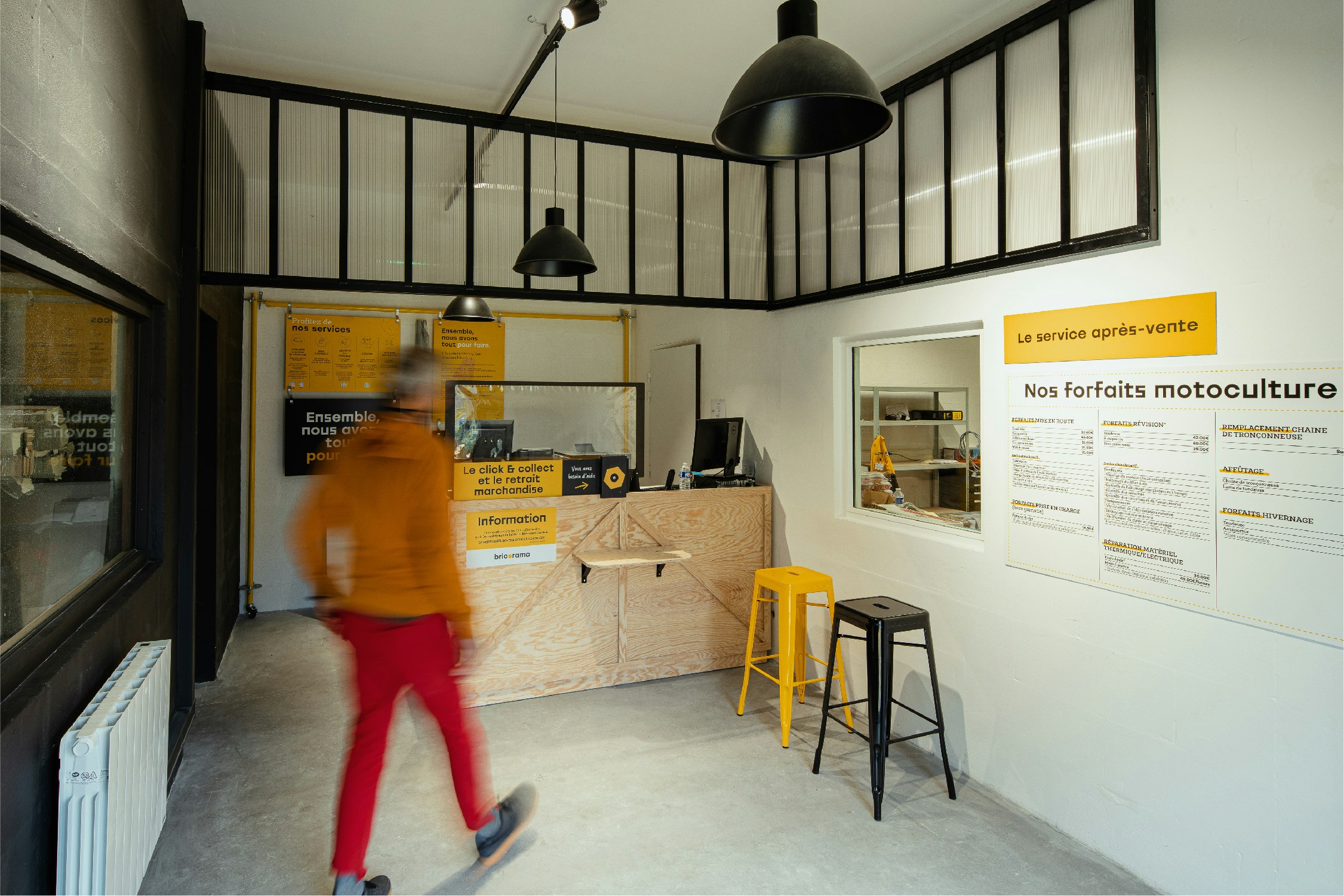
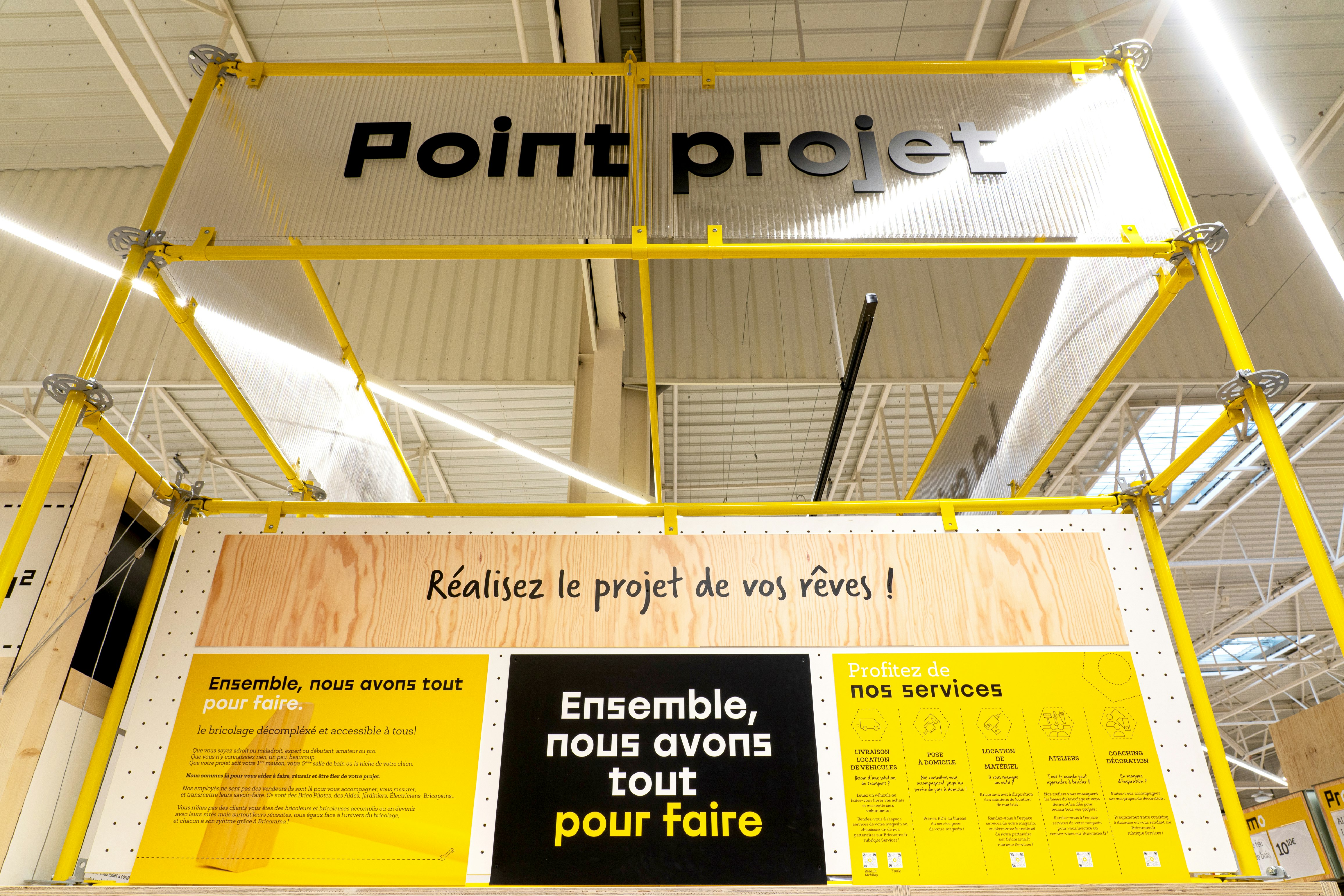
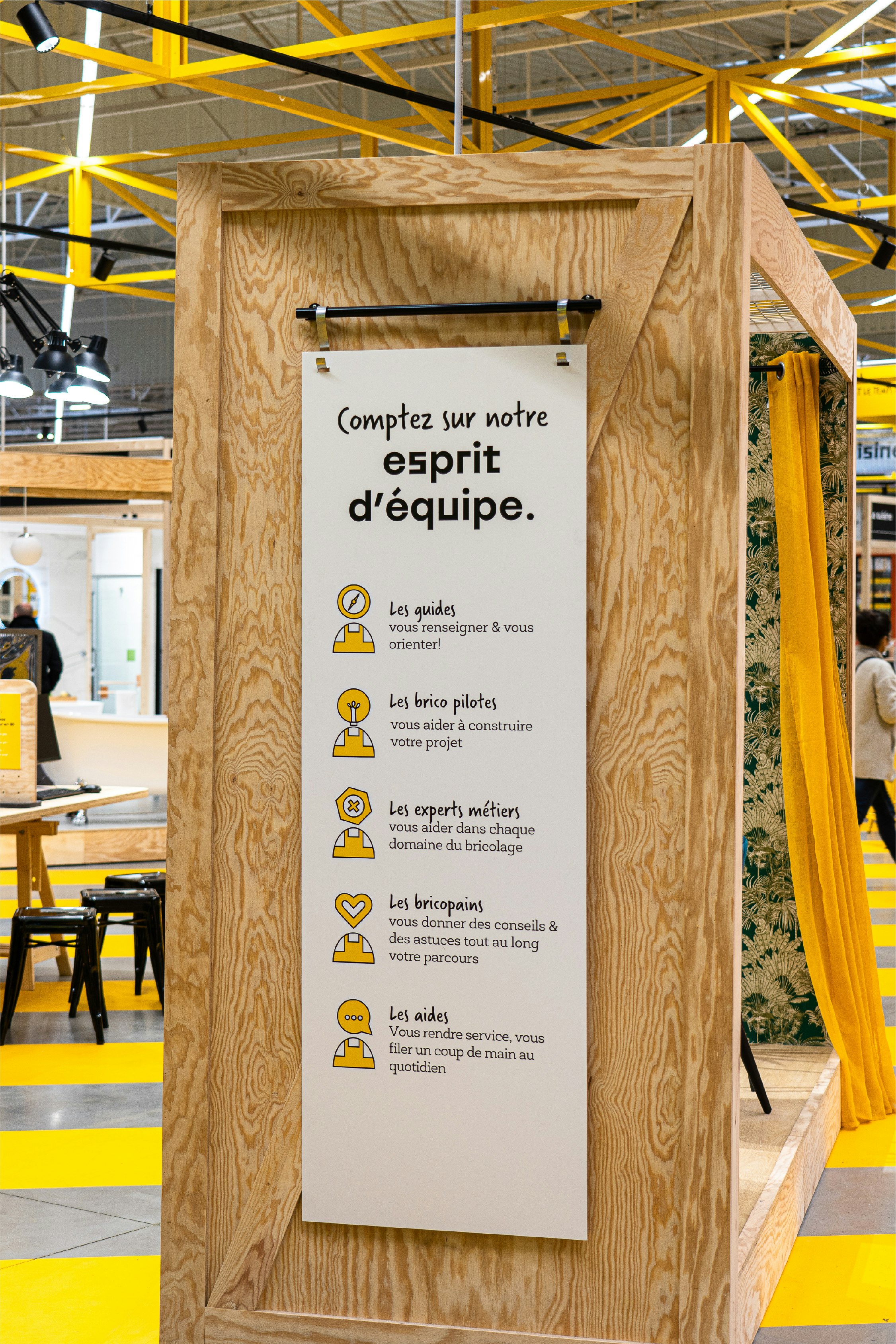
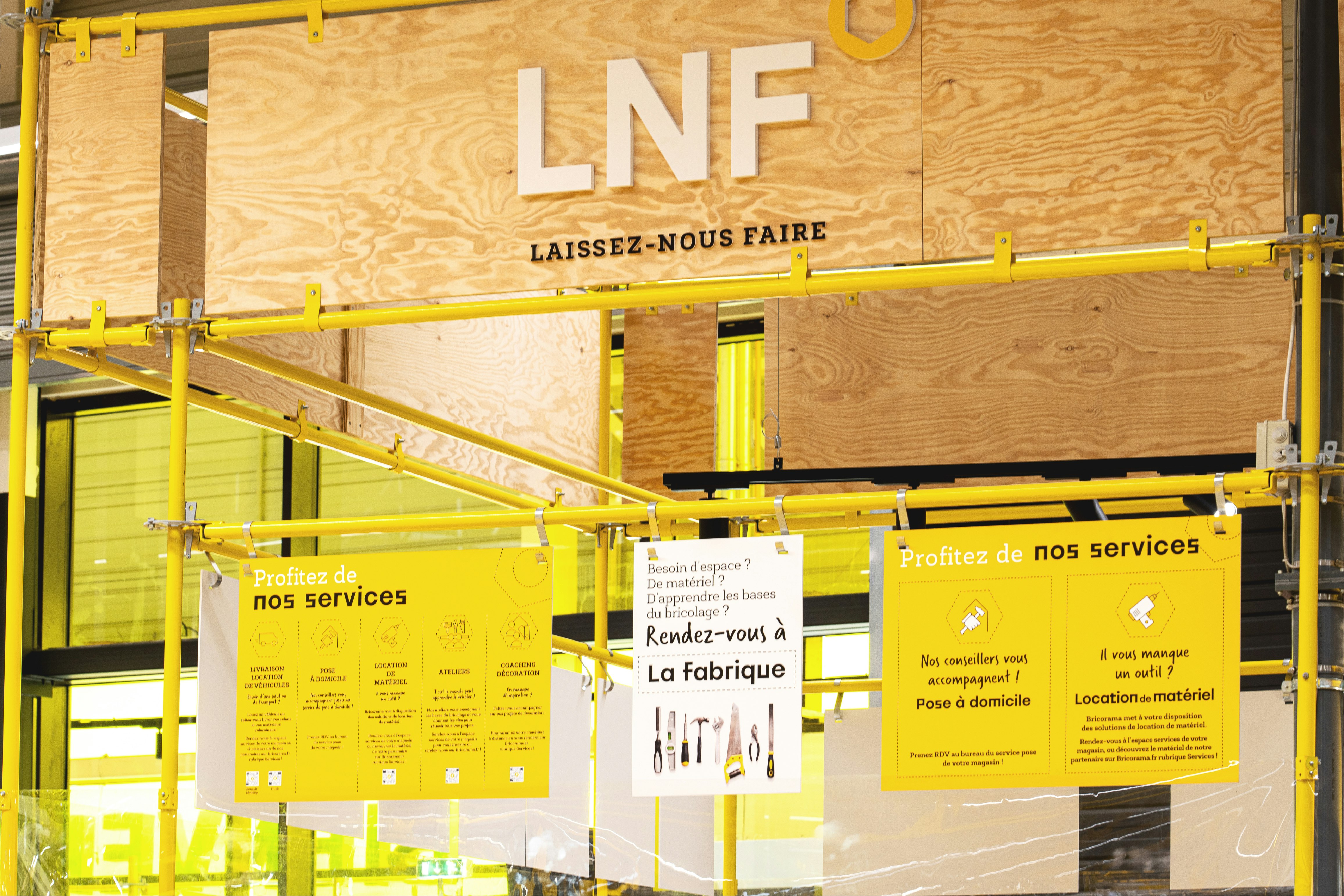
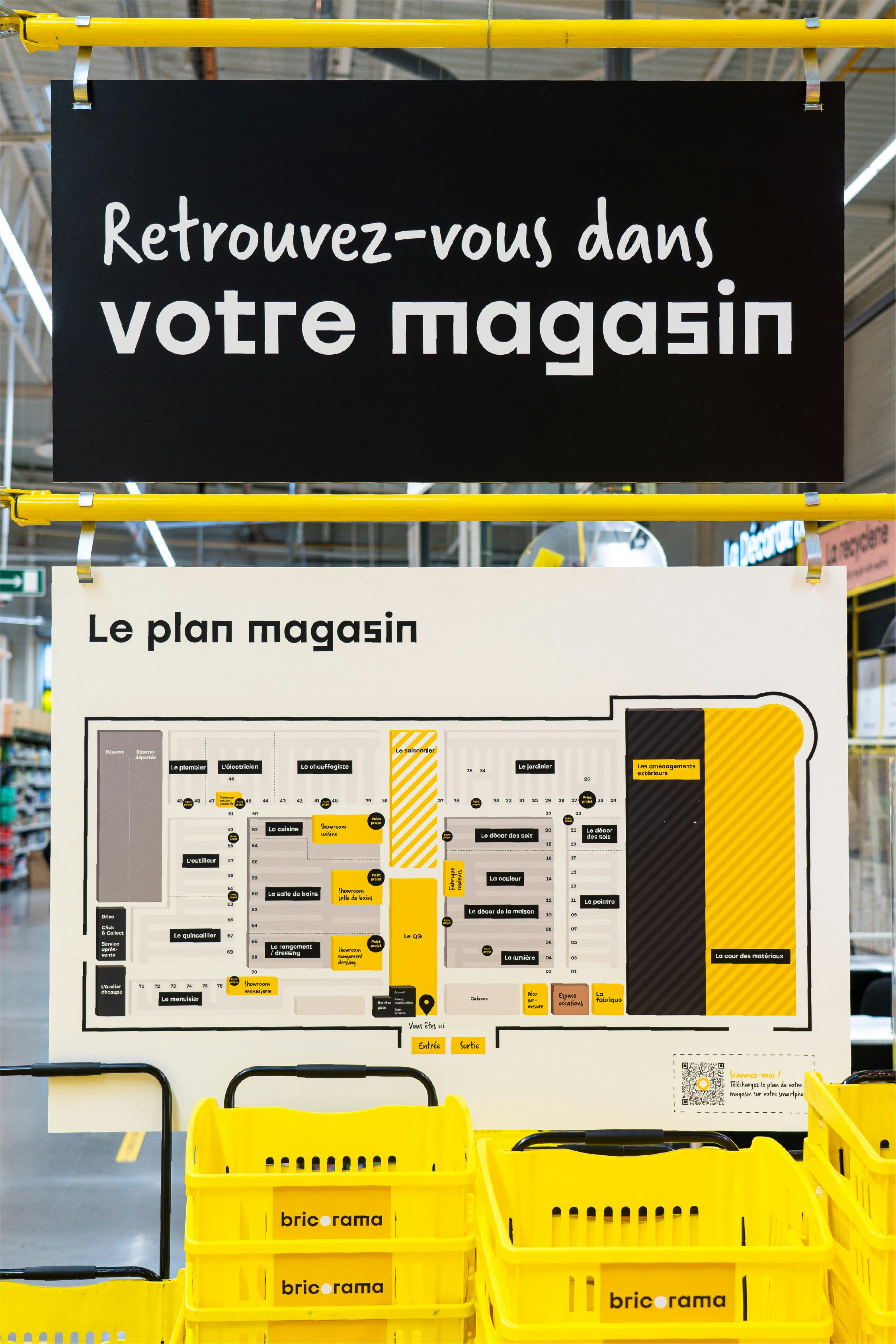
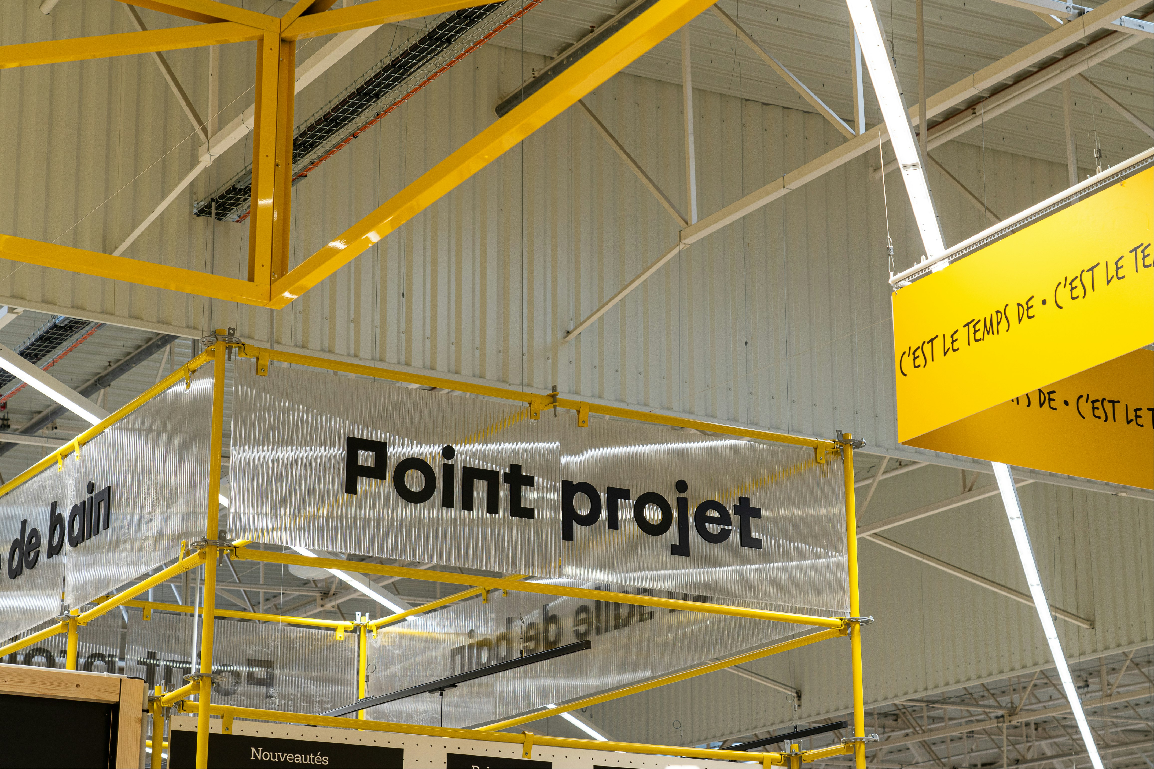
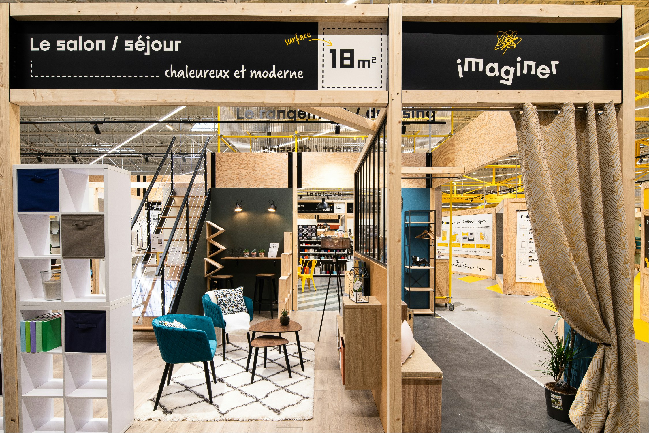
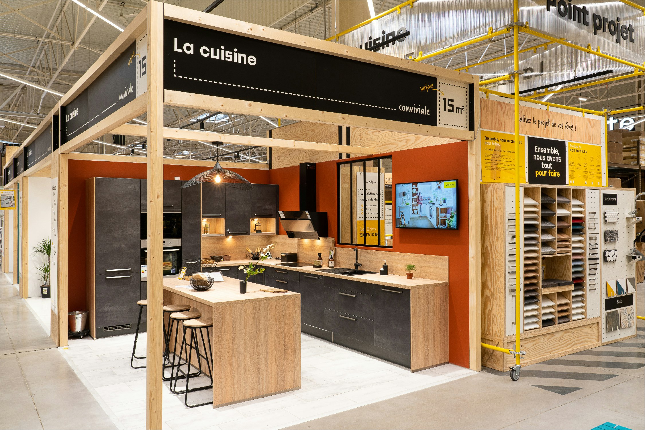
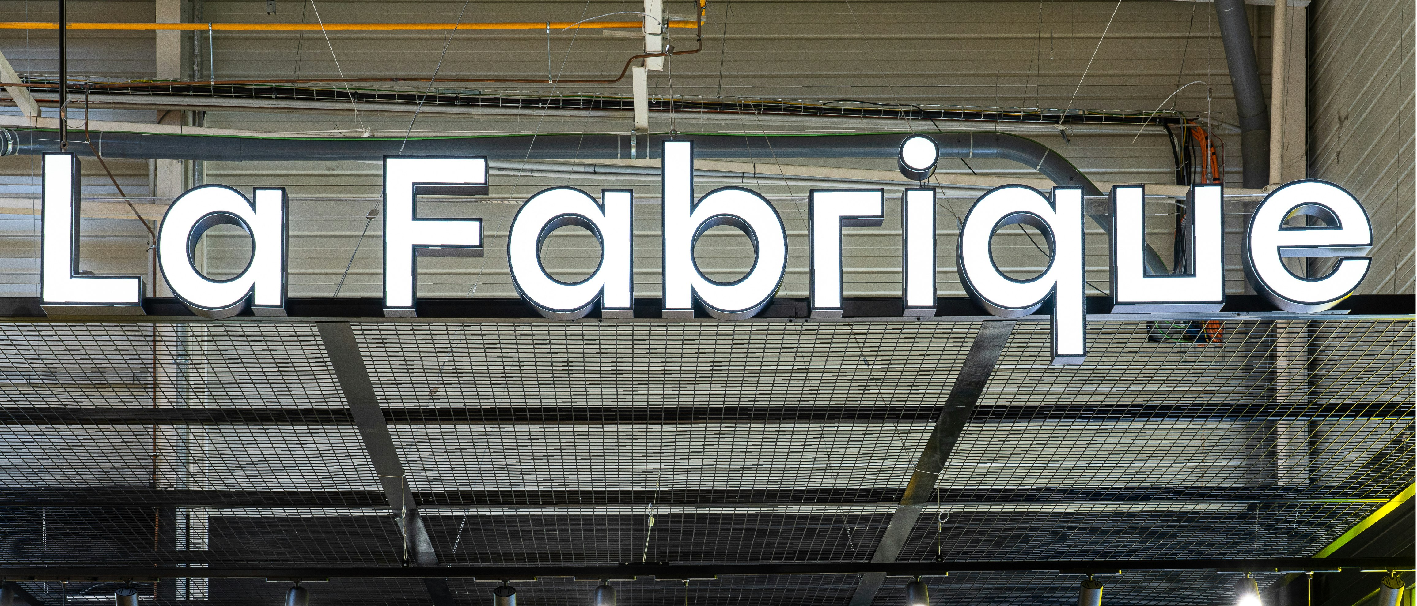
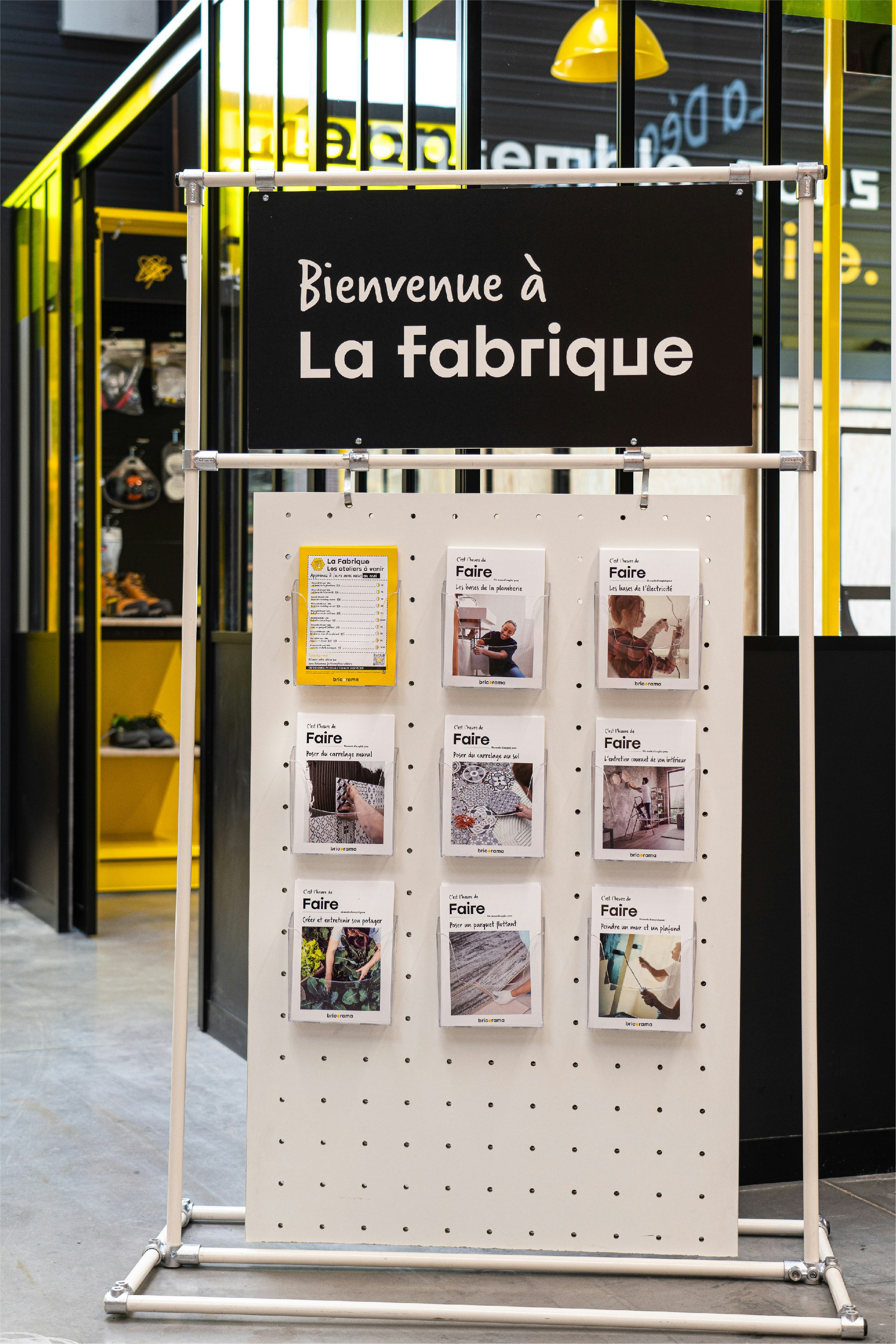
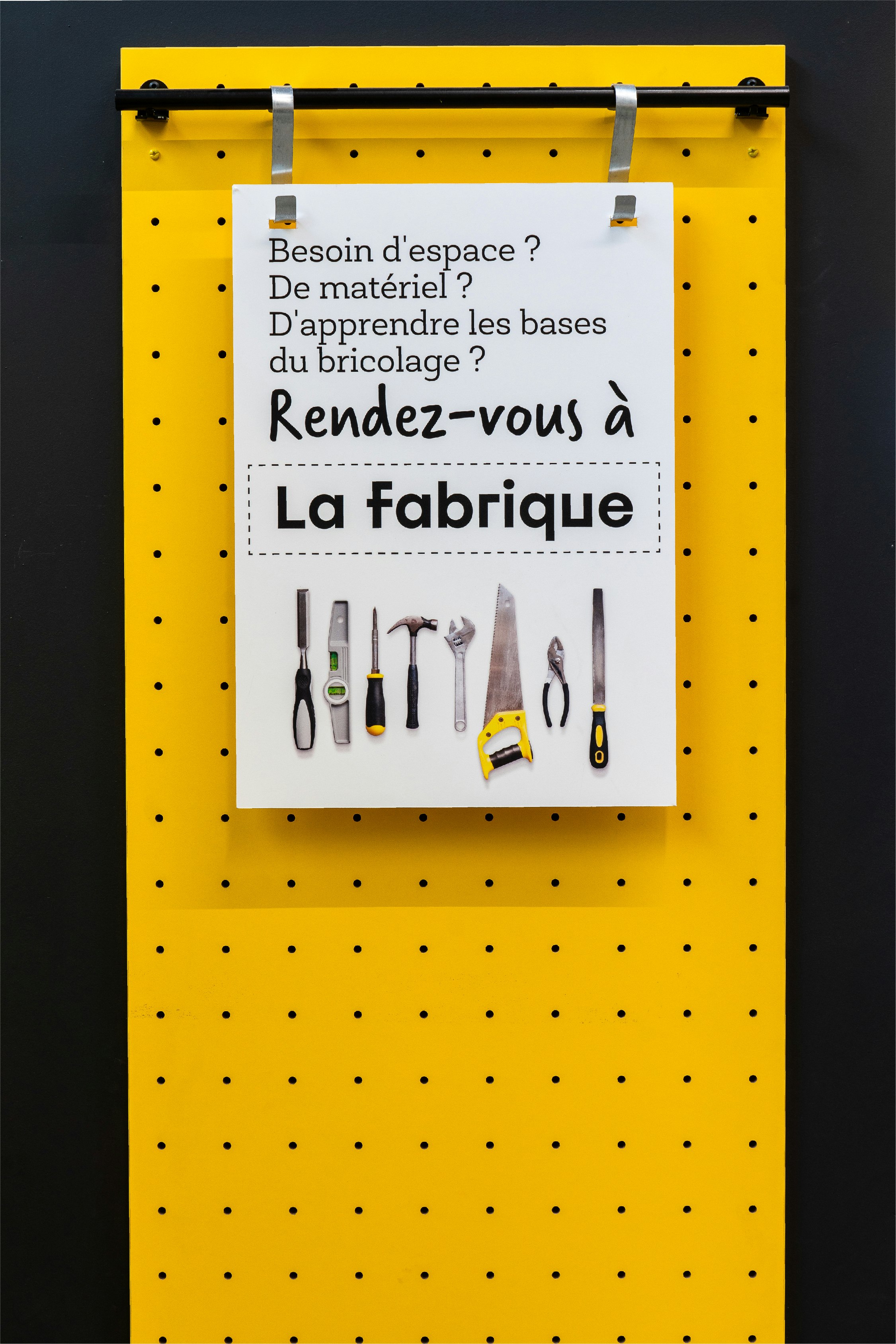
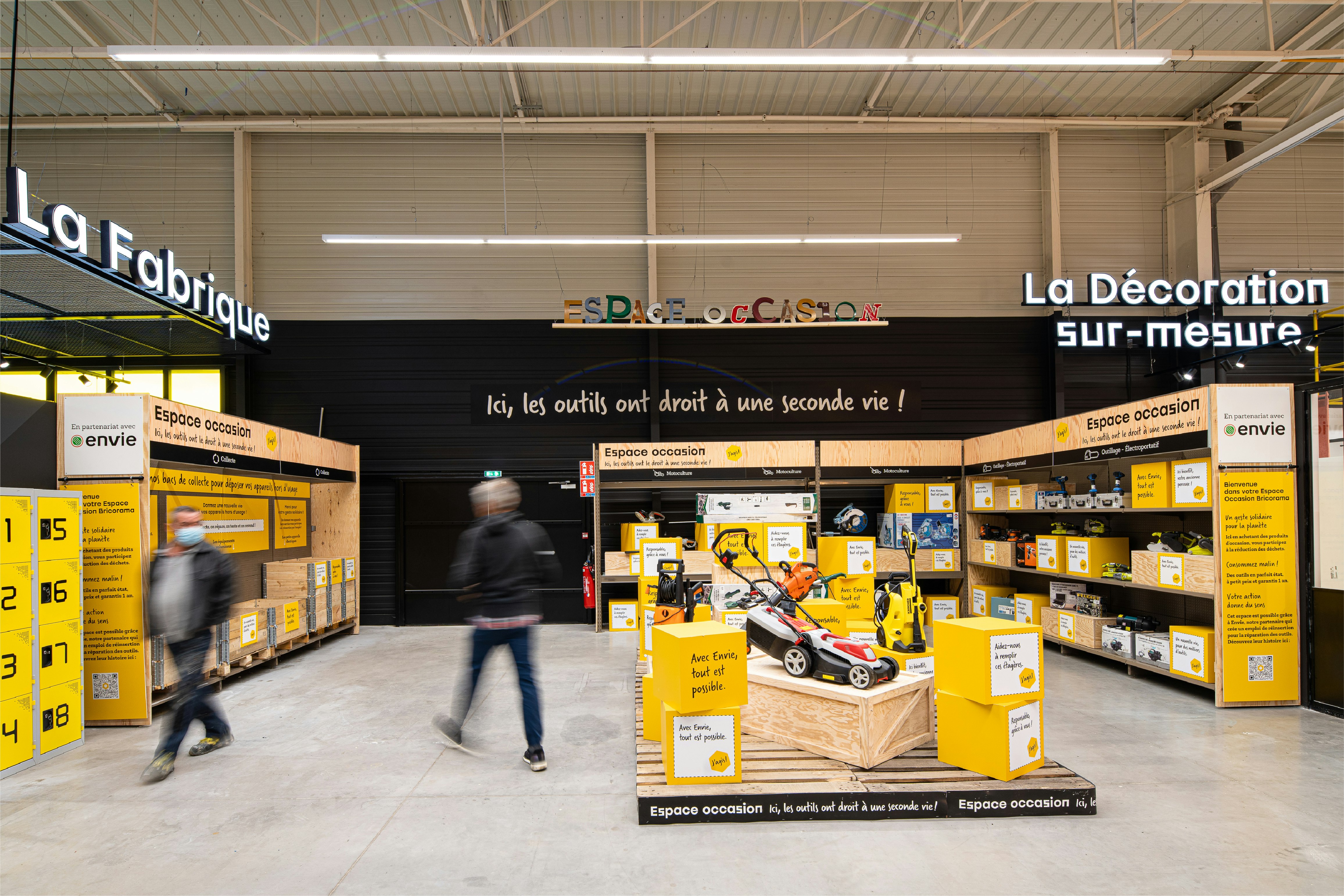
The first step was to reexamine the role of the sales assistants, giving them new, catchier titles like "bricopains", bricopilotes" and "guides". Complementing this system is a brand new take on the customer journey with a focus on service and use, including new and powerful markers for the brand: first, the HQ, the entrance and the heart of the store, designed as a customer hub to inspire ideas and be the first point of contact for starting a DIY project; a reception area that brings together all the different services; showrooms for seeing ideas come to life, associated with project spaces; and La Fabrique, an area hosting workshops that can also be privatised for working on projects with all the kit to hand. Finally, the second-hand service and the “J'agis” programme help customers make sustainable choices.
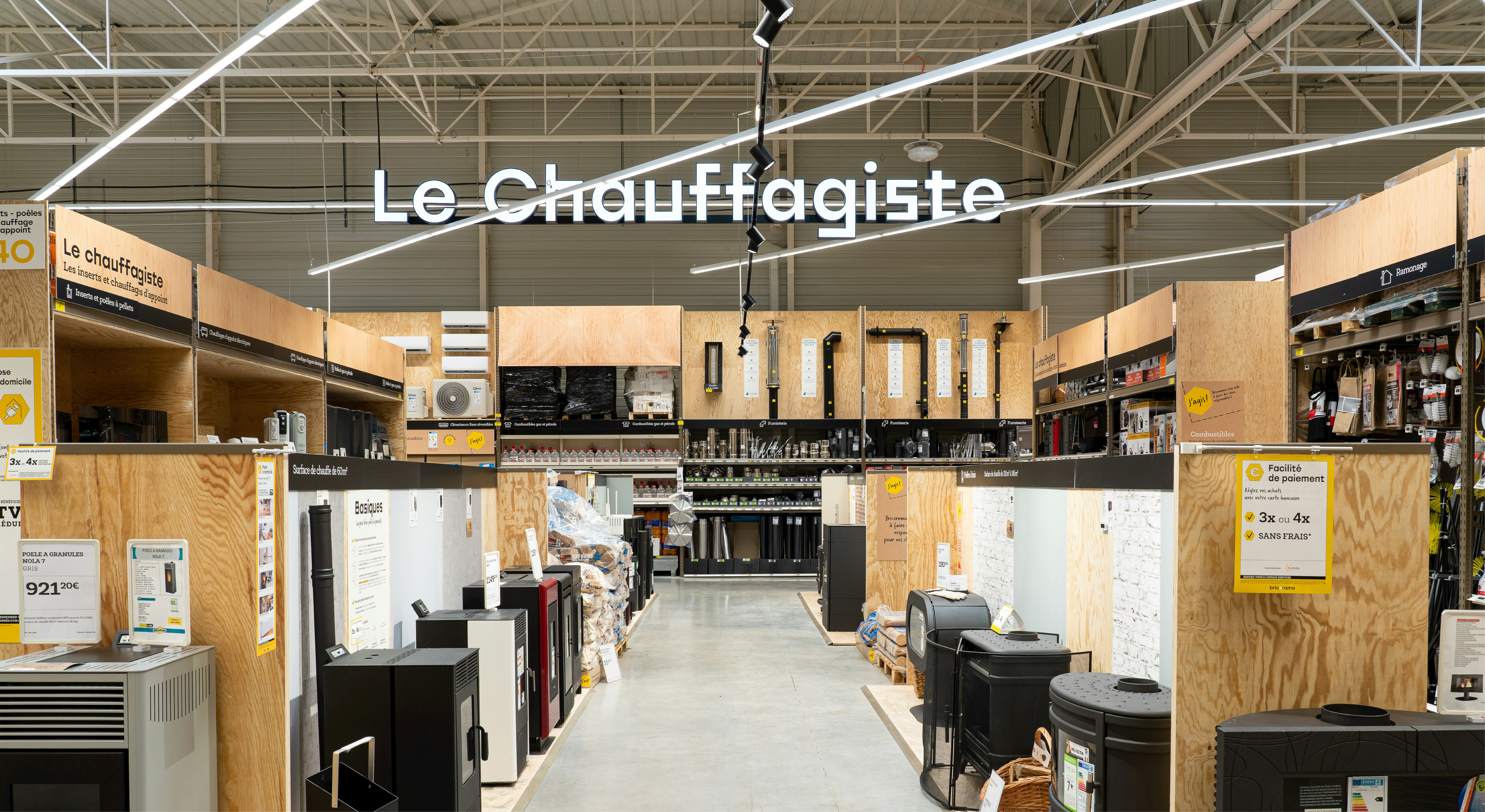
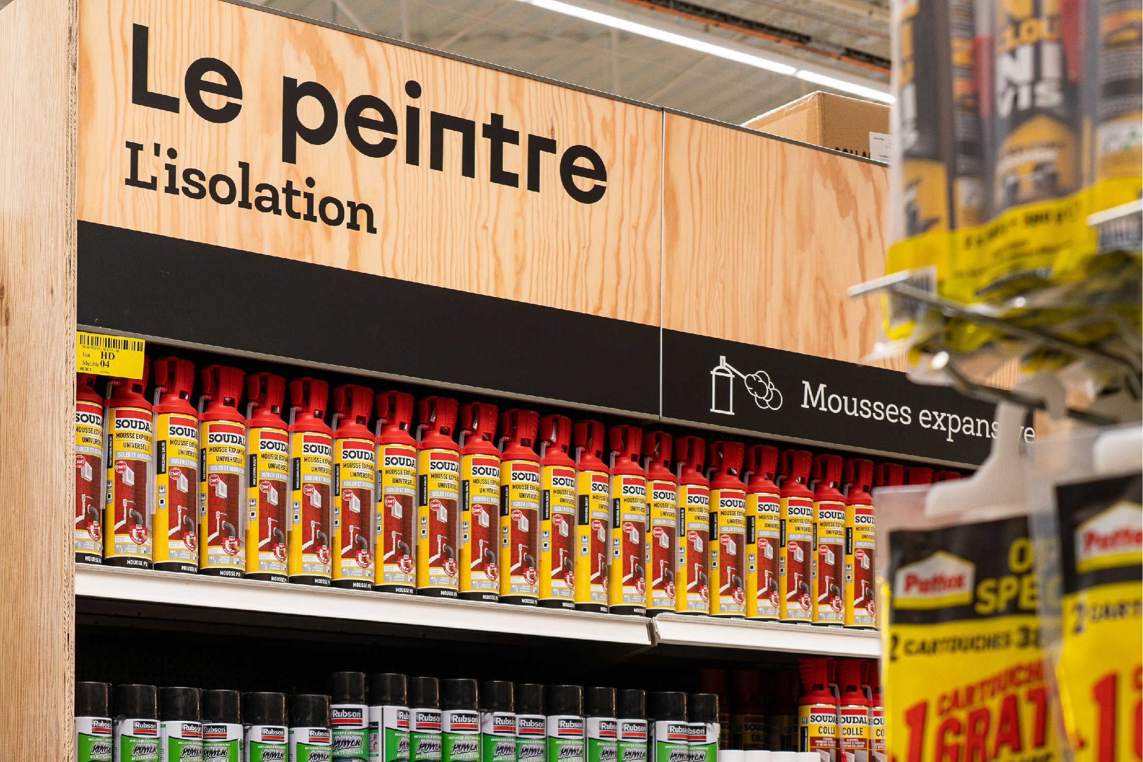
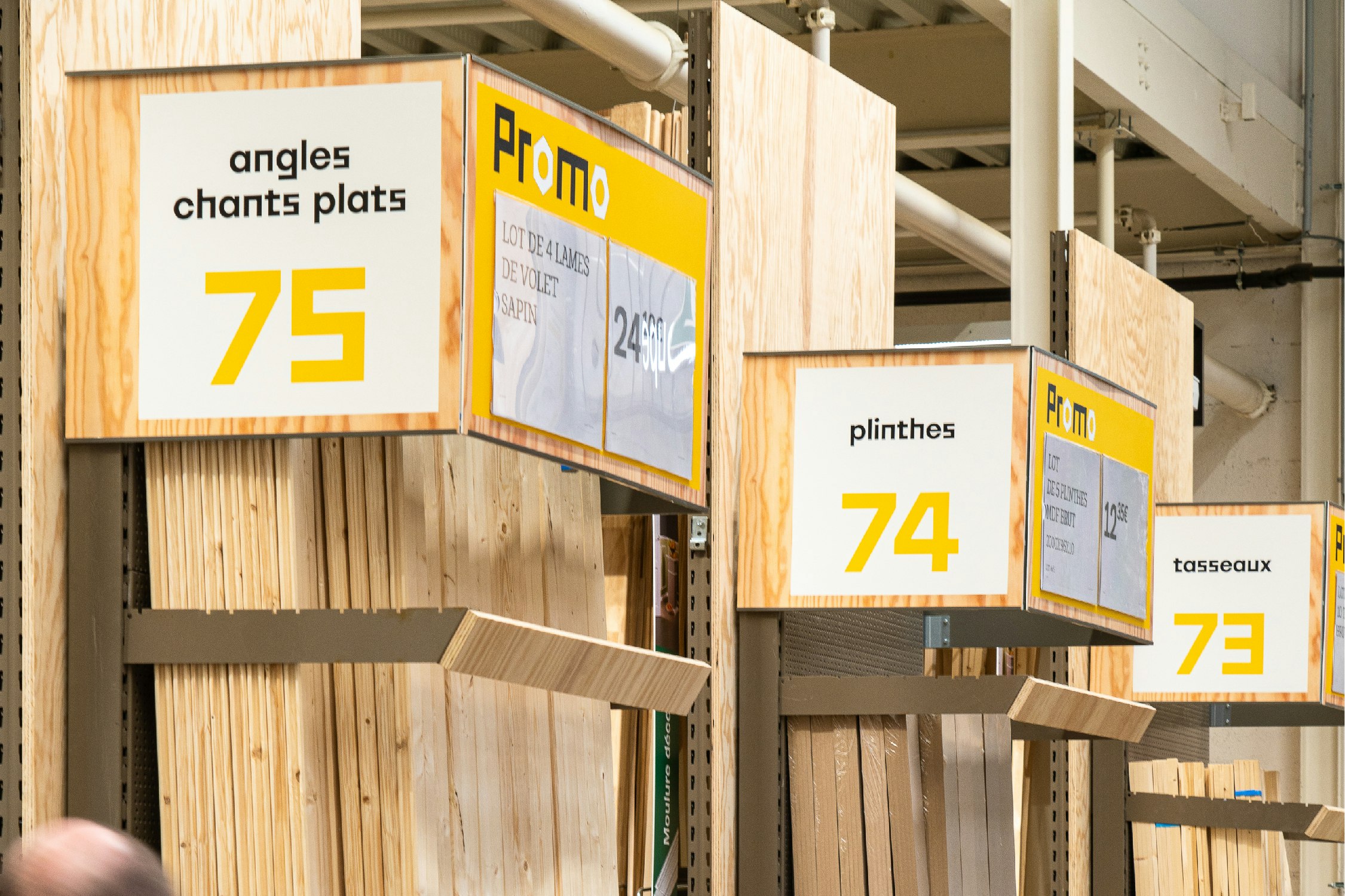
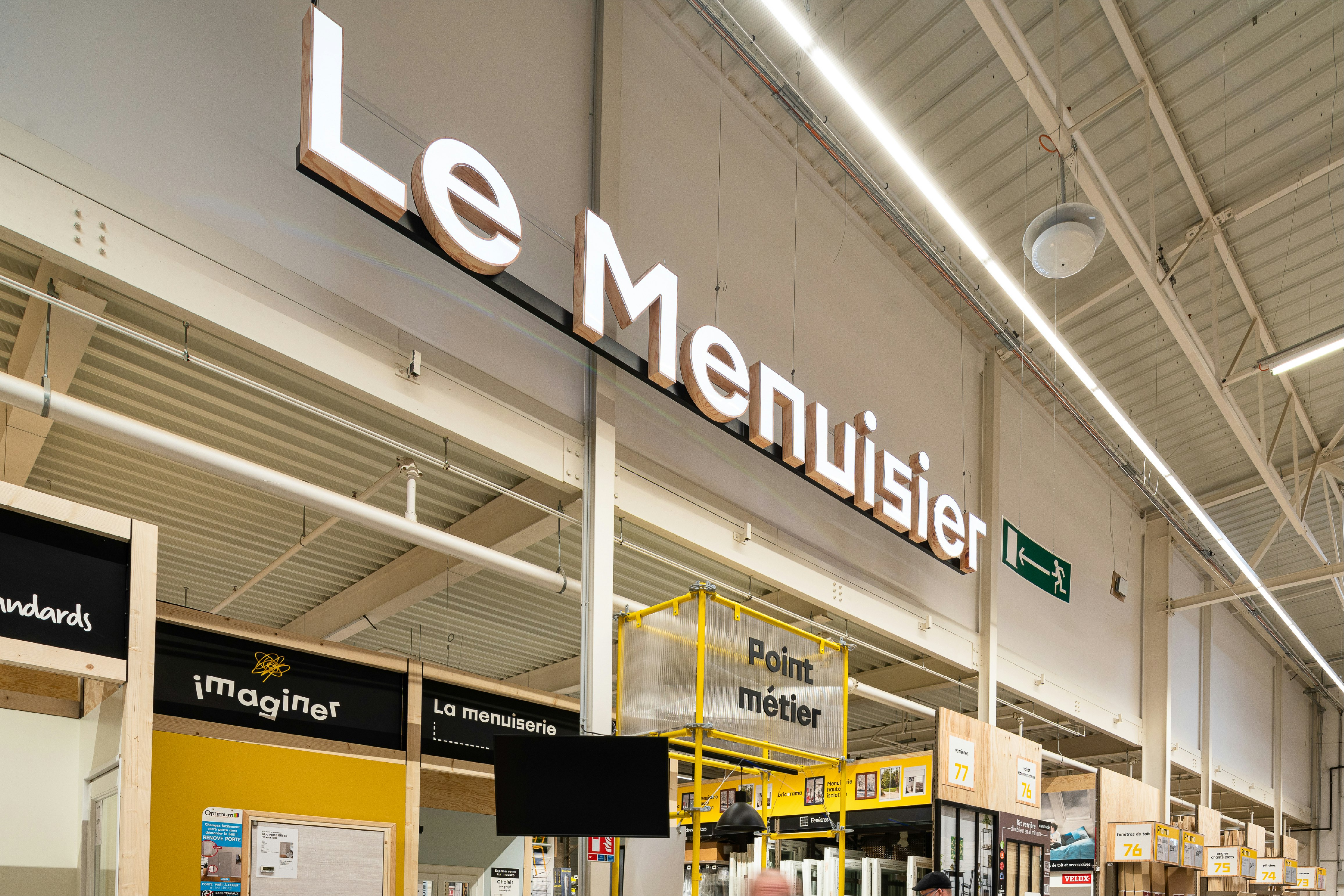
The departments are named after the trades they're associated with, to amplify the brand's expert role and create a feeling of proximity, so the sections are easy to identify in the customer journey.
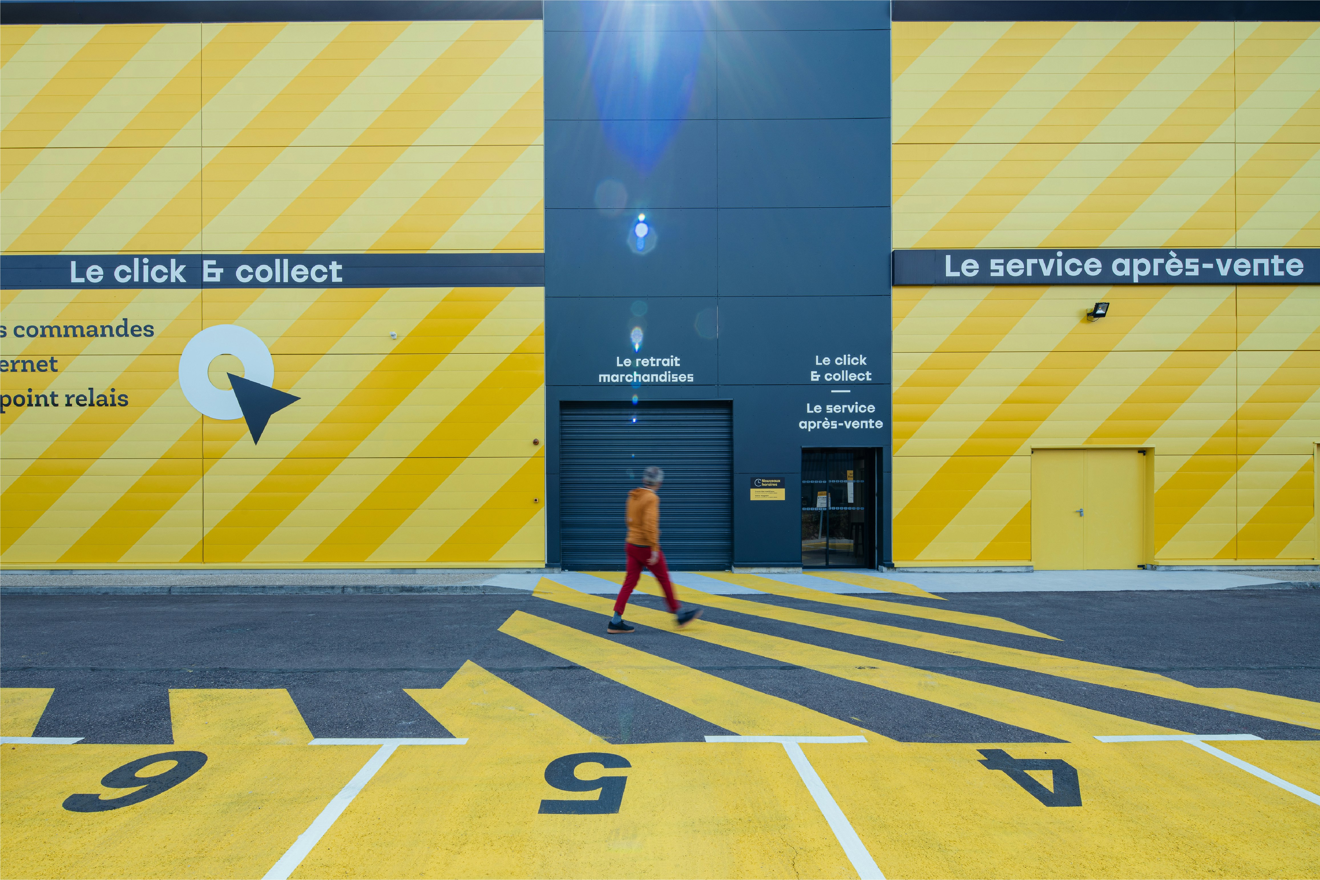
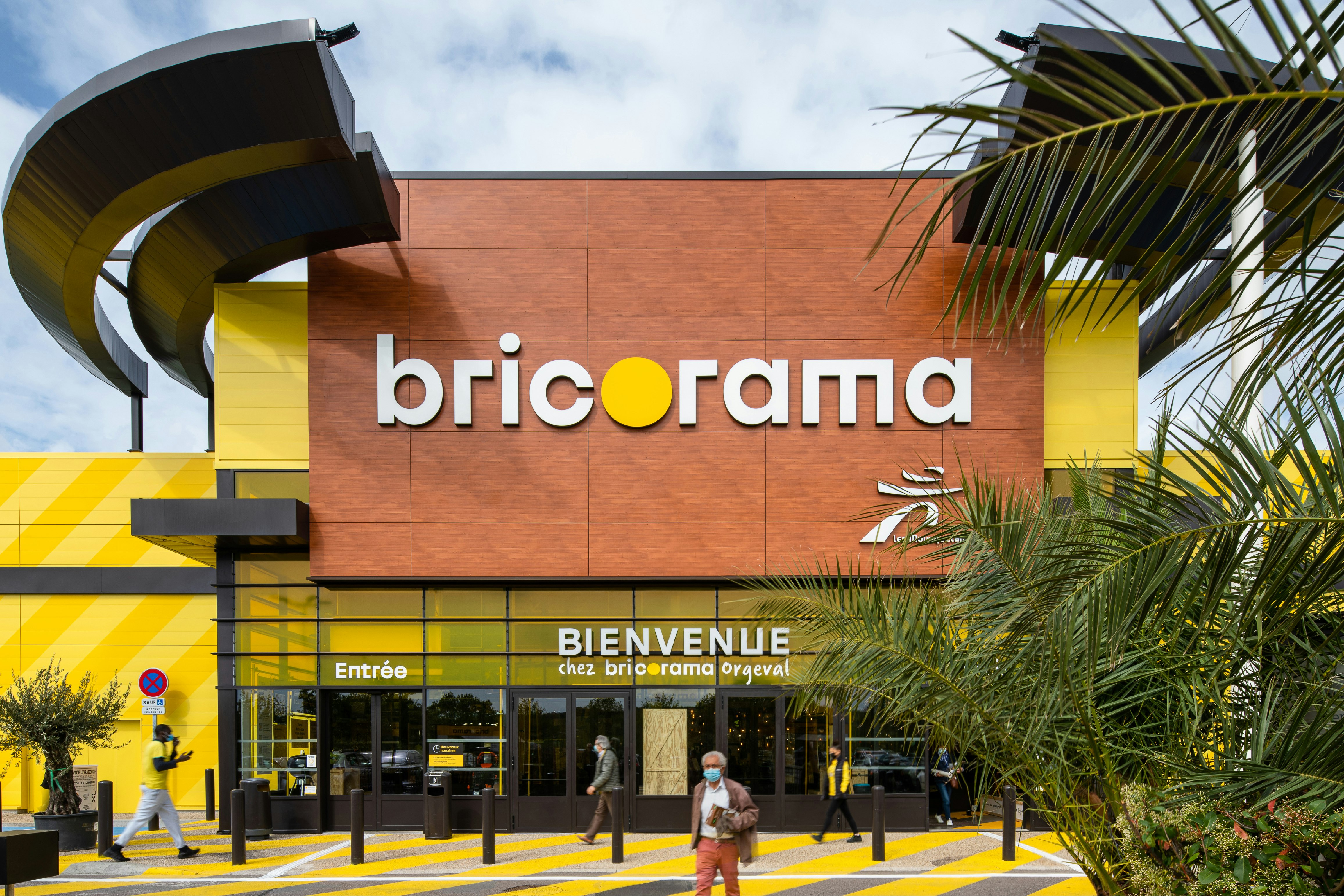
Finally, with a completely modernised façade, the treatment of the exteriors reflects the idea that each function of the sales outlet is visible on the outside.
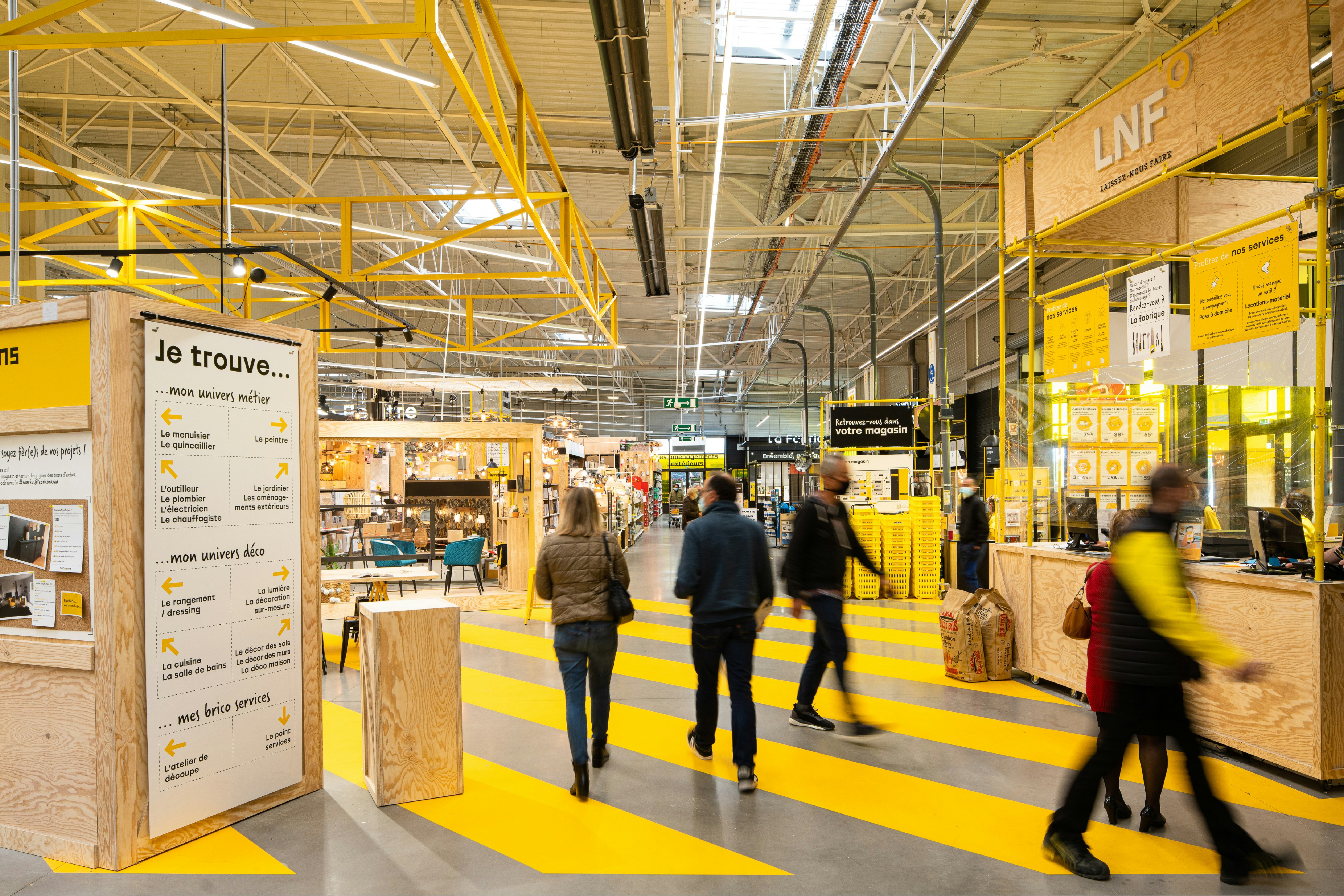
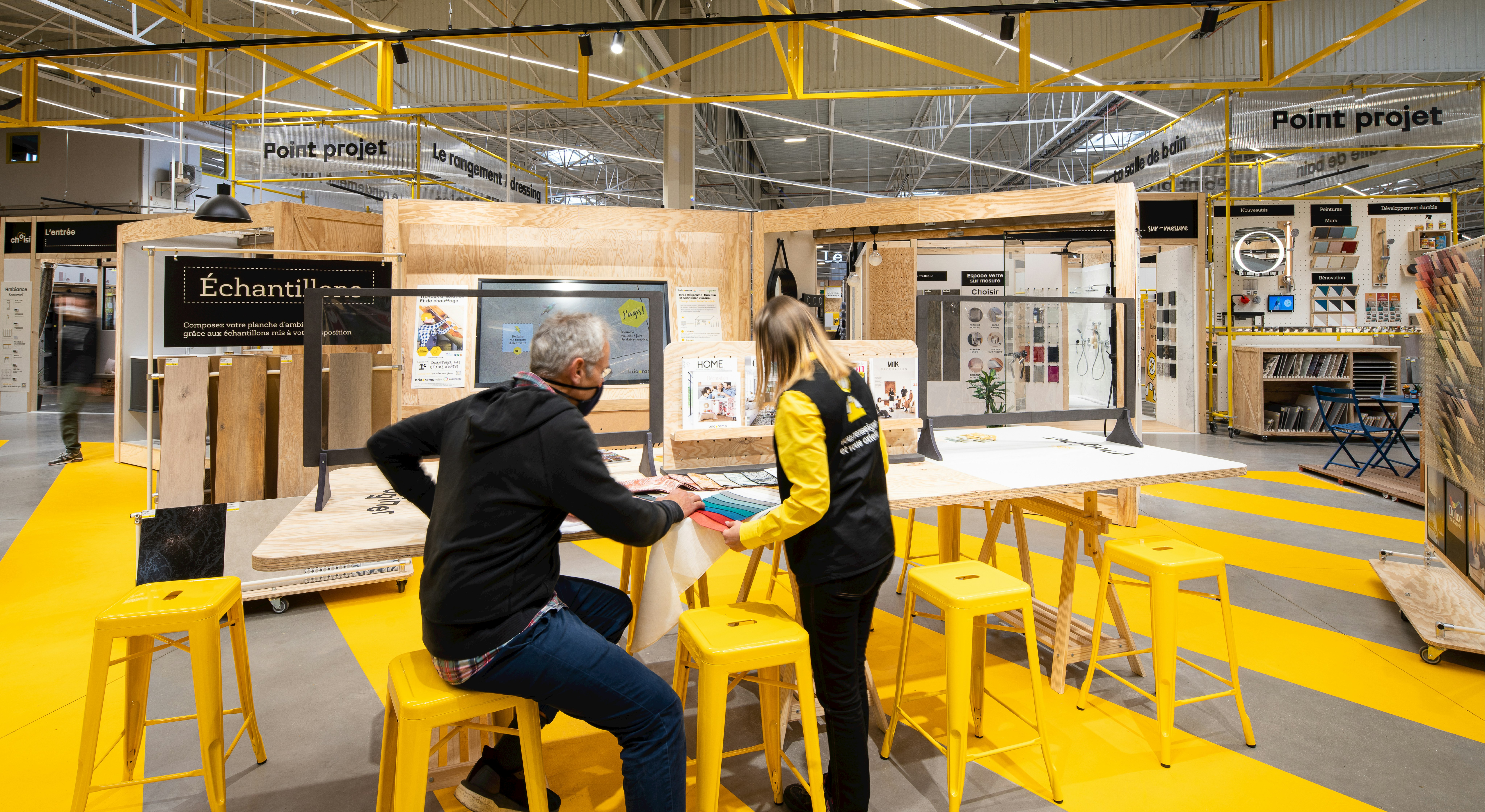
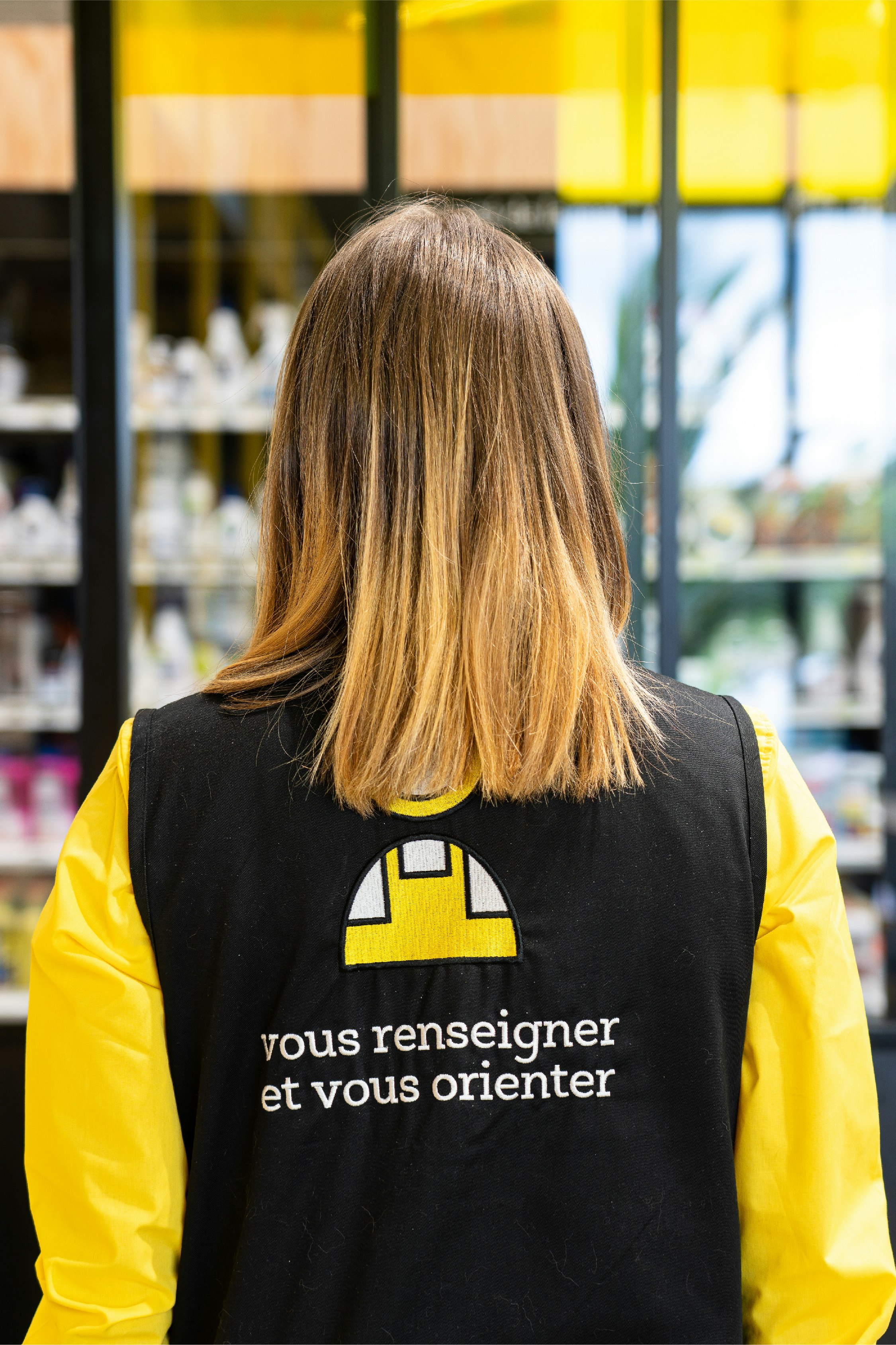
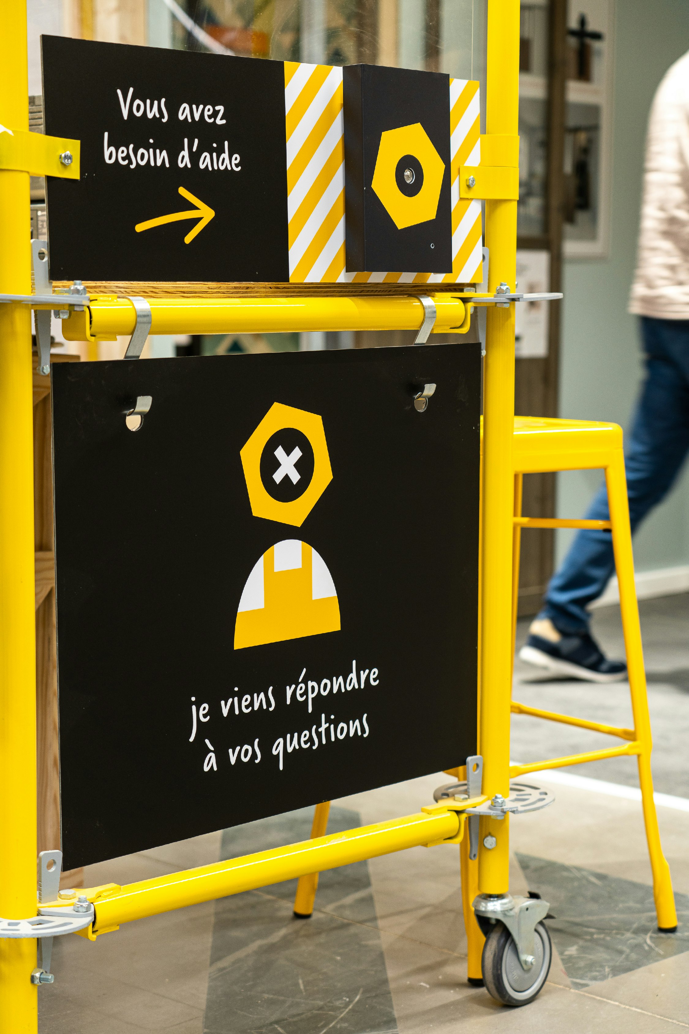
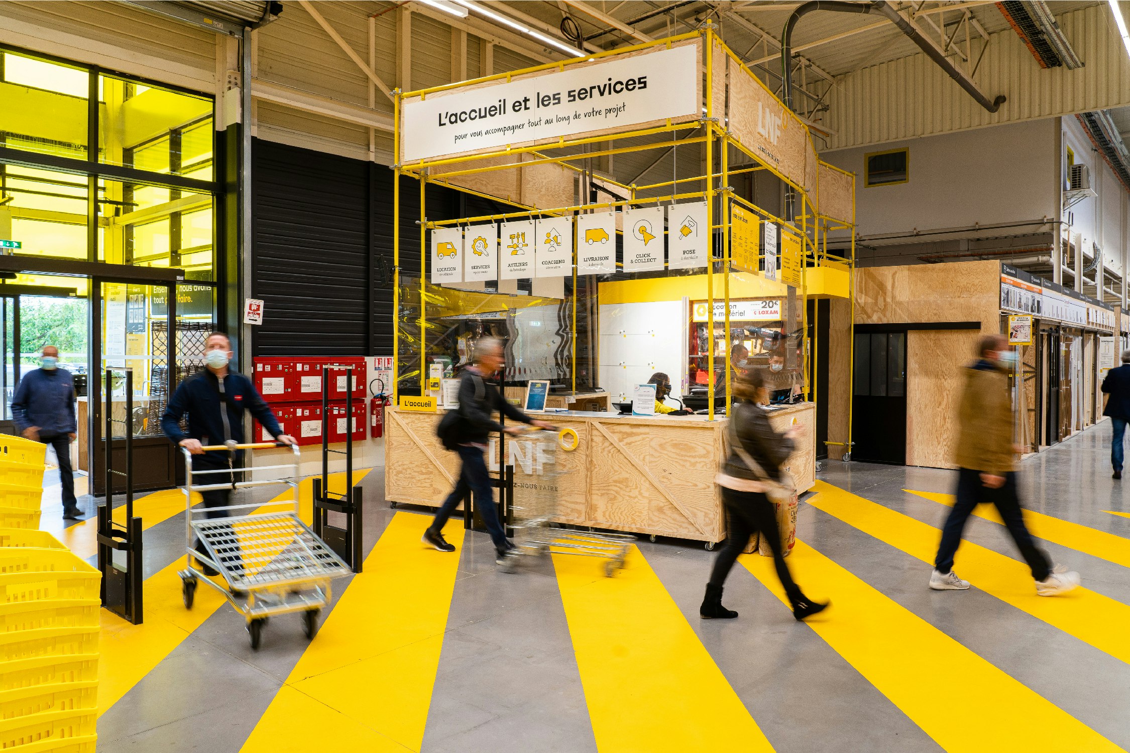
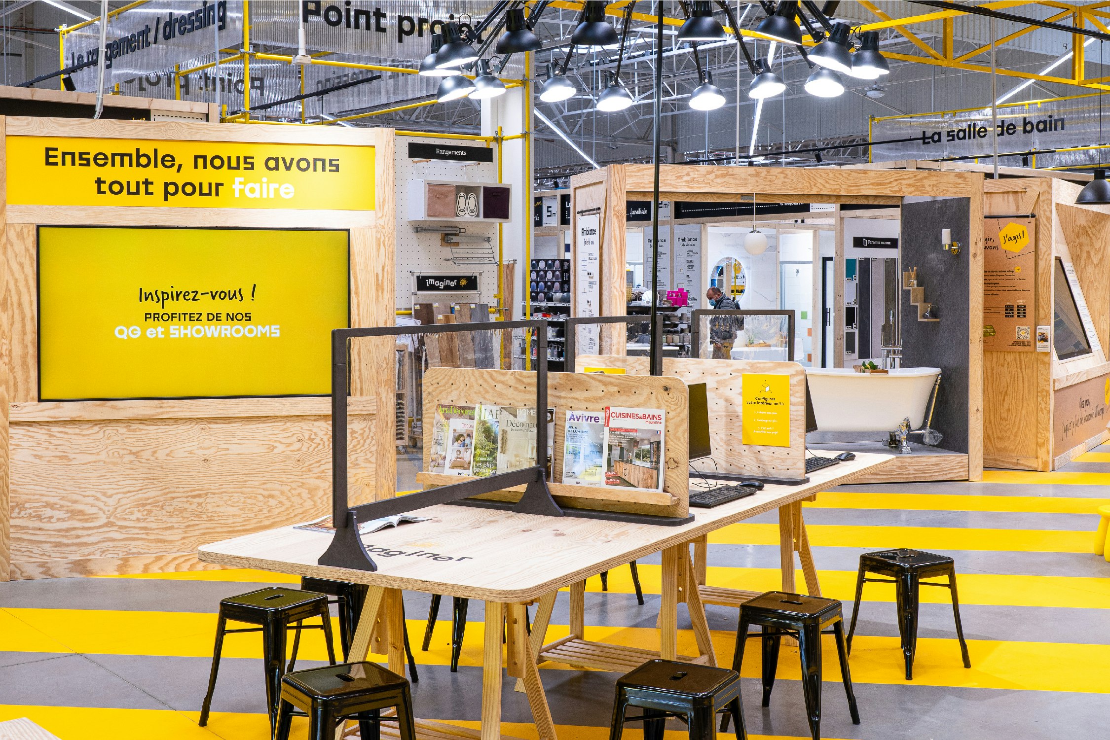
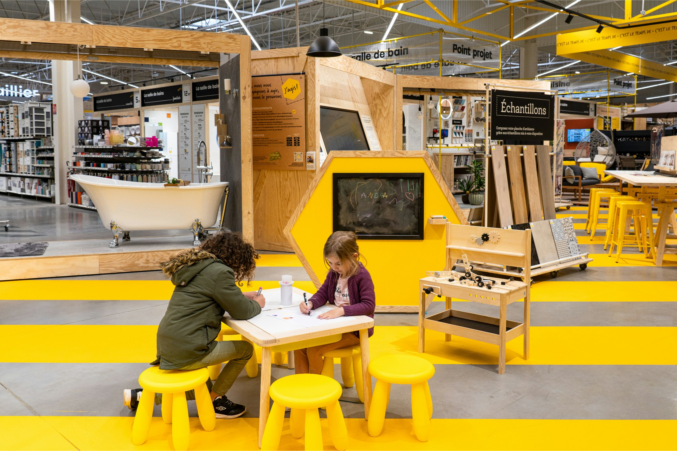
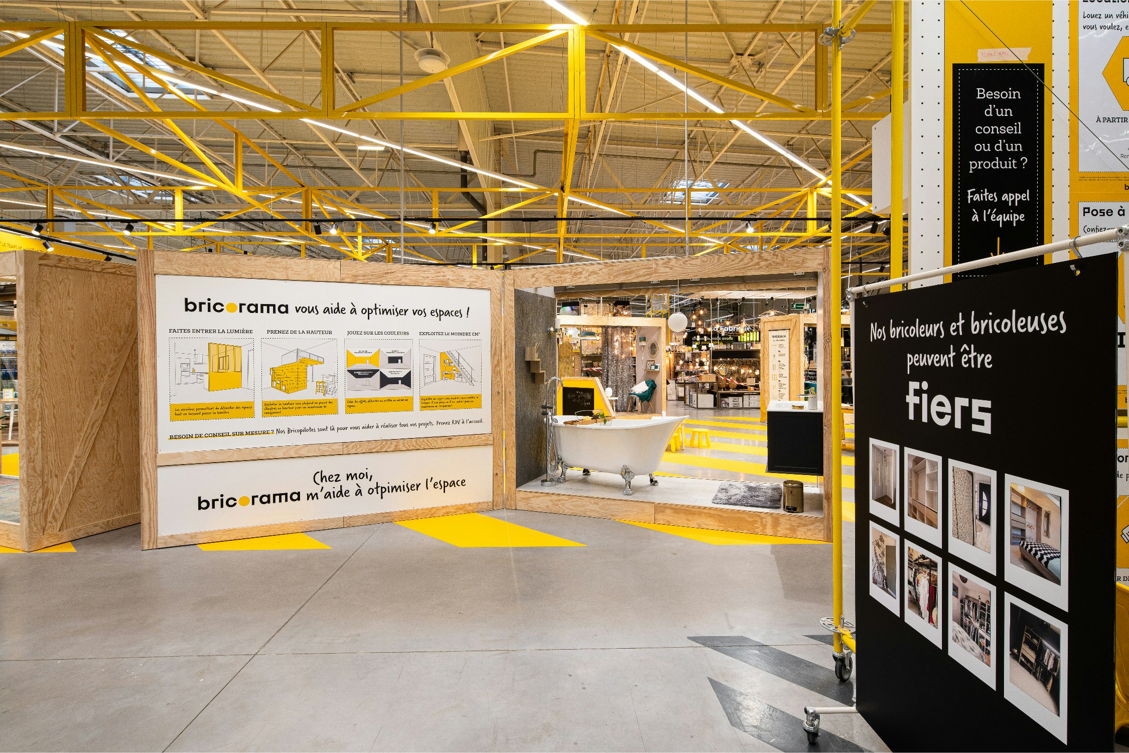
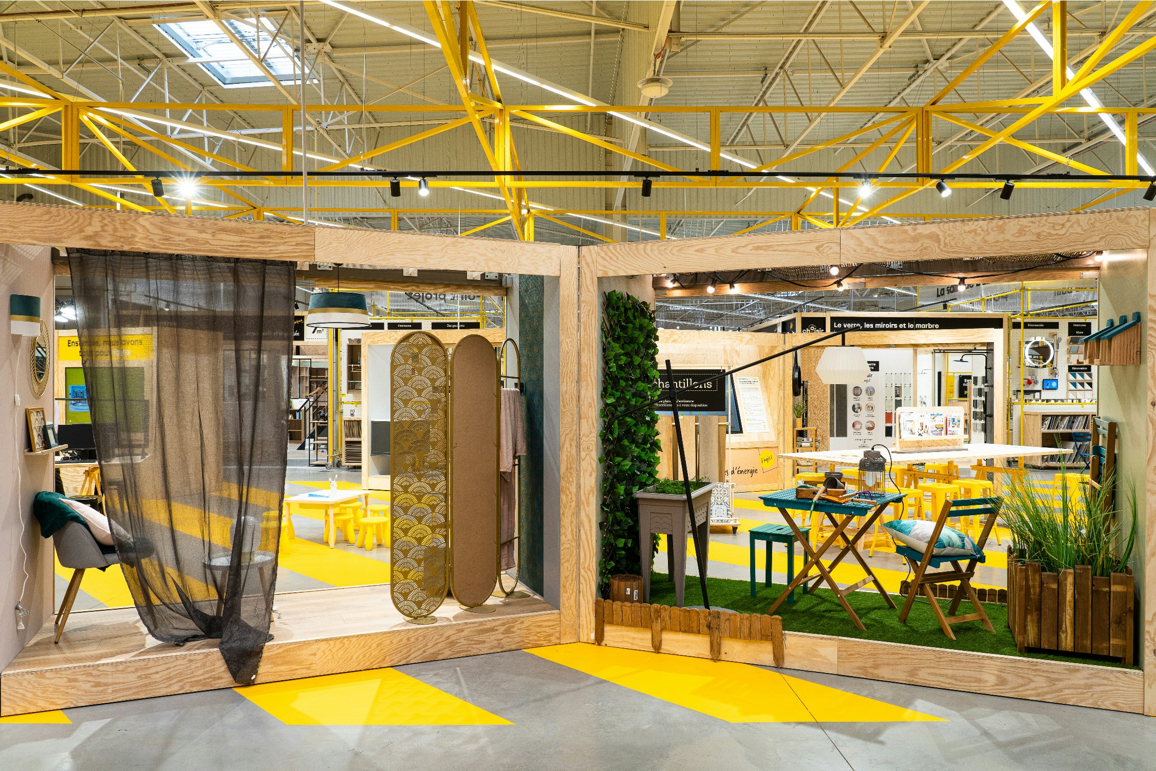
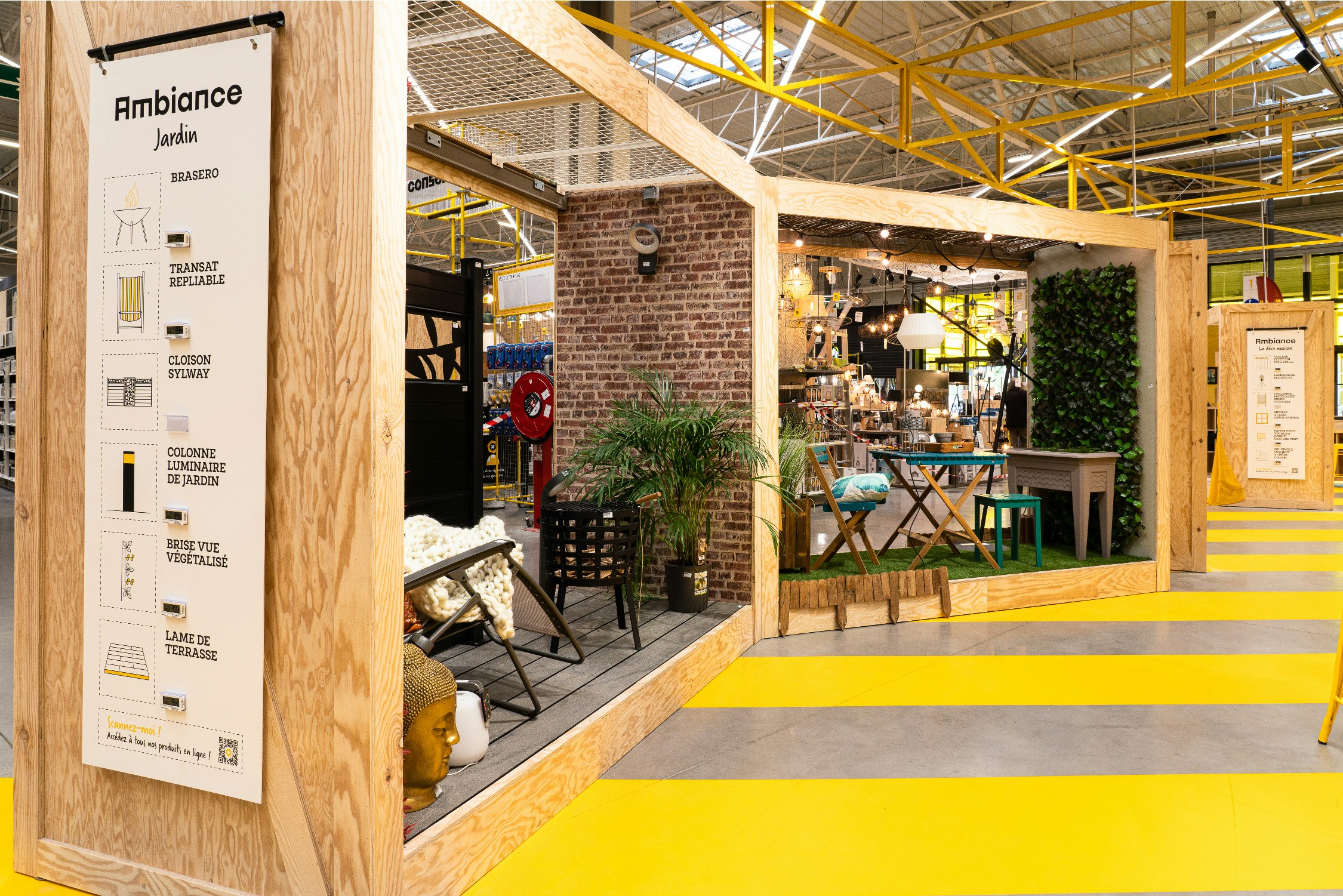
A new, accessible visual identity.
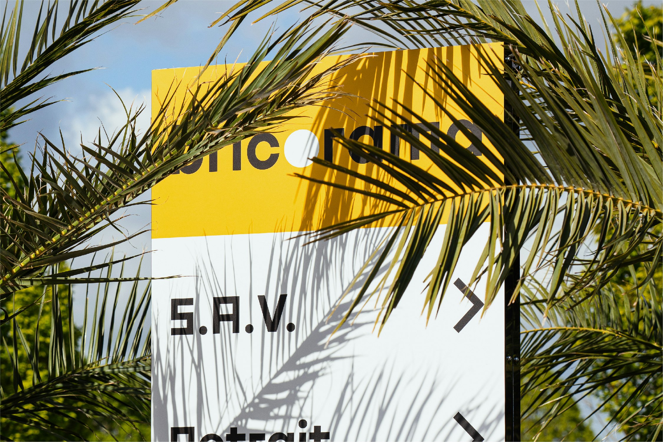
An update of the old identity based on black and yellow, with the solar circle that now merges into the central “O". A lowercase typography with a technological and mechanical yet welcoming feel, teamed with a new graphic concept applied to all the POS displays and signage in the store, as well as to all the customer's points of contact with the brand. Objective: clarity and proximity.

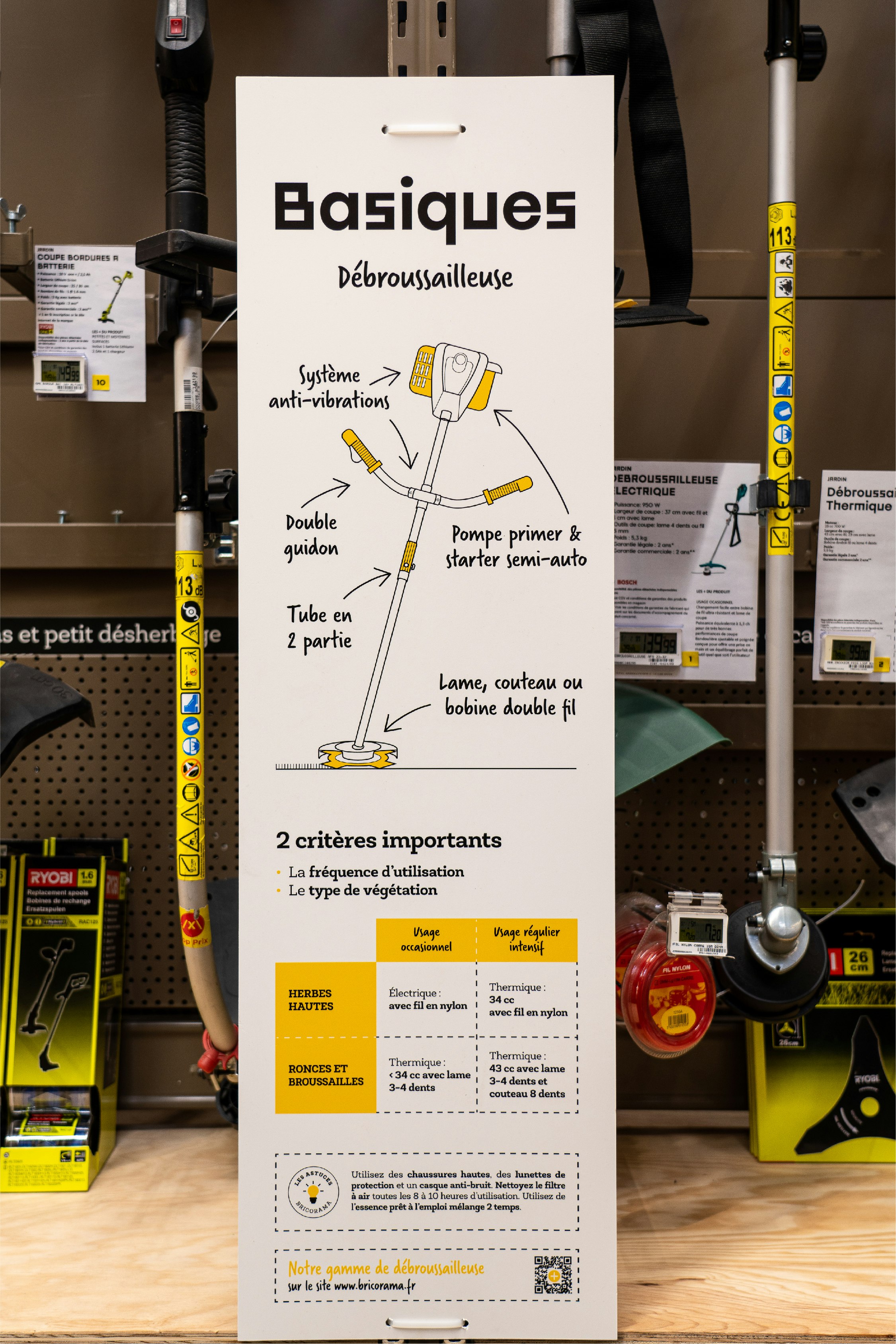
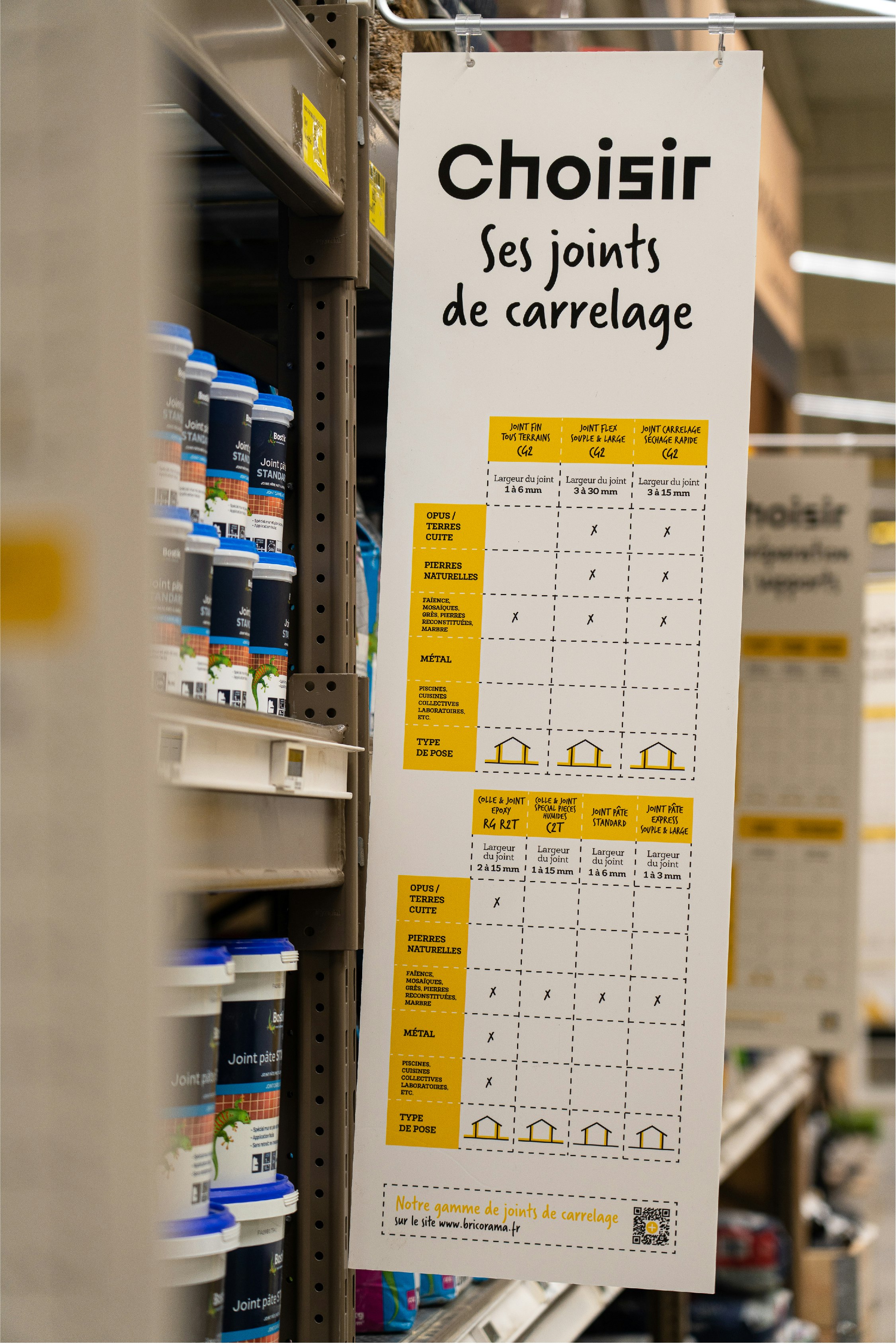
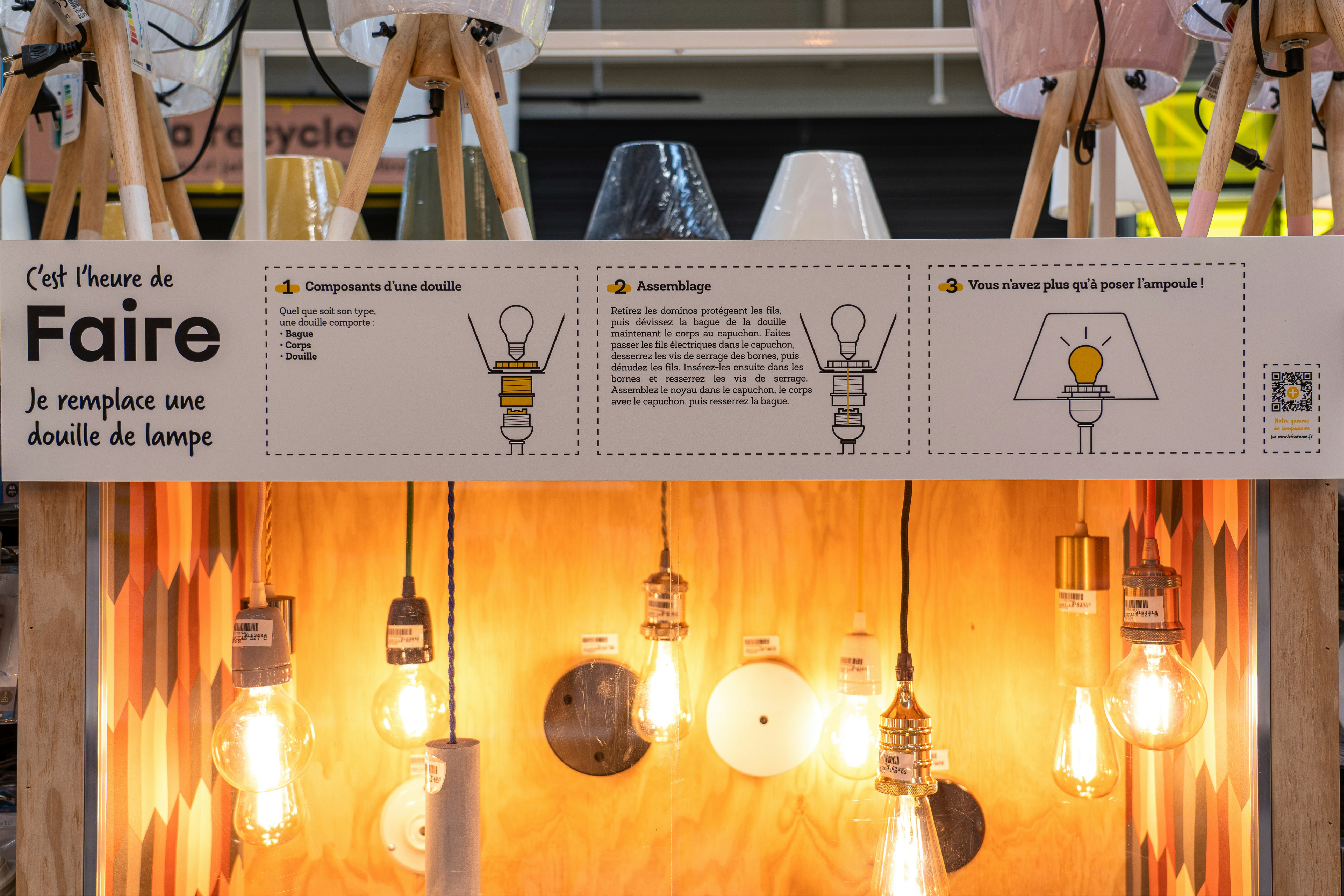
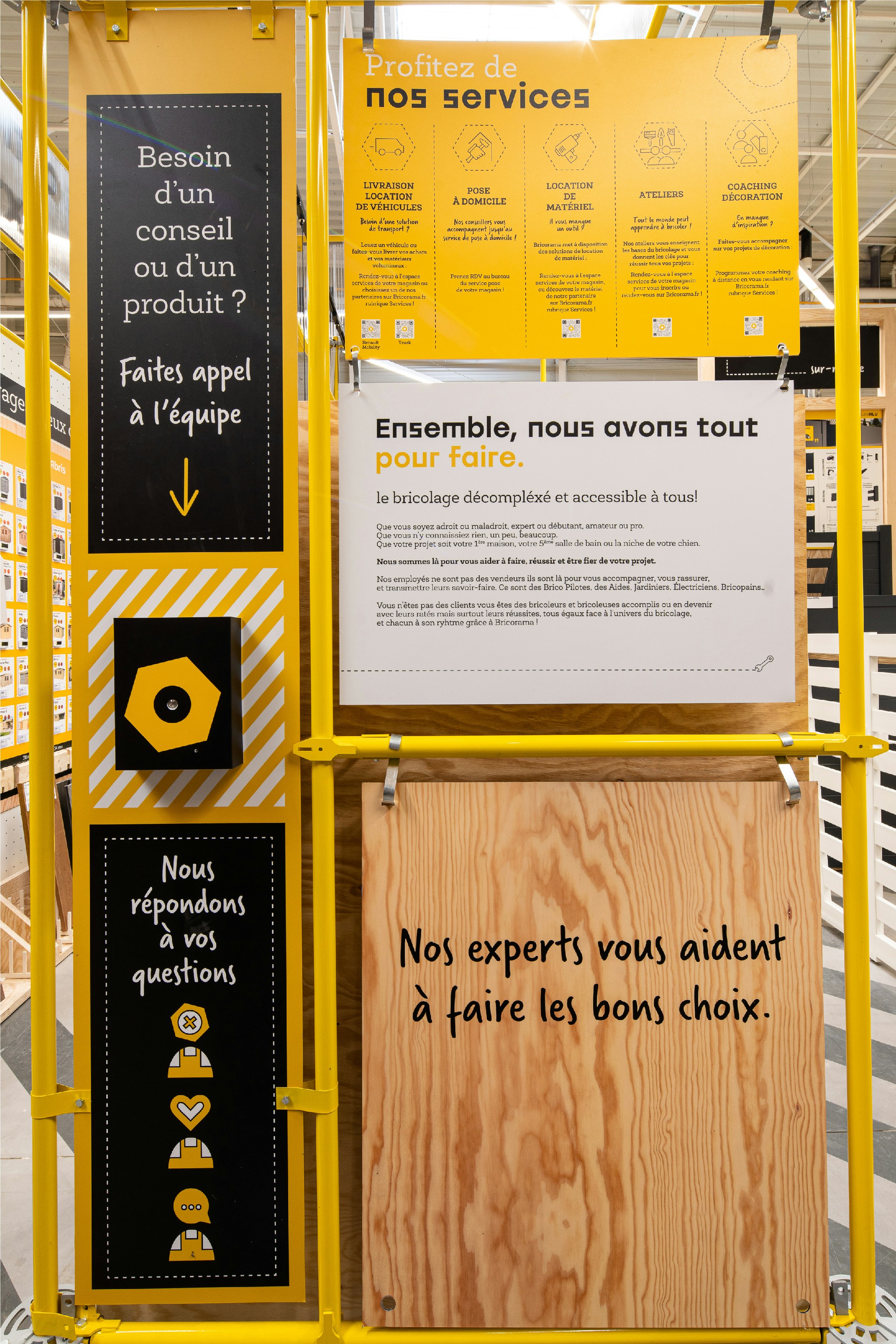
An informal "workshop" setting to support architectural aspirations.
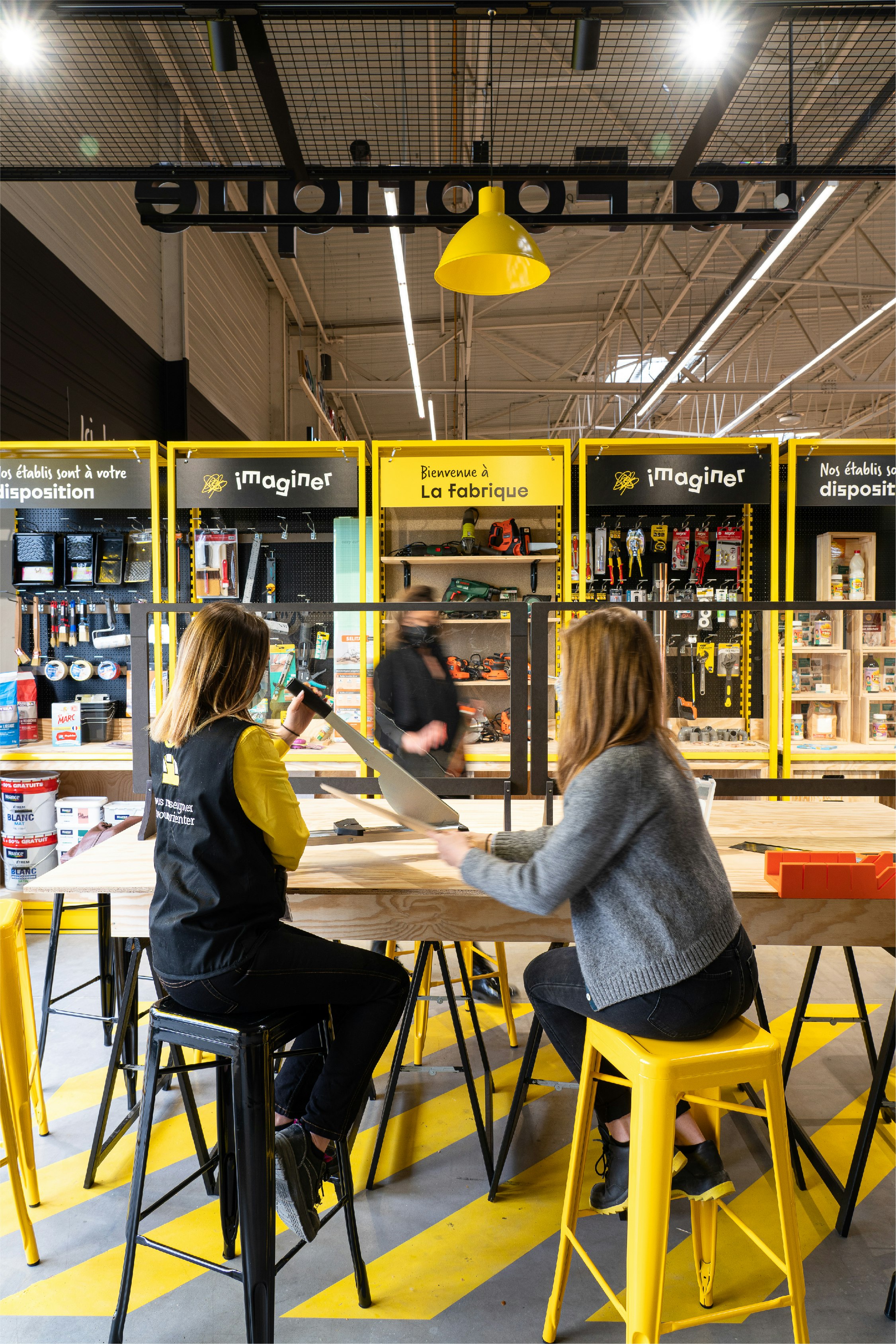
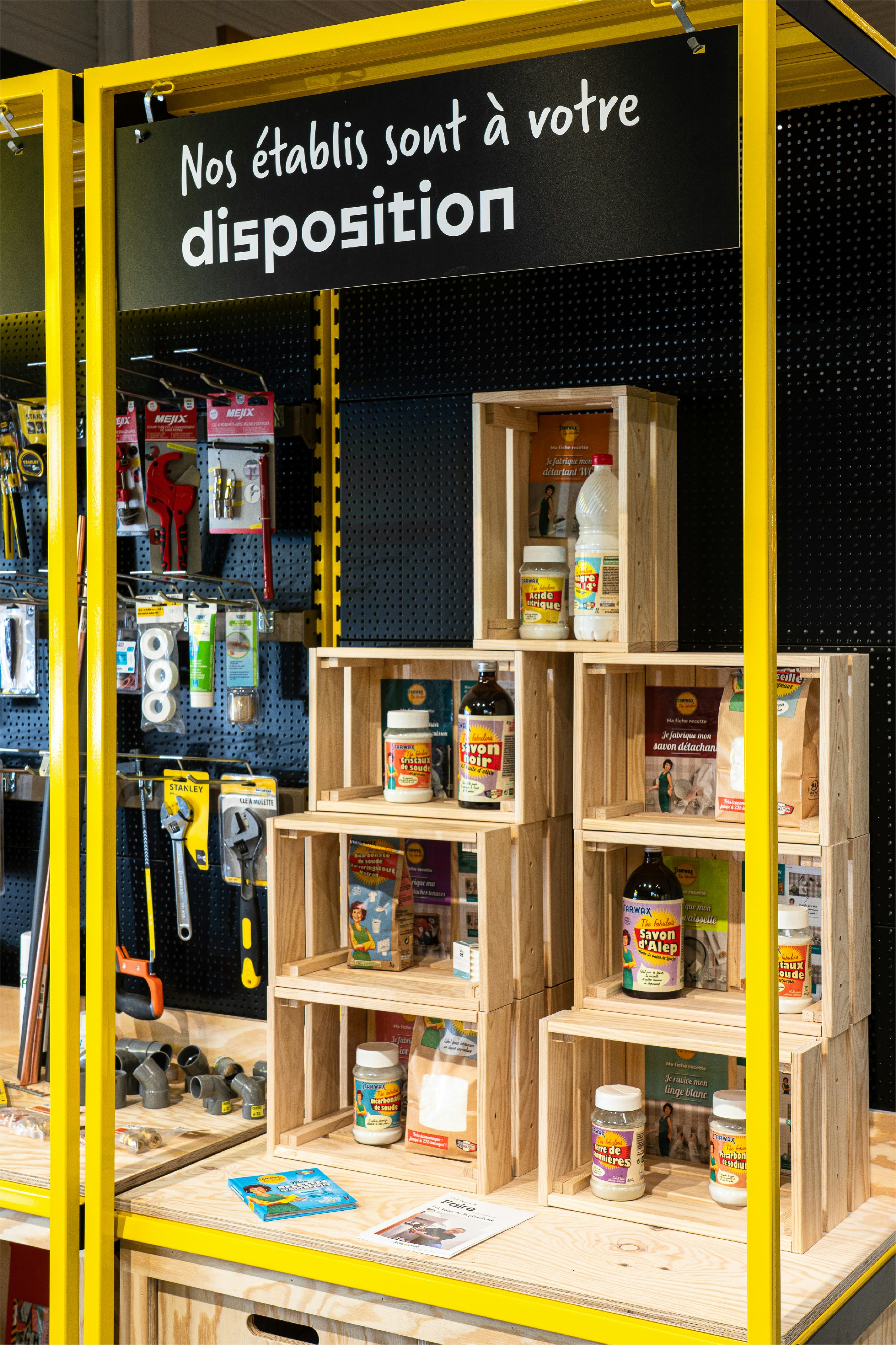
To create a fresh, contemporary feel and, most importantly, to stand out from other players on the market, we opted for specific materials to develop a relaxed and accessible workshop setting. Wood, yellow scaffolding and efficient diagonal lighting is combined with signage implemented in a very structured way, to enhance the clarity of the store and provide information on the project and products.
New, personalised experiences.
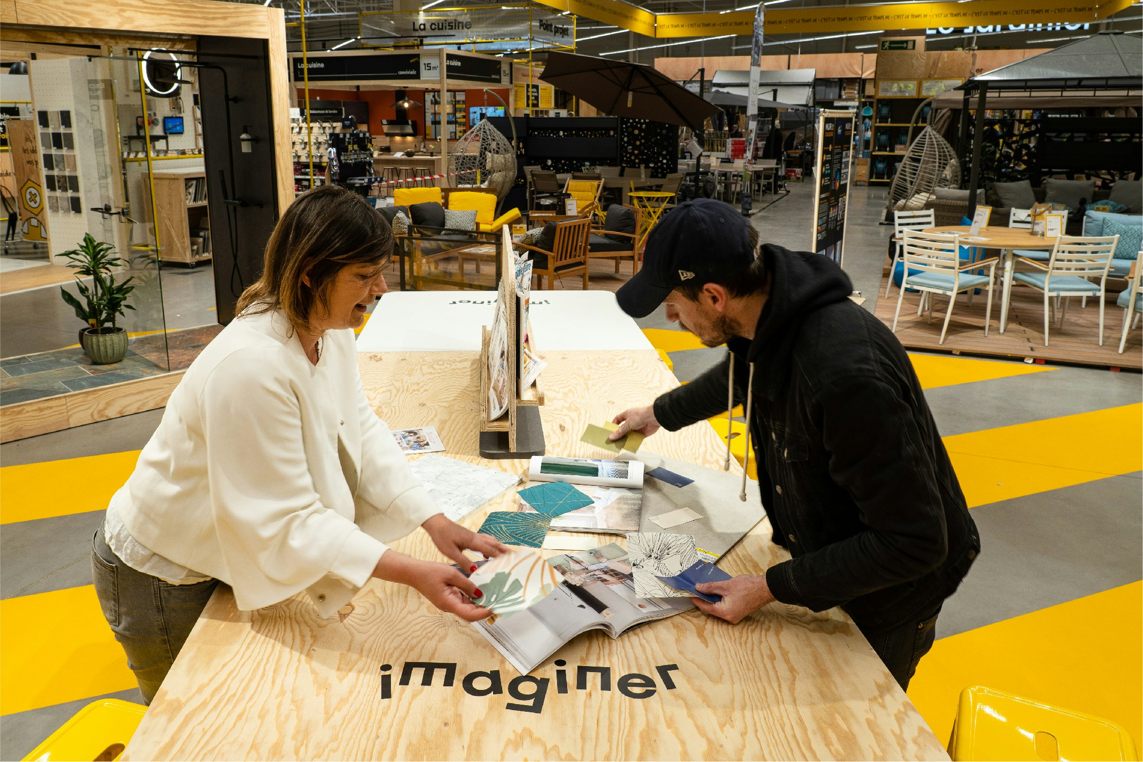
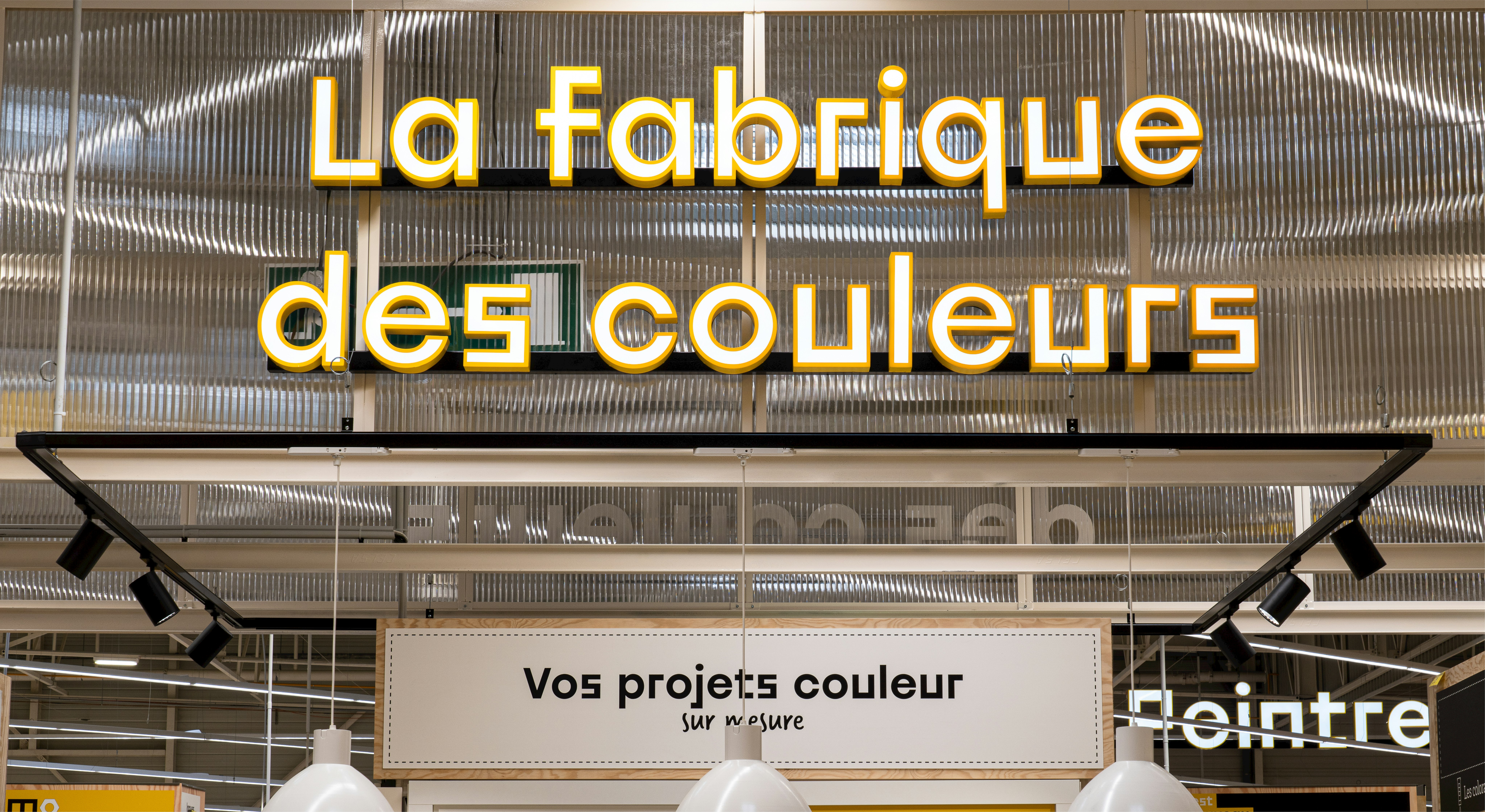
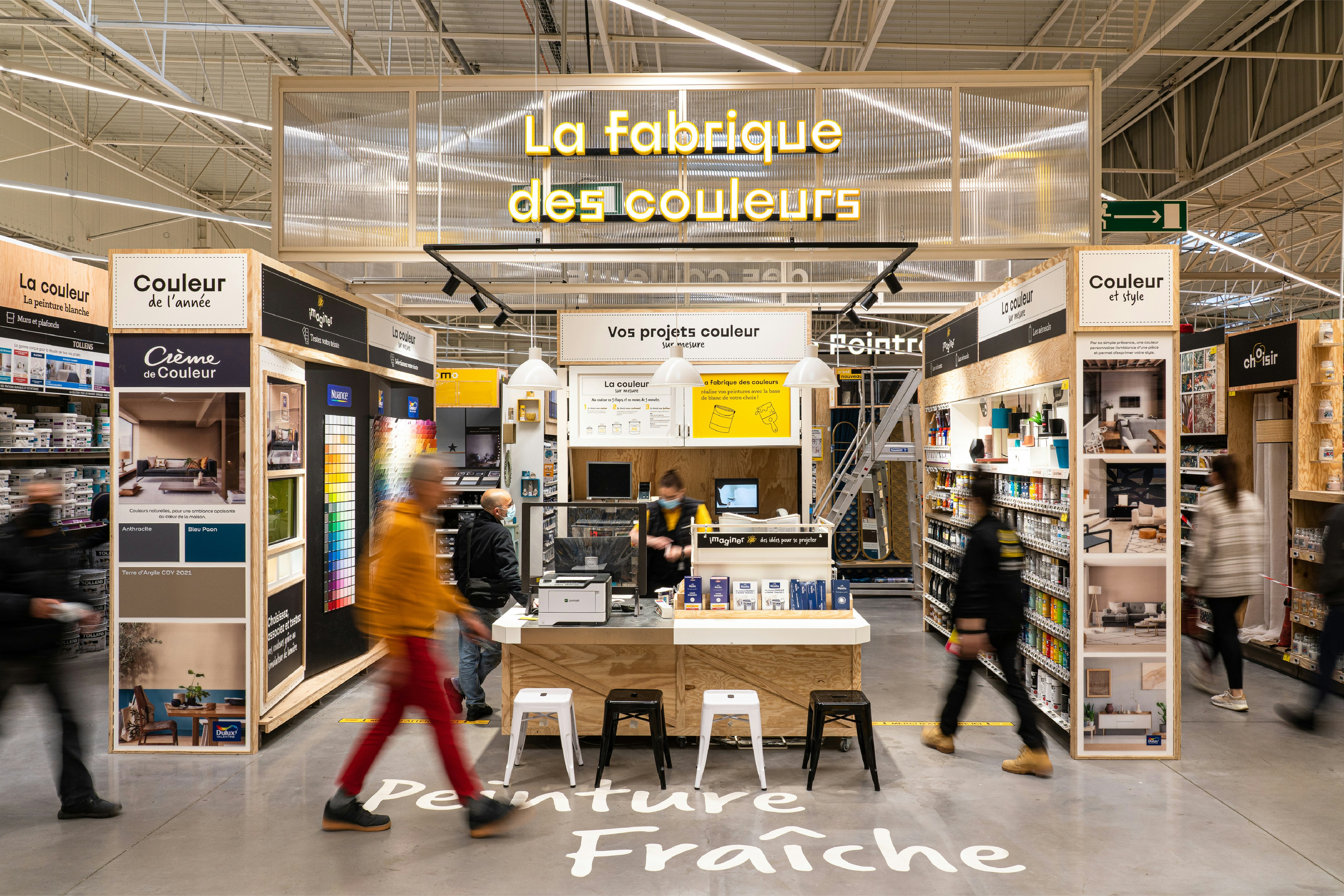
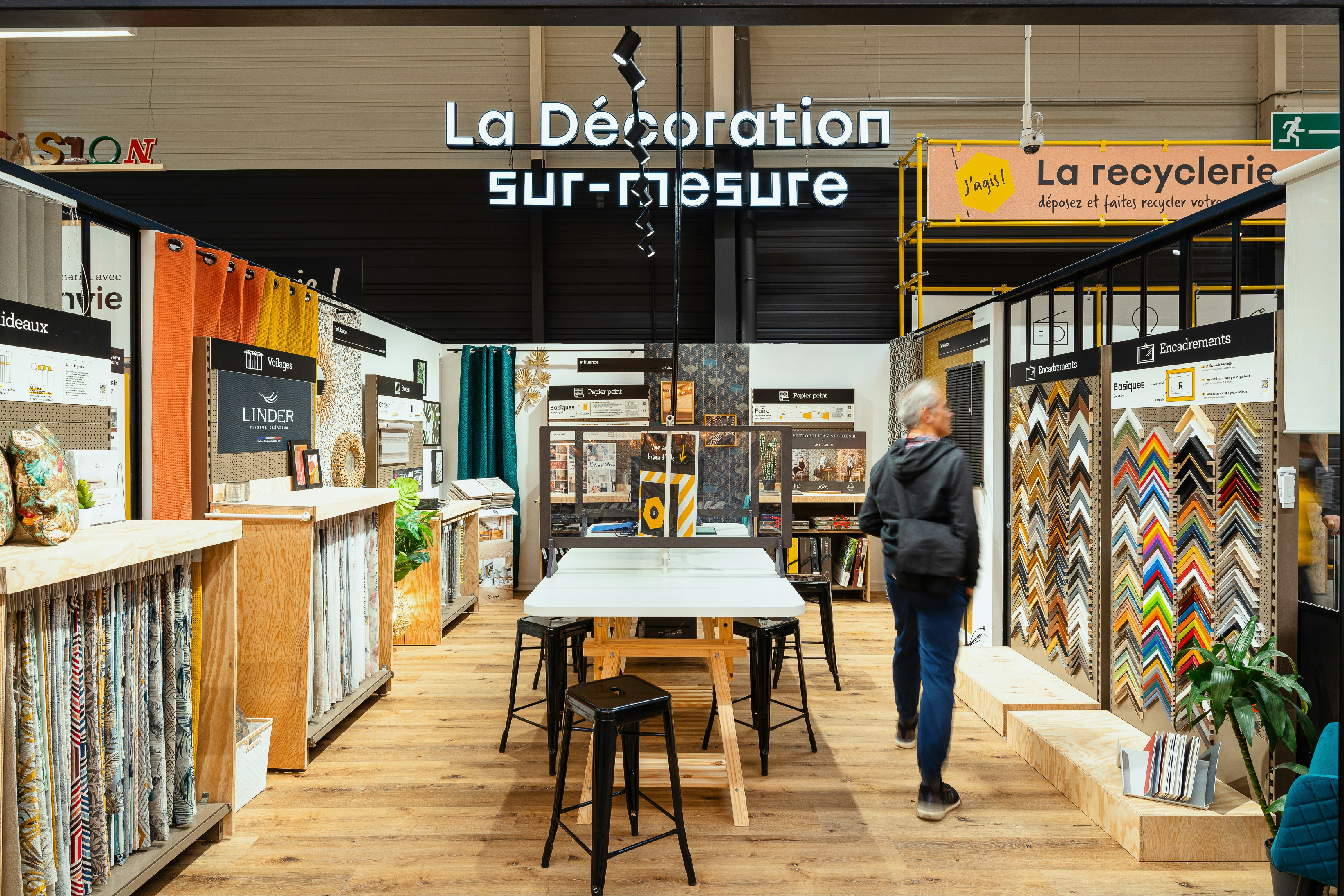
To help its customers to carry out their projects down to the smallest detail, the new concept offers spaces dedicated to personalisation, with La Fabrique des Couleurs in the paint department and the bespoke interiors space. Another new addition is La Fabrique, a space conceived like a DIY workshop, providing all the tools that DIYers need to carry out their projects, and designed to be available for hire as well as to host educational workshops.
A sustainable approach!
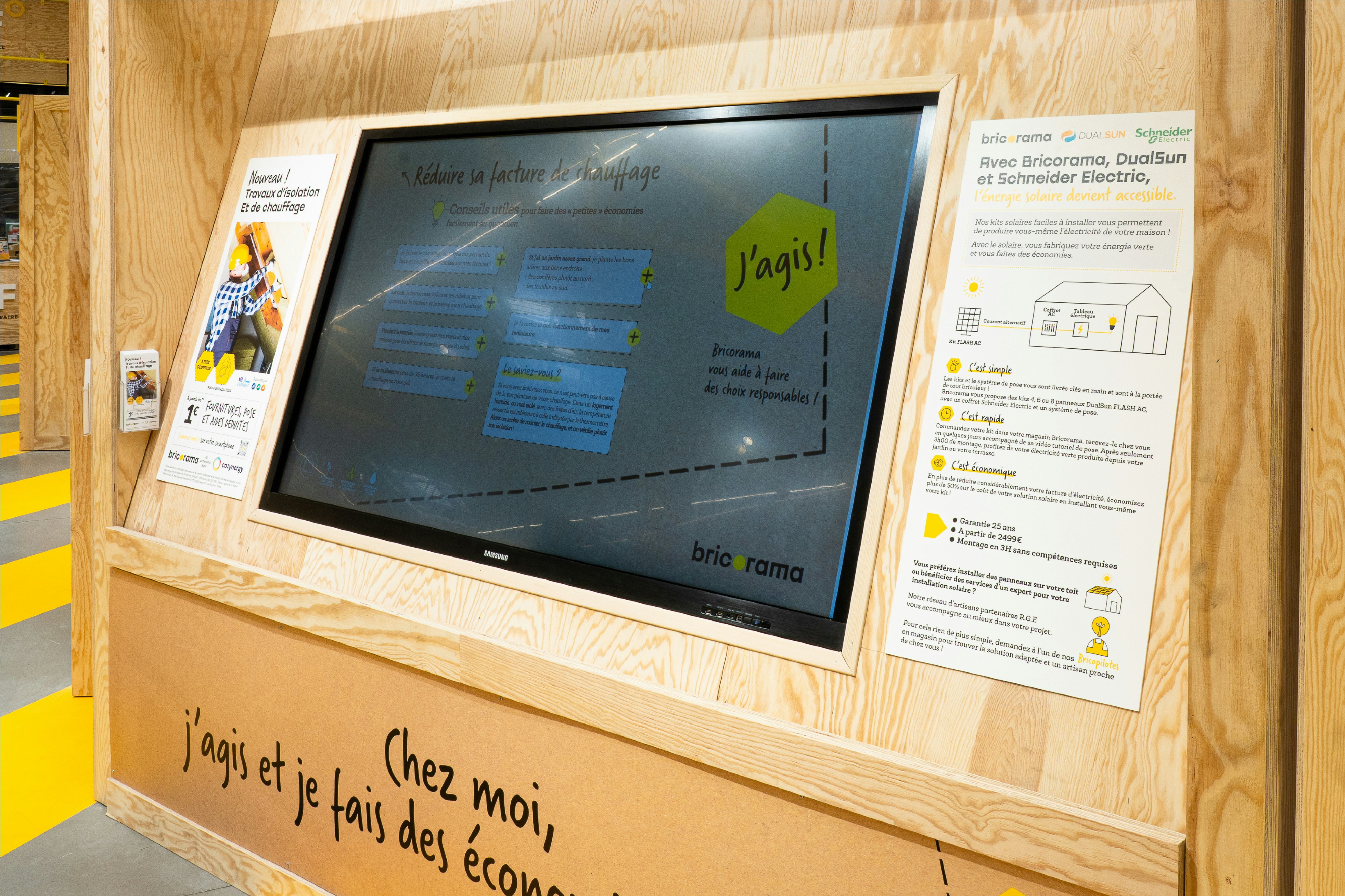
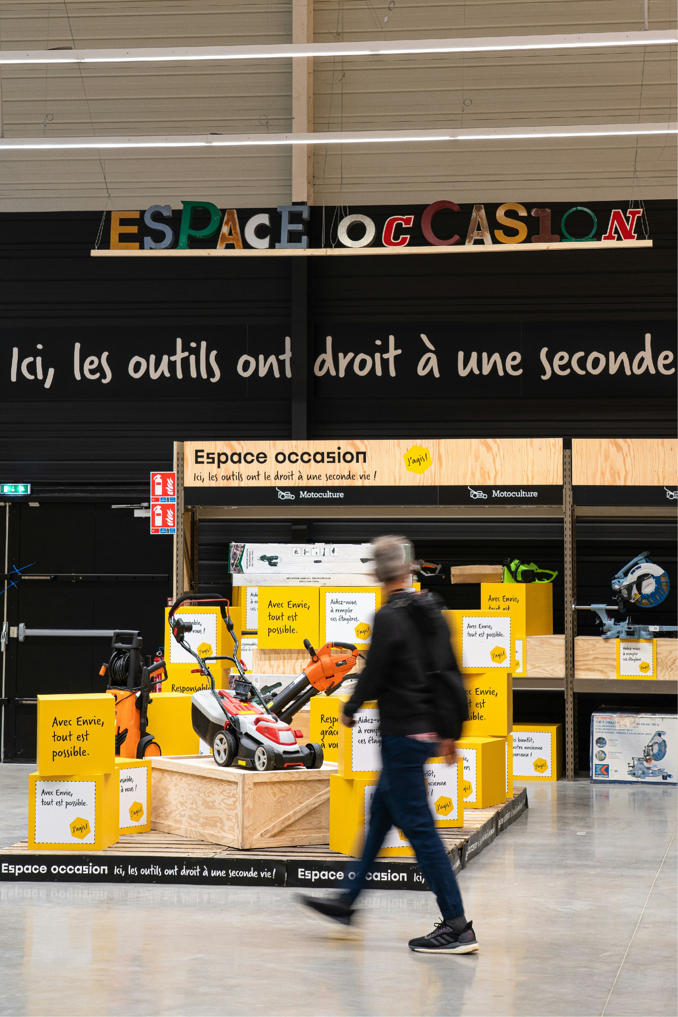
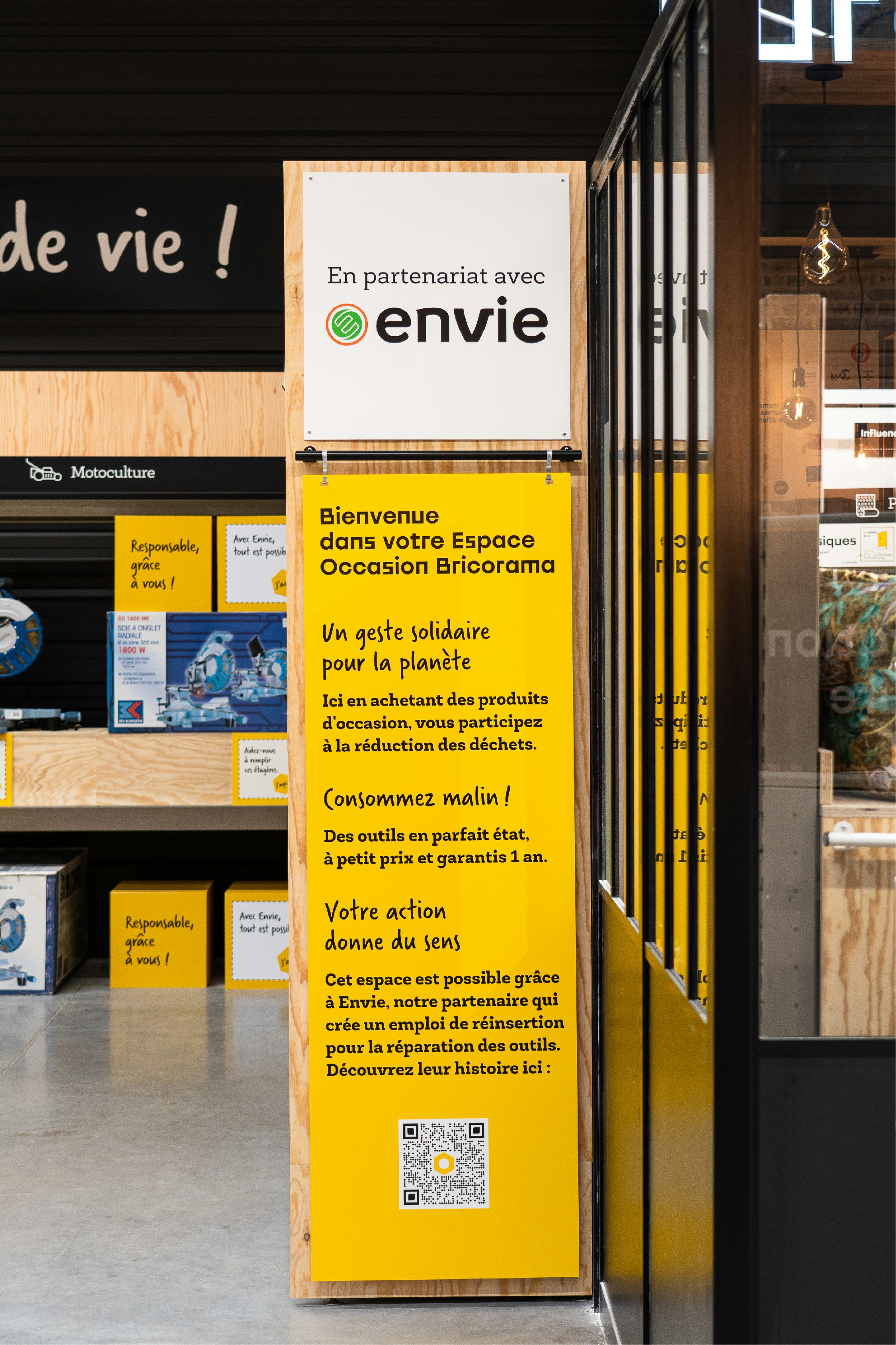
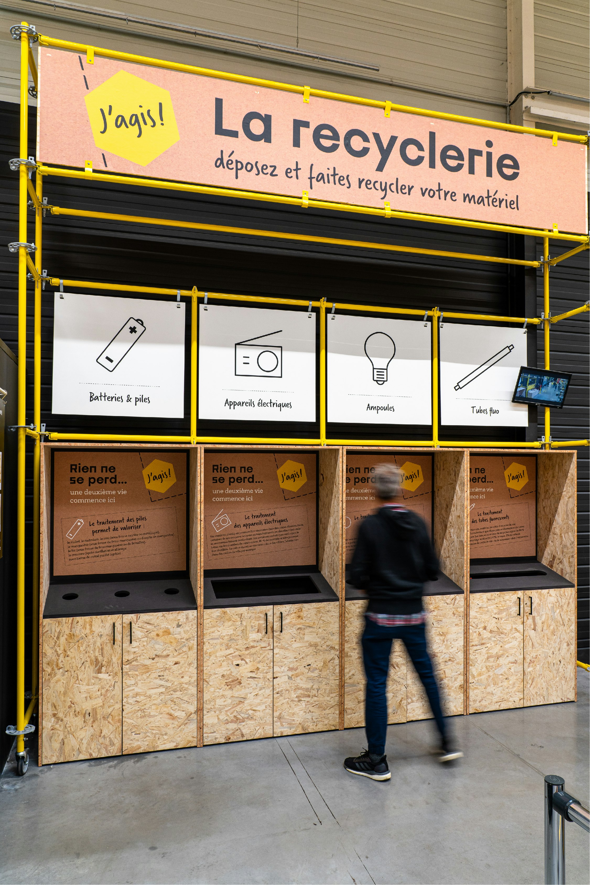
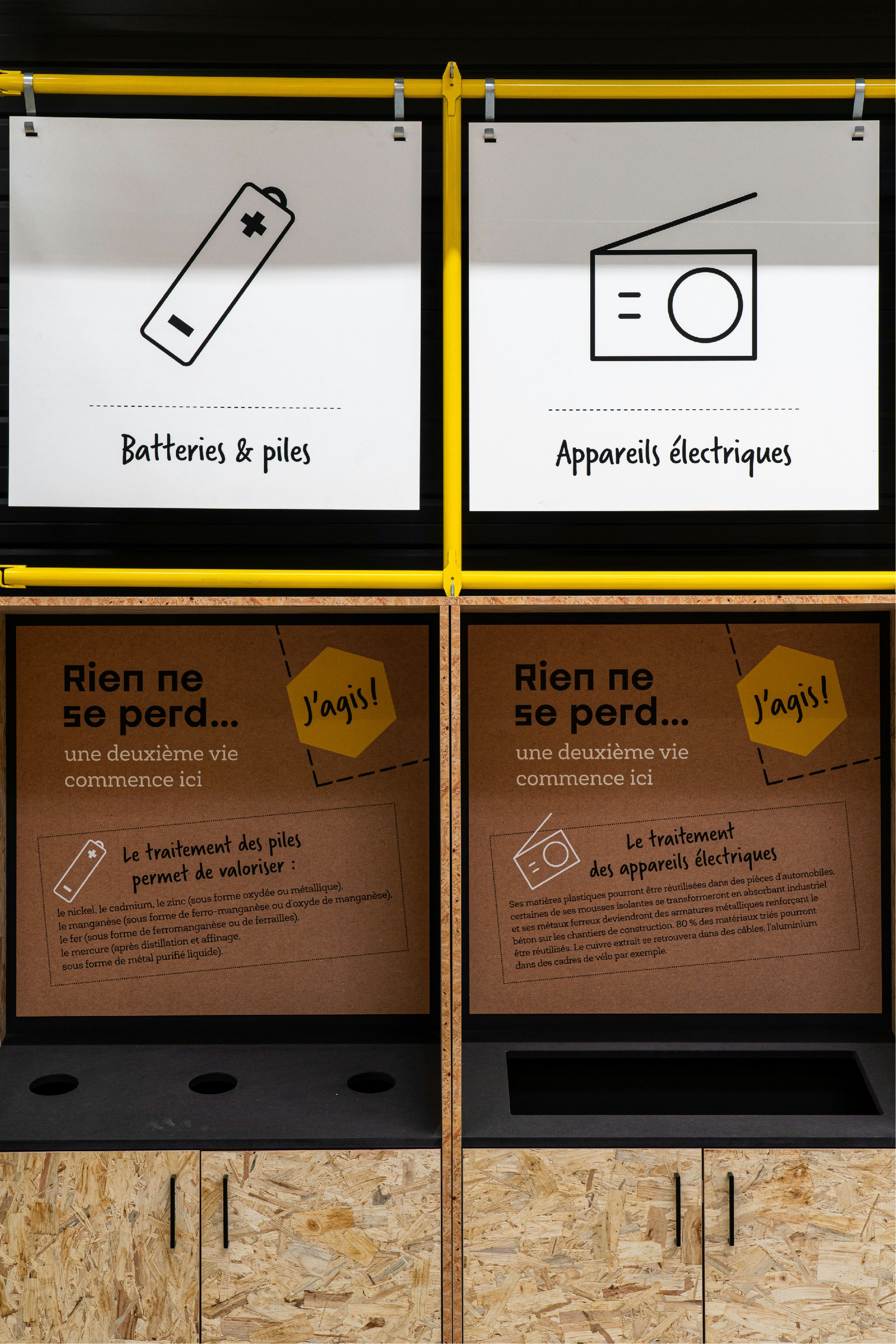
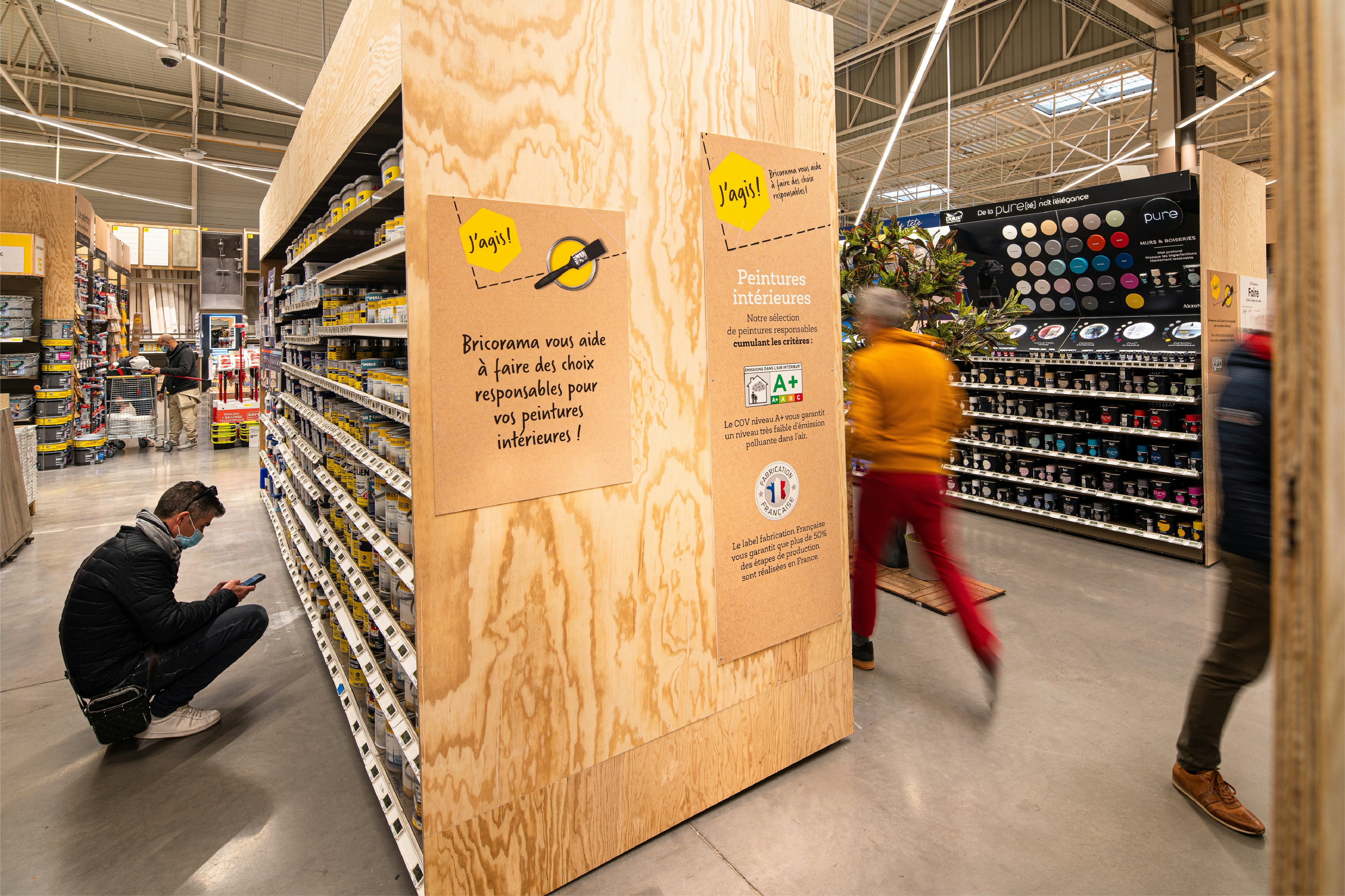
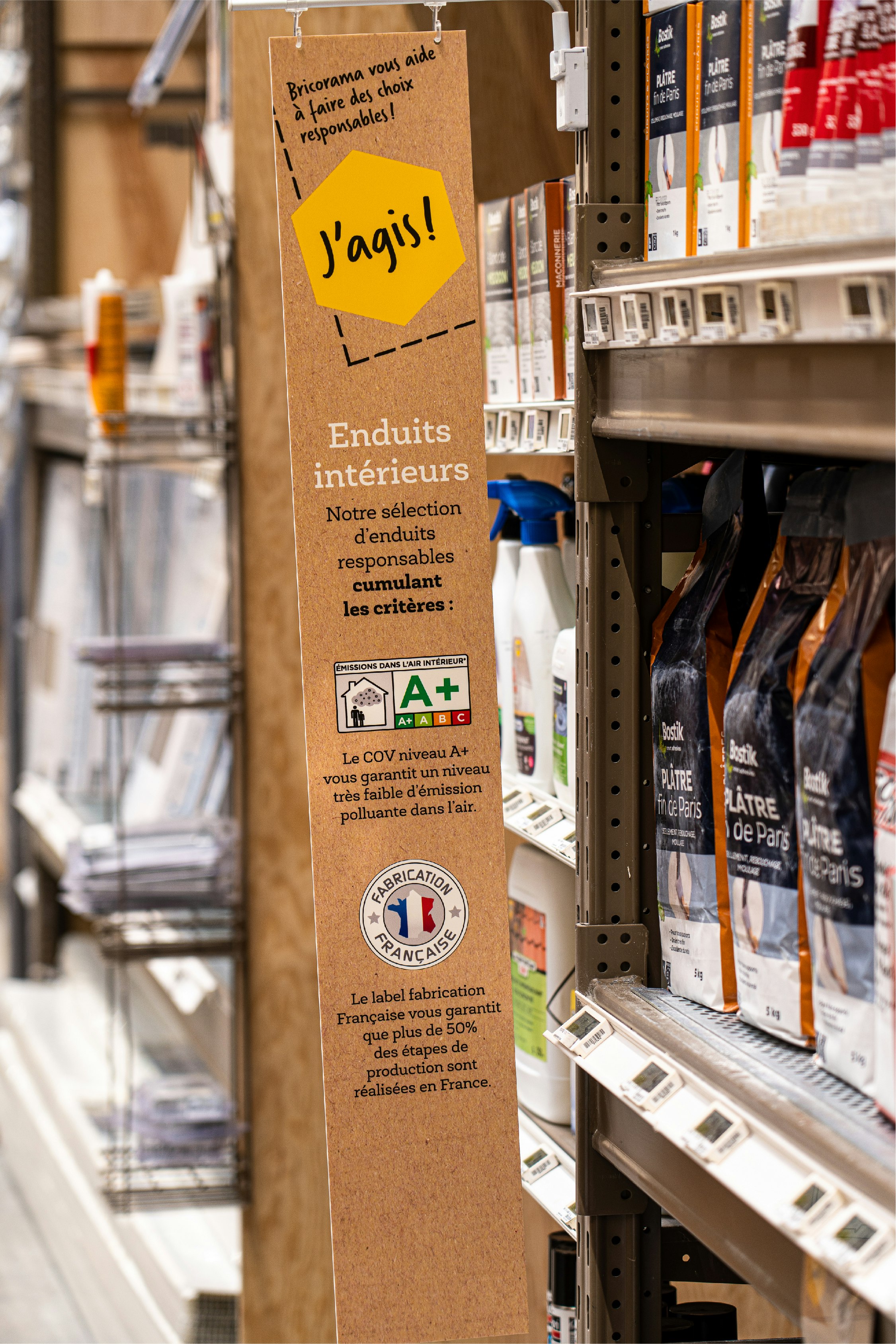
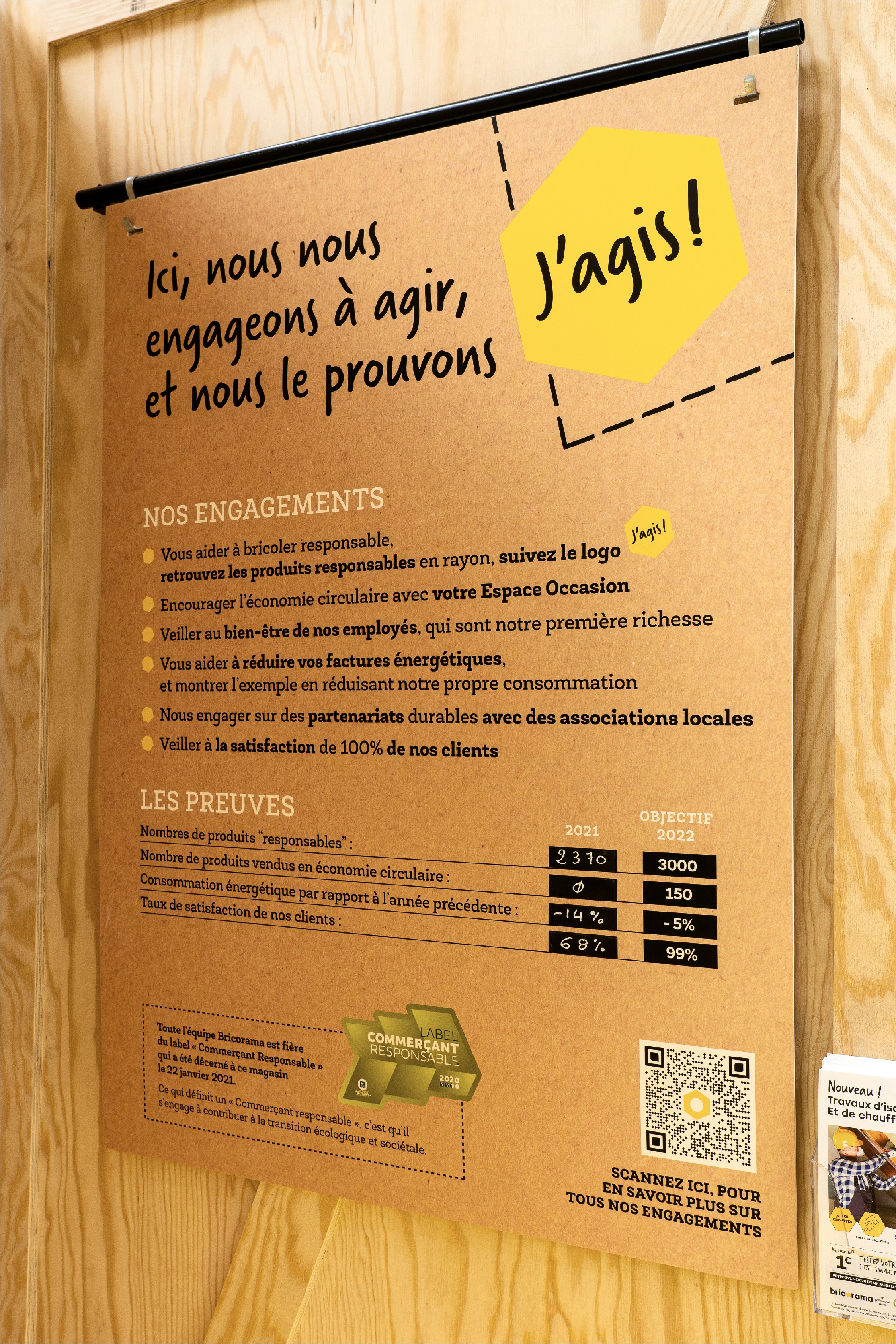
As our first symbolic act in transforming the store, we reused the existing furniture to limit waste. For the message and actions aimed at the customer and to help them make more sustainable choices, we have created the name and identity "J'agis" (I act), which establishes CSR aspects where they are necessary in store, and through a system of label selection. Finally, in partnership with Envie, which promotes social reintegration through the repair of old household appliances, we have created a second-hand area.

A phygital journey to stay connected.
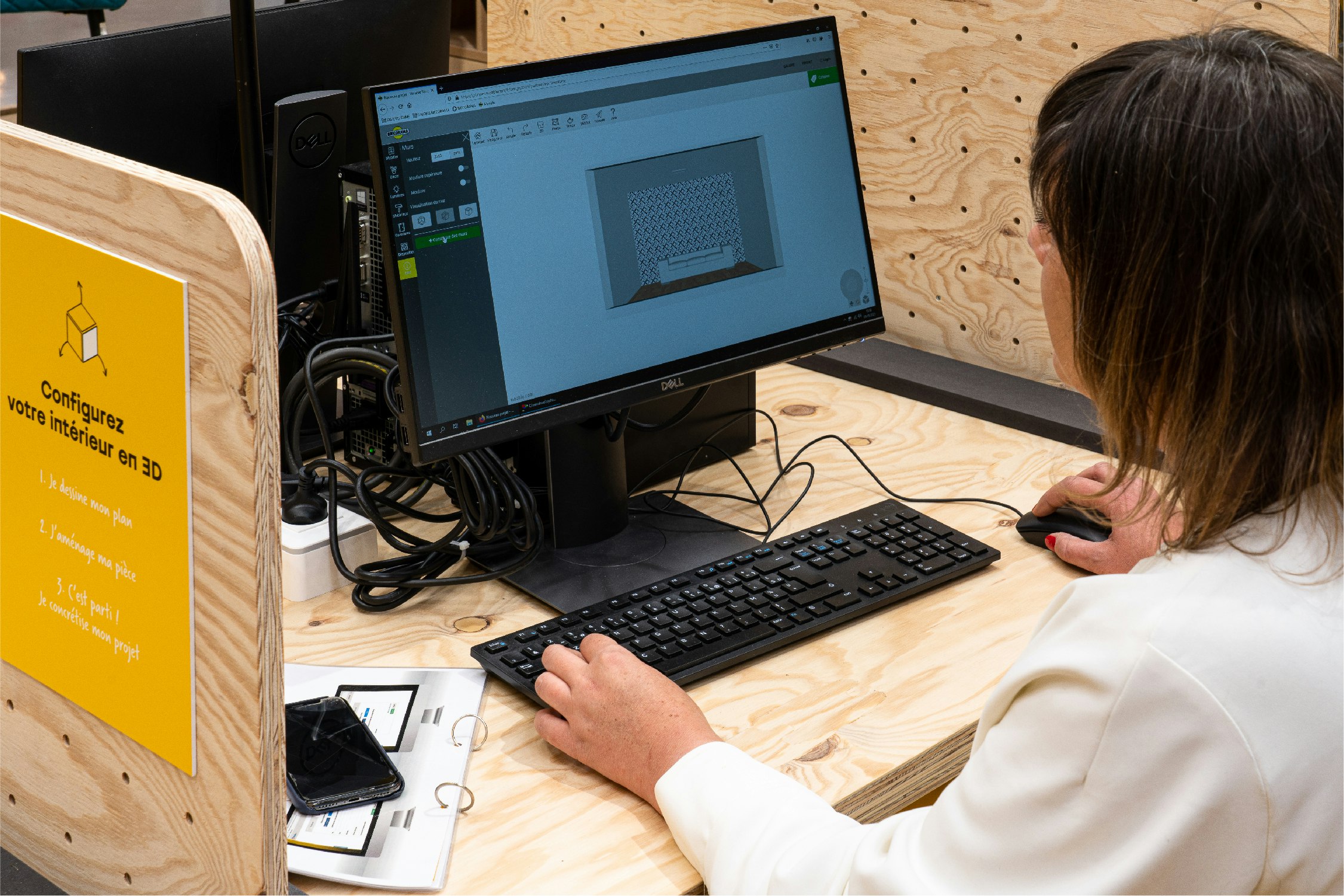
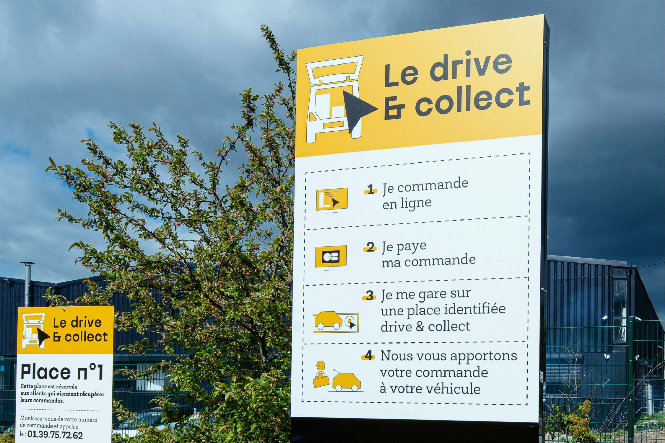
Throughout the customer journey, a common thread links products, services and inspiration with the use of QR codes. To enhance the customer experience, 3D design tools are available, as well as other more basic ones such as remote payment and a Click & Collect area. And finally, we are helping the brand with the creation of an energy saving app, allowing its users to determine the products that best meet their needs.
